Per request by a reviewer of my most recent election irregularities report in VA (here), here’s a little more technical detail as to how the “ideal” model is computed in accordance with the original 2012 National Academy of Sciences paper that I based this work off of.
The generalized summary in my report for VA reads as follows:
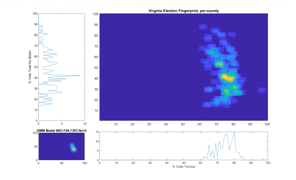
“The upper right image was computed per the NAS paper; the bottom left image shows what an idealized model of the data could or should look like, based on the reported voter turnout and vote share for the winner. This ideal model is allowed to have up to 3 Gaussian lobes based on the peak locations and standard deviations in the reported Virginia results.”
While that description is absolutely accurate, it glosses over some of the implementation as I didn’t want the reader to go all glassy-eyed on me! A more explicit technical definition is as follows: All of the localized maximal peaks in the 2D histogram that are above pThresh (~= 0.7) x the value of the global maximum peak are used as the centroids of a Gaussian Mixture model, with shared covariance matrix equal to 1.5 x sqrt of the covariance matrix of all of the data points. (Thats a lot of mathematics packed into one sentence, but its accurate!) In the case of the VA per county per cong district data this give us either 2 or 3 peaks dependent on the value that is used for the pThresh threshold. The value of 0.7 was chosen after observing results from multiple states data that I have been doing fingerprint analysis on. The MATLAB imregionalmax(…) function from the Image Processing Toolbox is used to find the candidate localized peaks, and the gmdistribution(…) function from the Statistics toolbox generated the final idealized model.
% HBf is the 2D Histogram image
BW = imregionalmax(HBf);
v = HBf(BW);
[r,c] = find(BW.*HBf >=  max(v(:))*pThresh);
mu = [r,c];
s = 1.5;

cv = diag(diag(s*sqrt(cov(rawData))));
GMModel = gmdistribution(mu,cv);
The end result of this is shown below (bottom left) with the Bayesian Information Criterion (BIC) and number of Gaussian components listed in the title of the bottom left “ideal” plot.
Finally. This has been a long time in the making, but here is my summarized report on the most significant VA 2020 General Election irregularities that I’ve discovered. All of this information is presented in detail in previous posts on this site, as well as cataloging many other issues, but I’ve collected the major points here to try and make things easily digestible and accessible to those who are interested.
Special thanks to everyone that helped in putting this together, acquiring deciphering and collating data, performing peer review, etc. I have tried to be as meticulous and as transparent as possible so that others can recreate my results at every stage if they wish to validate.
Note there is a newer updated version of this report (here).
The US National Academy of Sciences (NAS) published a paper in 2012 titled “Statistical detection of systematic election irregularities.” [1] The paper asked the question, “How can it be distinguished whether an election outcome represents the will of the people or the will of the counters?” The study reviewed the results from elections in Russia and other countries, where widespread fraud was suspected. The study was published in the proceedings of the National Academy of Sciences as well as referenced in multiple election guides by USAID [2][3], among other citations.
The study authors’ thesis was that with a large sample of the voting data, they would be able to see whether or not voting patterns deviated from the voting patterns of elections where there was no fraud. The results of their study proved that there were indeed significant deviations from the expected, normal voting patterns in the elections where fraud was suspected.
Statistical results are often graphed, to provide a visual representation of how normal data should look. A particularly useful visual representation of election data is the election fingerprint. When used to analyze election data, the election fingerprint typically analyzes the votes for the winner versus voter turnout by voting district. The expected shape of the fingerprint is of that of a 2D Gaussian (a.k.a. “Normal”) distribution [4]. (See this MIT News article for a great additional description and primer on the Gaussian or Normal distribution: https://news.mit.edu/2012/explained-sigma-0209)
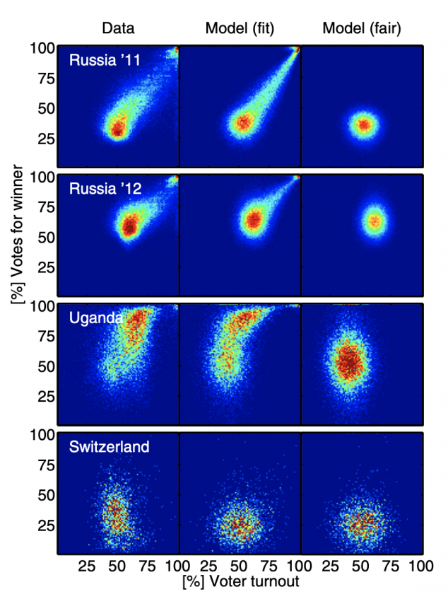
Here is an example reprinted from the referenced National Academy of Sciences paper:
The actual election results in Russia, Uganda and Switzerland appear in the left column, the right column is the expected appearance in a fair election with little fraud, and the middle column is the researchers’ model with fraud included.
As you can see, the election in Switzerland shows a range of voter turnout, from approximately 30 – 70% across voting districts, and a similar range of votes for the winner.
What do the clusters mean in the Russia 2011 and 2012 elections? Of particular concern are the top right corners, showing nearly 100% turnout of voters, and nearly 100% of them voted for the winner.
Both of those events (more than 90% of registered voters turning out to vote and more than 90% of the voters voting for the winner) are statistically improbable, even for very contested elections. Election results that show a strong linear streak away from the main fingerprint lobe indicates ‘ballot stuffing,’ where ballots are added at a specific rate. Voter turnout over 100% indicates ‘extreme fraud’. [1][5]
Election results with ‘outliers’ – results that fall outside of normal voting patterns – are not in and of themselves definitive proof of outright fraud. But additional reviews of voting patterns and election results should be conducted whenever deviations from normal patterns occur in an election. Additionally it should be noted that “the absence of evidence is not the evidence of absence”: Election Fingerprints that look otherwise normal might still have underlying issues that are just simply not readily apparent with this view of the data.
Using this studies methodology, in late 2020 and 2021, multiple researchers in the US have applied the same analysis to the US 2020 election results, as well as the results of previous elections.
Records of Voter Rolls Pre-Election Day, On Election Day, and marked as Absentee. (Note that due to personal privacy considerations, this raw dataset is not openly published and the raw data must be obtained via request. The summaries of this dataset is included in the “2020-NH-Combined-Data.csv” file included below)
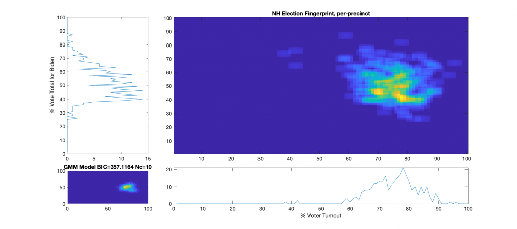
Election Fingerprint:
The upper right image in the following graphic is the computed election fingerprint, computed according to the NAS paper and using official state reported voter turnout and votes for the statewide winner. The color scale moves from precincts with low counts as deep blue, to precincts with high numbers represented as bright yellow. Note that a small blurring filter was applied to the computed image for ease of viewing small isolated histogram hits.
The bottom left image of the graphic shows what an “idealized” model of the data could look like. The upper right image was computed per the NAS paper; the bottom left image shows what an idealized mixture-of-Gaussian model of the data should look like, based on the reported voter turnout and vote share for the winner.
The top-left and bottom-right plots show the sum of the rows and columns of the fingerprint image. The top-left graph corresponds to the sum of the rows in the upper right image and is the histogram of the vote share for Biden across precincts. The bottom right plot corresponds sum of the columns of the upper right image, and is the histogram of the % turnout across the precincts.
Observations/Conclusions:
There does not appear to be any majorly distinct linear correlations, over 100% turnout precincts, or otherwise major red flags even though there is some patterned noise. The distribution is very large and diffuse, and has a definite skew, which is curious, but not necessarily indicative.
There are a small number of outlier precincts outside of the main distribution lobe, most notably the cluster along the 40% turnout line (Lempster, Newport & Claremont Ward 3), and two precincts above 90% turnout (Randolph & Ellsworth).
There are at least two major peaks in the main lobe, which is consistent with the theory of a split electorate.
The % Vote Share for Biden plot (Upper-Left) is “lop-sided” and shows a distinct skew in the data above the 40% Vote Share mark.
Looking at the difference between the Total Reported Votes from Source B and Total Votes count from official Source C shows 10,666 unaccounted for votes. The total number of Write-In votes from Source D was only 1158 and not nearly enough to account for this difference.
Looking at the difference between the registered voters from Source E and the Registered voters from Source A, there is a difference of 122,248 registrations.
References:
[1] “Statistical detection of election irregularities” Peter Klimek, Yuri Yegorov, Rudolf Hanel, Stefan Thurner Proceedings of the National Academy of Sciences Oct 2012, 109 (41) 16469-16473; DOI: 10.1073/pnas.1210722109 (https://www.pnas.org/content/109/41/16469)
[5] Mebane, Walter R. and Kalinin, Kirill, Comparative Election Fraud Detection (2009). APSA 2009 Toronto Meeting Paper, Available at SSRN: https://ssrn.com/abstract=1450078