
Abstract
Examining the Election Night Reporting data from the VA 2024 March Democratic and Republican primaries provides supporting evidence that the Republican primary was impacted and skewed by a large number of Democratic “crossover” voters, resulting in an irregular election fingerprint when the data is plotted.
Background
The US National Academy of Sciences (NAS) published a paper in 2012 titled “Statistical detection of systematic election irregularities.” [1] The paper asked the question, “How can it be distinguished whether an election outcome represents the will of the people or the will of the counters?” The study reviewed the results from elections in Russia and other countries, where widespread fraud was suspected. The study was published in the proceedings of the National Academy of Sciences as well as referenced in multiple election guides by USAID [2][3], among other citations.
The study authors’ thesis was that with a large sample sample of the voting data, they would be able to see whether or not voting patterns deviated from the voting patterns of elections where there was no suspected fraud. The results of their study proved that there were indeed significant deviations from the expected, normal voting patterns in the elections where fraud was suspected, as well as provided a number of interesting insights into the associated “signatures” of various electoral mechanism as they present themselves in the data.
Statistical results are often graphed, to provide a visual representation of how normal data should look. A particularly useful visual representation of election data, as utilized in [1], is a two-dimensional histogram of the percent voter turnout vs the percent vote share for the winner, or what I call an “election fingerprint”. Under the assumptions of a truly free and fair election, the expected shape of the fingerprint is of that of a 2D Gaussian (a.k.a. a “Normal”) distribution [4]. The obvious caveat here is that no election is ever perfect, but with a large enough sample size of data points we should be able to identify large scale statistical properties.
In many situations, the results of an experiment follow what is called a ‘normal distribution’. For example, if you flip a coin 100 times and count how many times it comes up heads, the average result will be 50. But if you do this test 100 times, most of the results will be close to 50, but not exactly. You’ll get almost as many cases with 49, or 51. You’ll get quite a few 45s or 55s, but almost no 20s or 80s. If you plot your 100 tests on a graph, you’ll get a well-known shape called a bell curve that’s highest in the middle and tapers off on either side. That is a normal distribution.
https://news.mit.edu/2012/explained-sigma-0209
In a free and fair election, the plotted graphs of both the Turnout percentage and the percentage of Vote Share for Election Winner should (again … ideally) both resemble Gaussian “Normal” distributions; and their combined distribution should also follow a 2-dimensional Gaussian (or “normal”) distribution. Computing this 2 Dimensional joint distribution of the % Turnout vs. % Vote Share is what I refer to as an “Election Fingerprint”.
Figure 1 is reprinted examples from the referenced National Academy of Sciences paper. The actual election results in Russia, Uganda and Switzerland appear in the left column, the right column is the modeled expected appearance in a fair election with little fraud, and the middle column is the researchers’ model of the as-collected data, with any possible fraud mechanisms included.
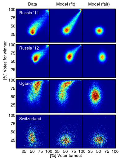
As you can see, the election in Switzerland (assumed fair) shows a range of voter turnout, from approximately 30 – 70% across voting districts, and a similar range of votes for the winner. The Switzerland data is consistent across models, and does not show any significant irregularities.
What do the clusters mean in the Russia 2011 and 2012 elections? Of particular concern are the top right corners, showing nearly 100% turnout of voters, and nearly 100% of them voted for the winner.
Both of those events (more than 90% of registered voters turning out to vote and more than 90% of the voters voting for the winner) are statistically improbable, even for very contested elections. Election results that show a strong linear streak away from the main fingerprint lobe indicates ‘ballot stuffing,’ where ballots are added at a specific rate. Voter turnout over 100% indicates ‘extreme fraud’. [1][5]
Note that election results with ‘outliers’ – results that fall outside of expected normal voting patterns – while evidentiary indicators, are not in and of themselves definitive proof of outright fraud or malfeasance. For example, in rare but extreme cases, where the electorate is very split and the split closely follows the geographic boundaries between voting precincts, we could see multiple overlapping Gaussian lobes in the 2D image. Even in that rare case, there should not be distinct structures visible in the election fingerprint, linear streaks, overly skewed or smeared distributions, or exceedingly high turnout or vote share percentages. Additional reviews of voting patterns and election results should be conducted whenever deviations from normal patterns occur in an election.
Additionally it should be noted that “the absence of evidence is not the evidence of absence”: Election Fingerprints that look otherwise normal might still have underlying issues that are not readily apparent with this view of the data.
Results on 2024 VA March Primaries:
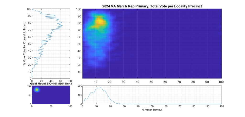
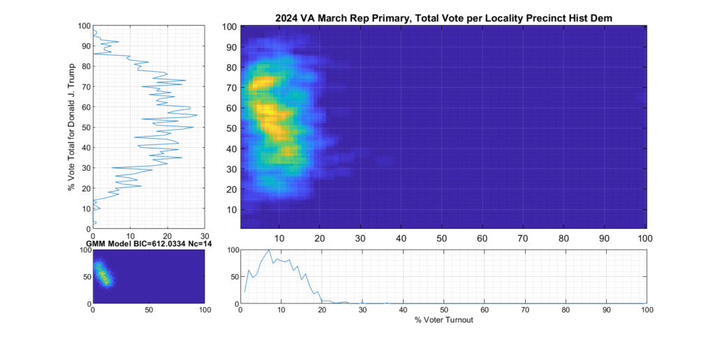
Figure 2 and Figure 3 are the computed election fingerprints for the Democratic and Republican VA 2024 March Primaries, respectively. They were computed according to the NAS paper and using official state reported voter turnout and votes for the statewide winner and reported per voting Locality with combined In-Person Early, Election Day, Absentee and Provisional votes. Figures 4 and 5 perform the same process, except each data point is generated per individual precinct in a locality. The color scale moves from precincts with low counts as deep blue, to precincts with high numbers represented as bright yellow. Note that a small blurring filter was applied to the computed image for ease of viewing small isolated Locality or Precinct results.
The upper right inset in each graphic image was computed per the NAS paper; the bottom left inset shows what an idealized model of the data could or should look like, based on the reported voter turnout and vote share for the winner. This ideal model is allowed to have up to 3 Gaussian lobes based on the peak locations and standard deviations in the reported results. The top-left and bottom-right inset plots show the sum of the rows and columns of the fingerprint image. The top-left graph corresponds to the sum of the rows in the upper right image and is the histogram of the vote share for the winner across precincts. The bottom right graph shows the sum of the columns of the upper right image, and is the histogram of the percentage turnout across voting localities.
Figure 2 Democratic primary, accumulated per Locality:
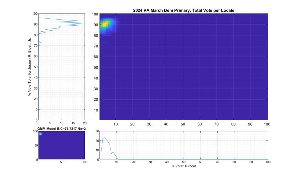
Figure 3 Republican primary, accumulated per Locality:
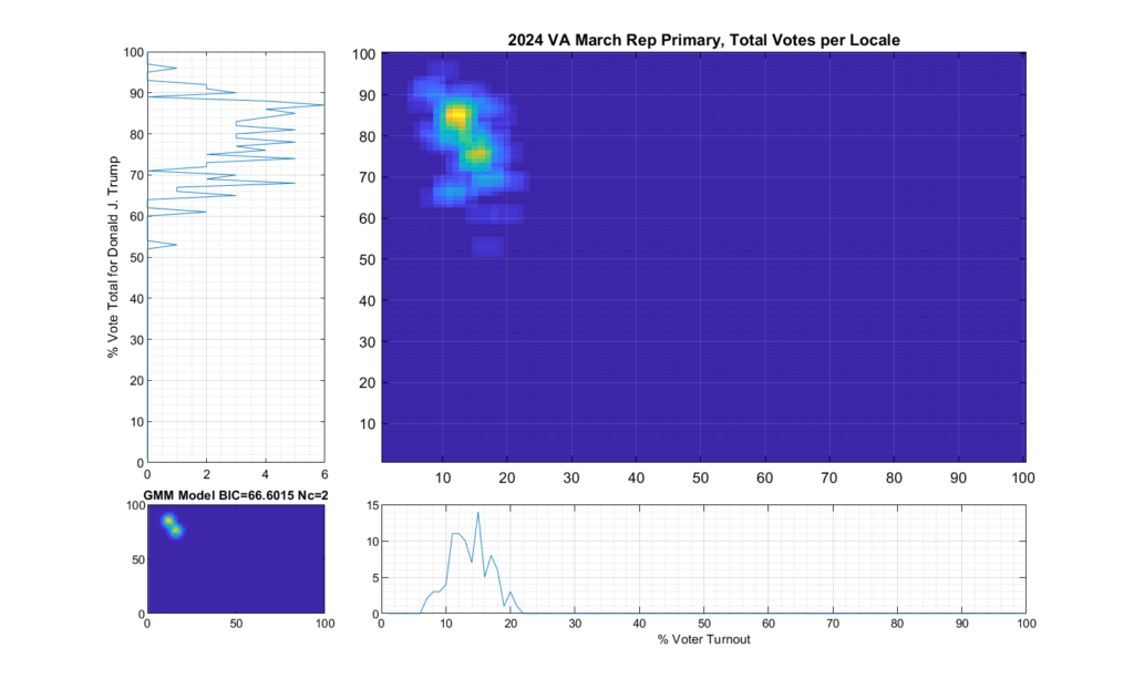
Figure 4 Democratic primary, accumulated per Precinct:
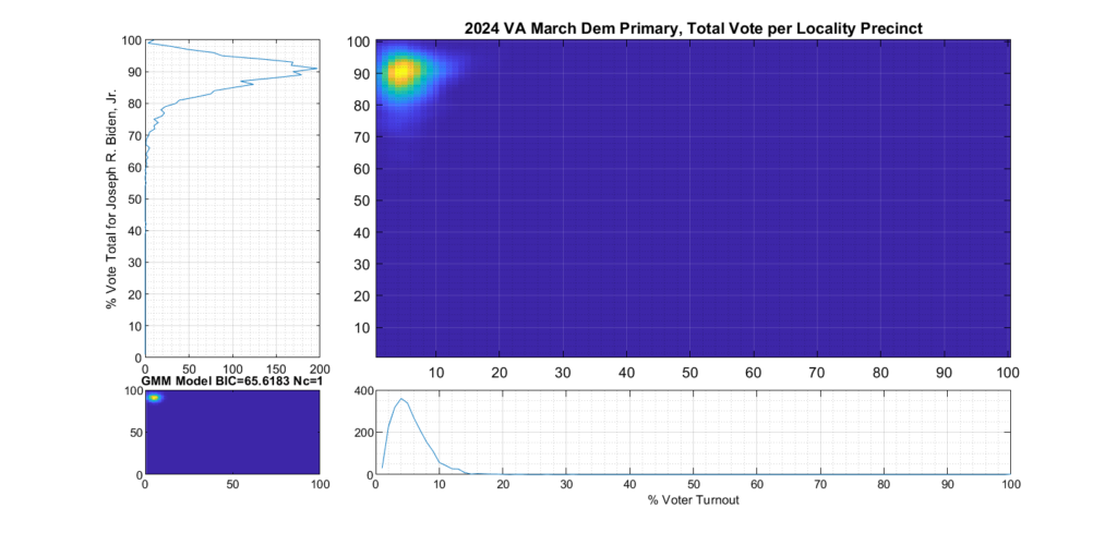
Figure 5 Republican primary, accumulated per Precinct:
Analysis:
As can be seen in Figure 2 and 4, the Democratic primary fingerprint looks to fall within expected normal distribution. Even though the total vote share for the winner (Biden) is up around 90%, this was not unexpected given the current set of contestants and the fact that Biden is the incumbent.
The Republican primary results, as shown in Figure 3 and 5, show significant “smearing” of the percent of total vote share for the winner. The percent of voter turnout (x-axis) does however show a near Gaussian distribution, which is what one would expect. The republican primary data does not show the linear streaking pattern that the authors in [1] correlate with extreme fraud, but significant smearing of the distribution is observed.
A consideration that might partially explain this smearing of the histogram, is that there was at least 17% of “crossover voters” who historically lean Democrat but voted in the Republican primary (see here for more information). Multiple news reports and exit polling suggest that this was due in part to loosely organized efforts by the opposing party to cast “Protest Votes” and artificially inflate the challenger (Haley) and dilute the expected (Trump) margin of victory for the winner, with no intention of supporting a Republican candidate in the General Election. (This is completely legal in VA, by the way, as VA does not require by-party voter registration.)
If we categorize each locality as being either Democratic or Republican leaning based on the average results of the last four presidential elections, and then split the computation of the per precinct results into separate parts accordingly, we can see this phenomenon much clearer.
Figure 6 shows the per-precinct results for only those locality precincts that belong to historic Republican leaning localities. It depicts a much tighter distribution and has much less smearing or blurring of the distribution tails. We can see from the data that Republican base in historically Republican leaning localities seems solidly behind candidate Trump.
Figure 7 shows the per-precinct results for only those locality precincts that belong to historic Democratic leaning localities. It can clearly be seen by comparing the two plots that the major contributor to the spread of the total republican primary distribution is the votes from historically Democratic leaning localities.
Figure 6 Republican primary, accumulated per Precinct in Republican leaning localities:
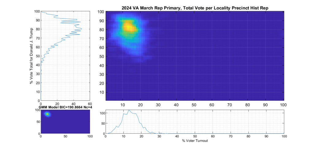
Figure 7 Republican primary, accumulated per Precinct in Democratic leaning localities:
References:
- [1] “Statistical detection of election irregularities” Peter Klimek, Yuri Yegorov, Rudolf Hanel, Stefan Thurner Proceedings of the National Academy of Sciences Oct 2012, 109 (41) 16469-16473; DOI: 10.1073/pnas.1210722109 (https://www.pnas.org/content/109/41/16469)
- [2] USAID: Assessing and Verifying Election Results: A Decision Makers Guide to Parallel Vote Tabulation and Other Tools (http://web.archive.org/web/20201118021847/https://pdf.usaid.gov/pdf_docs/PA00KGWR.pdf)
- [3] USAID: A guide to Election Forensics (http://web.archive.org/web/20210501091306/https://pdf.usaid.gov/pdf_docs/PA00MXR7.pdf)
- [4] Multivariate Normal Distribution – Wikipedia (https://en.wikipedia.org/wiki/Multivariate_normal_distribution)
- [5] Mebane, Walter R. and Kalinin, Kirill, Comparative Election Fraud Detection (2009). APSA 2009 Toronto Meeting Paper, Available at SSRN: https://ssrn.com/abstract=1450078