Updated 19:17 2021-08-03
See also my post on “excess” absentee votes in VA here.
Note: that I’ve made a new blog post that is just the latest results by state and doesn’t have the play-by-play commentary. I’ll still update this blog with the technical details, but if you just want the latest results see here.
So as some of you know I’m a data guy … and I’ve been crunching some numbers on the election using standard statistical techniques for identifying the signs of election irregularities, and there are a LOT of signs. The techniques I’m using are as published by the National Academy of Sciences in a 2012 paper titled “Statistical Detection of Systemic Election Irregularities” and cited over 188 times, at least according to google. (https://www.pnas.org/content/109/41/16469). Note that I am not the author of the original paper. I have attempted to contact the authors but have not yet heard back from them.
These methods are not conclusive, but they can be indicative, and they use standard and robust statistical methods that are well understood on the raw data as provided by election operators. For each voting location (County/Precinct/etc) one only needs to collect the following:
- Number of actual votes for each candidate in a location
- The total count of votes cast in the location can be computed as the sum of votes for all the candidates.
- Number of registered or valid votes possible in the location.
Bottom Line Up Front:
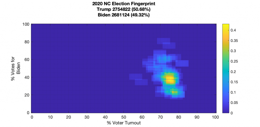
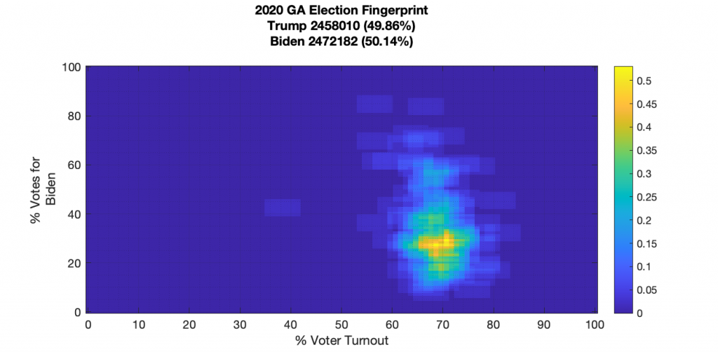
None of the states election fingerprints I’ve done are perfect, but PA, WI and VA stand out as having significant irregularities. FL, MI, GA, NY and TX I’d still label as deserving scrutiny as they show significant non-Gaussian structures. MN, and NC all have imperfections, but no major structural irregularities. MN looks to be the cleanest of all so far.
One really interesting aspect of the analysis I’ve been doing is to look at the trend over time of VA between 2008, 2012, 2016 and 2020 as the per county fingerprint has shifted from a much more “fair” distribution to one that has distinct structural artifacts indicative of election manipulation. And no, this change isn’t a sign of changing demographics … mathematically that would just move the centroid of the “bulls-eye” and not impose such significant structural irregularities. The VA historical data seems to confirm the hypothesis that these irregularities have been increasing over the years.
The Theory:
The theory behind this technique is based on looking at how Gaussian (a.k.a. a symmetric “Bell Curve”) the 2D histogram of the (% Voter Turnout) Vs. (% Voted for Winner) looks. This “Election Fingerprint” is computed directly from the reported returns and the published voter registration data from each County or Precinct. The graphic below is extracted from the original authors paper, and we can see the difference between “ideal” elections and the data for some specific cases. The actual data is on the left, with the “ideal” model on the right. The top 3 rows are from elections that are assumed to be manipulated. The bottom row (from Switzerland) is assumed to have been a fair election. We can see that Switzerland’s data matches the model fairly well, while the other 3 show significant deviations. So … bottom line … we are looking to verify that the election fingerprints have a symmetric, clean Gaussian “blob”. The presence of of other structured patterns by definition show irregularity. Some (but not all), of these structured patterns are well-known indicators of specific types of fraud: Streaking away from the main lobe in one direction indicates “incremental fraud” or a.k.a “ballot stuffing” at a statistical rate; Voter turnout of over 100% is a red flag and a sign of “extreme fraud”. Etc.

The Data:
So I’ve only had time to get through a few states so far. My biggest challenge is collecting all the data … if you know of a central archive of machine readable data that I could access I’d appreciate it!. For most of the ones I’ve done so far, the most granular I’ve been able to get is at the county level, except for VA where I’ve been able to get to the precinct level. Let’s start first with PA and compare with the Russia ’11 or Russia ’12 Data as presented above. All data has been gathered from either official state-owned elections data repositories, or from scraping the CNN elections returns data map.
I will happily make all source data and code available to any interested parties.
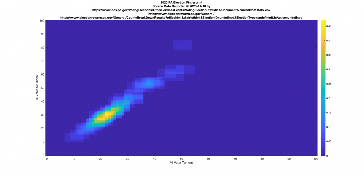
PENNSYLVANIA:
(Note: This analysis is incorrect and has been updated below, but is kept here for historical purposes.) We see the same streak moving up and to the right, which according to the authors is indicative, but not conclusive, of incremental Fraud (aka “ballot stuffing”) where ballots are taken away from both the non-voters and the opposition and added to the winners at a certain statistical rate. Note that the authors have labeled the sharp peak at (100,100) in the Russia plots above as indicative of extreme Fraud, or that almost all votes have been taken away from non-voters or the opposition. PA definitely has signs of incremental fraud looking at the image I computed below, but does not show a telltale peak of extreme fraud.

PA UPDATE 10:45pm, Nov 14th
I’ve been able to get an updated machine readable dataset from the PA Dept of elections (here), instead of plugging things in by hand as well as finding and fixing a few significant errors in my code that I think might have been responsible for the above plot shape (I had flipped the place of two variables in my code! … this is why I’d love for someone else to review this work and help me find typos and mistakes!). The PA dataset was the first one I did, so I also wanted to go back and revisit it to clean up the code to make use some of the modular improvements I did with subsequent runs.
With this new dataset from the PA Dept. of Elections I also have the ability to separate out the In-Person, Mail-In and Provisional vote tallies per county per candidate.
So lets dive in, shall we …
Right off the bat there’s some numerical inconsistencies in a few of the counties data. The data set from PA dept of elections provides: In-Person, Mail-In, Provisional and a TotalVote count for each candidate. There are three counties where the sum of (Mail-In + In-Person + Provisional) doesn’t equal TotalVote : Montour, Northumberland and Potter. They are small differences … only a few hundred votes max … but still, they are tabulated below.
| diff Biden | diff Trump | diff Jo | |
| Montour | 4 | 8 | 1 |
| Northumberland | 216 | 485 | 13 |
| Potter | 30 | 99 | 1 |
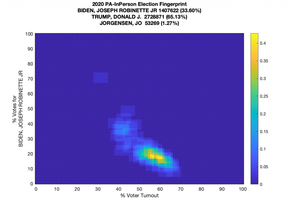
The in-person data by itself has an odd “boomerang” shape, which is a bit confusing and definitely irregular, but its not associated with either the “incremental fraud” or “extreme fraud” cases that are called out in the PNAS paper. It’s irregular and somewhat eyebrow raising, but not super indicative of one of the known major fraud categories.
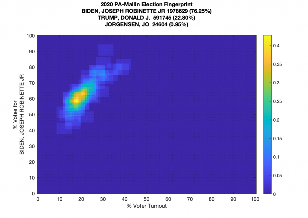
The Mail-In data in PA however … well thats another story! The mail in ballots clearly show the “up-and-to-the-right” kurtotic streak called out in the paper as an indicator of incremental fraud (“ballot stuffing”) as discussed above.
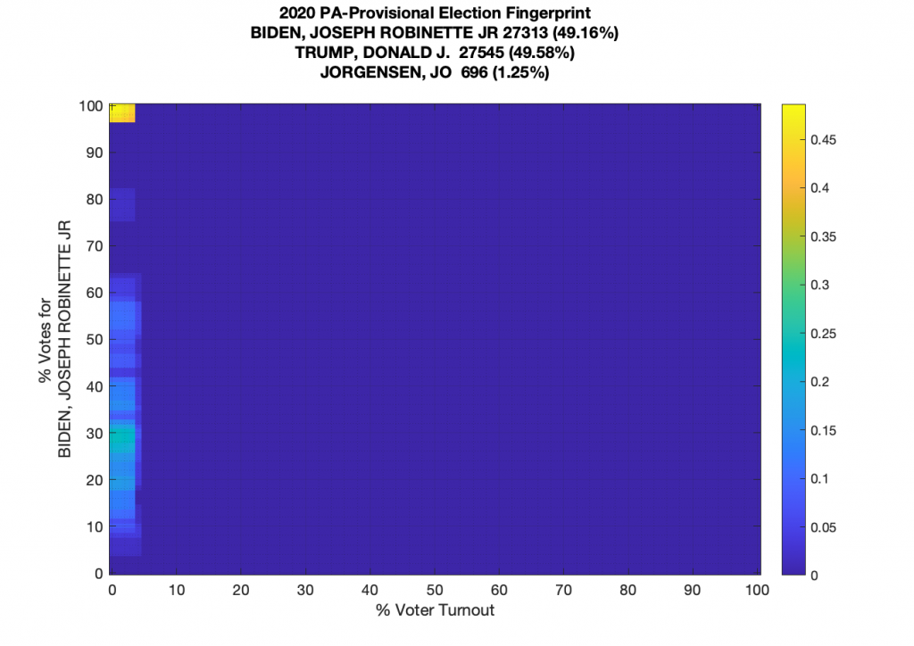
There really aren’t that many provisional ballots total compared to In-Person and Mail-In, so they all line up just above the 0 % voter turnout when looking at them in isolation. There looks to be a centered distribution with a peak around the 30% vertical mark, and then a big spike at 100%.
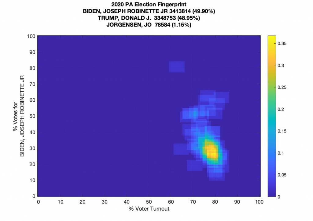
And now putting everything together (using the reported total vote data and not the sum of the three) we get the following completed fingerprint. The distribution has a definite kurtotic tail spreading upwards from the central lobe, and a single lone datapoint at (60,80).
Update 2020-11-20 17:08
Found another set of (small) issues in the PA data.
In Crawford County PA, there are 314 more votes for Trump, and 557 for Biden being reported that the sum of (Mail-In + In Person + Provisional) that were recorded. (“excess votes”)
In Jefferson County PA, there were 29 excess Trump votes and 32 excess Biden votes.
I’m using the latest data direct from PA Dept of elections: https://www.electionreturns.pa.gov/api/ElectionReturn/GetCountyBreak?officeId=1&districtId=1&methodName=GetCountyBreak&electionid=undefined&electiontype=undefined&isactive=undefined&fbclid=IwAR1RZB5pDIs2JSX4u-Xv_0K1OyWJCu2mpc_Xq3uHbw8ZGCeU5bw_oEY6dN4
Next up, MICHIGAN:
So MI doesn’t have nearly the distinct (+,+) kurtotic tail that PA has in the Mail-In data, but there is a definite “kink” in the distribution where it looks like its been bent into a smaller boomerang, but this time with one wing of the boomerang pointing upper right and the other pointing down. It’s also got some distinct salt-and-pepper artifacts and clustering above the main lobe. Keep in mind the theory is that the ideal “fair” election fingerprint would look like a symmetrical Gaussian lobe, according to the National Academy of Sciences paper. And again this method and analysis cannot provide conclusive evidence, but it can provide indicative evidence of election irregularities. Also note that this data is from AFTER the computer “glitches” were caught in Antrim and Wayne counties and corrected. (I think Wayne was the other one if memory serves.)

FLORIDA:
This looks fairly clean, with a solid bimodal distribution, and no diagonal skew. i.e. the % Voter turnout was fairly consistent, but there is a distinct partisan split (not too many people left in the middle I guess). However, there still is a kurtotic vertical “squiggly” tail for Biden, which isn’t a very strong indicator of election irregularities, but it is a deviation from the ideal “fair” (clean + symmetric lobes). It’s not nearly the red flag of a large diagonal skew (indicating incremental fraud), or a separate sharp disconnected peak at the [100,100] cell (indicative of extreme fraud), or many units with extremely high turnout disconnected from the main lobe.

NEW YORK:
Like FL, I’m not quite sure what to make of this one, as it has a nice centered lobe, but this odd kurtotic tail going up and to the left. (towards lower turnout % and higher Biden vote %) There is no delineation between absentee / in-person votes in this data. Its just a histogram of turnout (via absentee OR in-person) % vs. votes % for Biden in NY counties. Now it could be that there is ALSO a correlation between lower turnout and higher absentee ballots returns, and that absentee ballots were skewed towards Biden. But I don’t have the data to check that.
Update @ 1045pm Nov 14th:
Given that I was able to break out and decompose the new PA data that showed a similar looking combined distribution, I’d be interested to see if the NY data has the same indicators of incremental fraud in one of its components like Mail-In or In-Person ballots, but I don’t have a dataset that breaks that out.

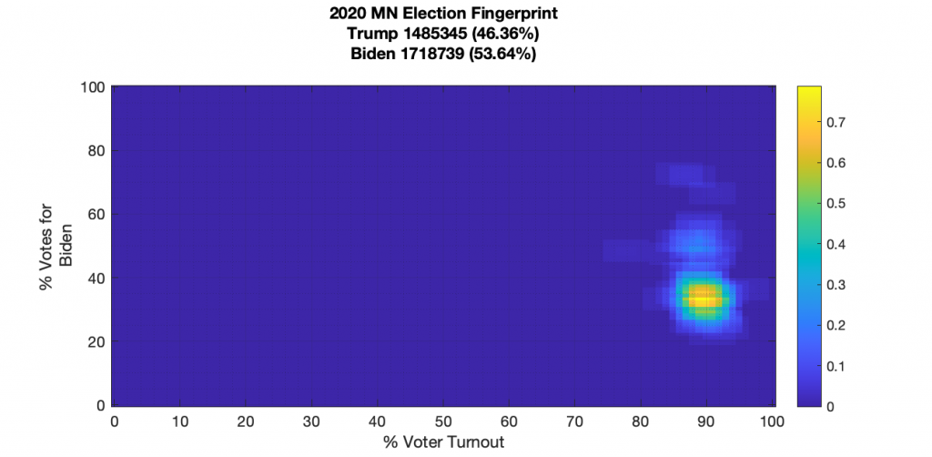
MINNESOTA:
Minnesota has a slightly kurtotic vertical smear in the tails, but other than that, it looks like a nice, centered Gaussian distribution.
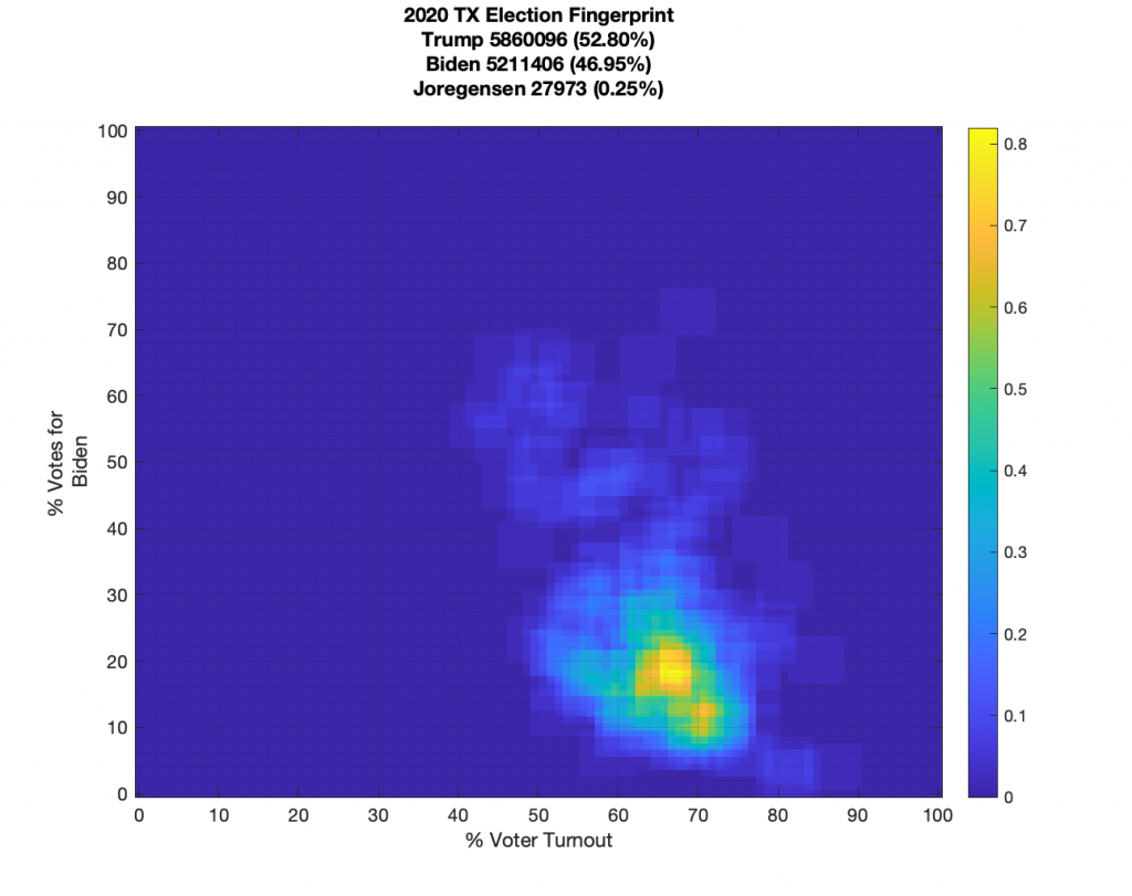
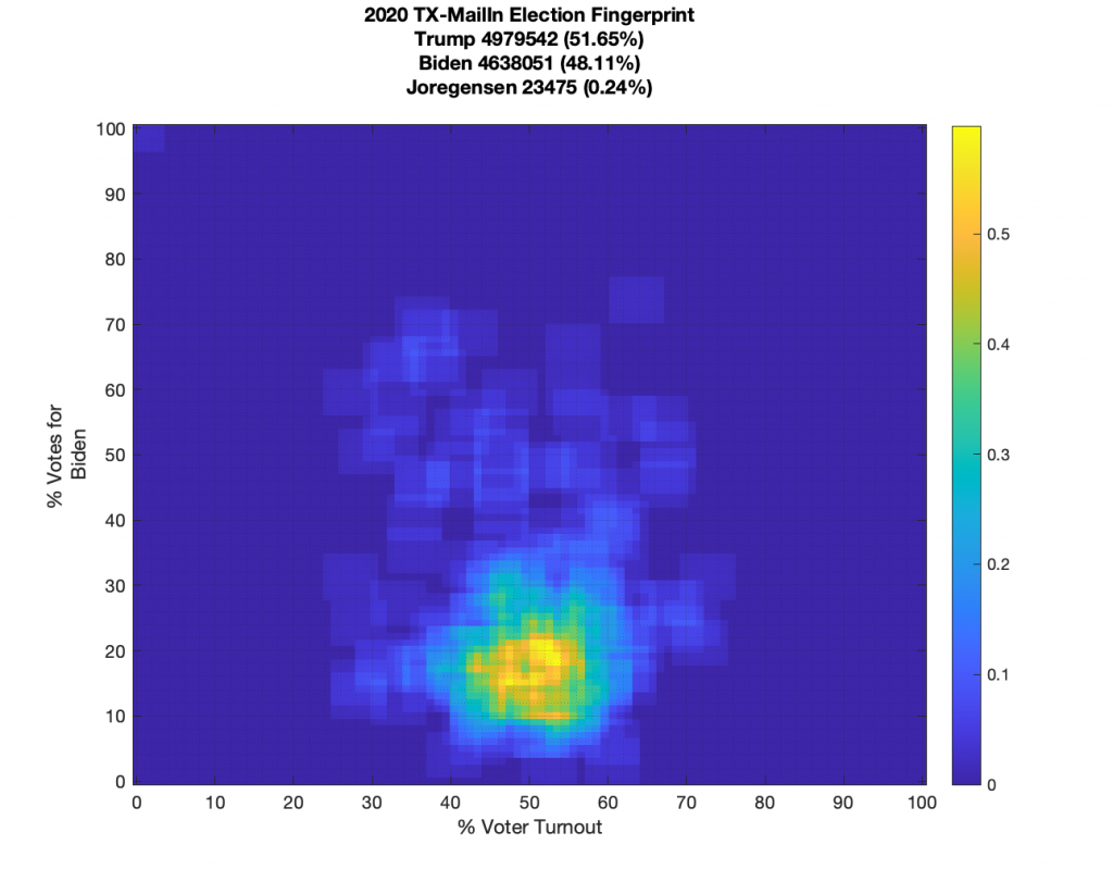
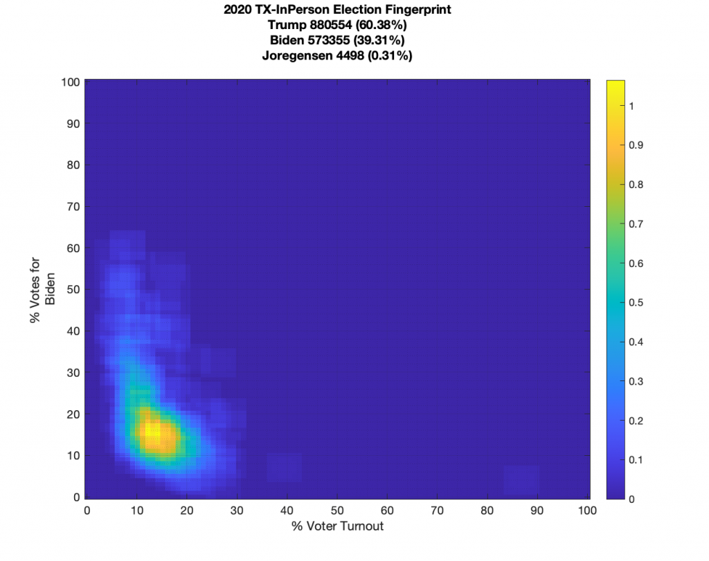
TEXAS:
Texas data looks noisy but it does have a well defined centroid and little sharp linear features. It does have some “salt-n-pepper” data-points that are smeared in the vertical. With Texas data we also have the ability to break out the mail in and in person votes, which while also noisy, don’t show any extreme structural features.
WISCONSIN:
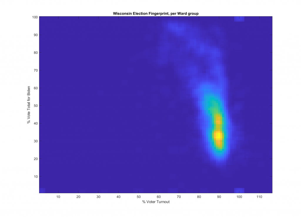
WI analysis updated 2021-08-03, See HERE: https://digitalpollwatchers.org/new-wi-2020-election-fingerprints/
NORTH CAROLINA
GEORGIA
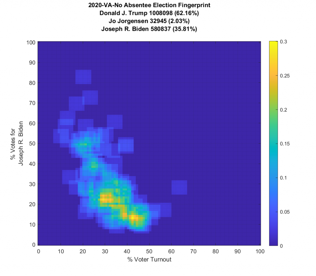
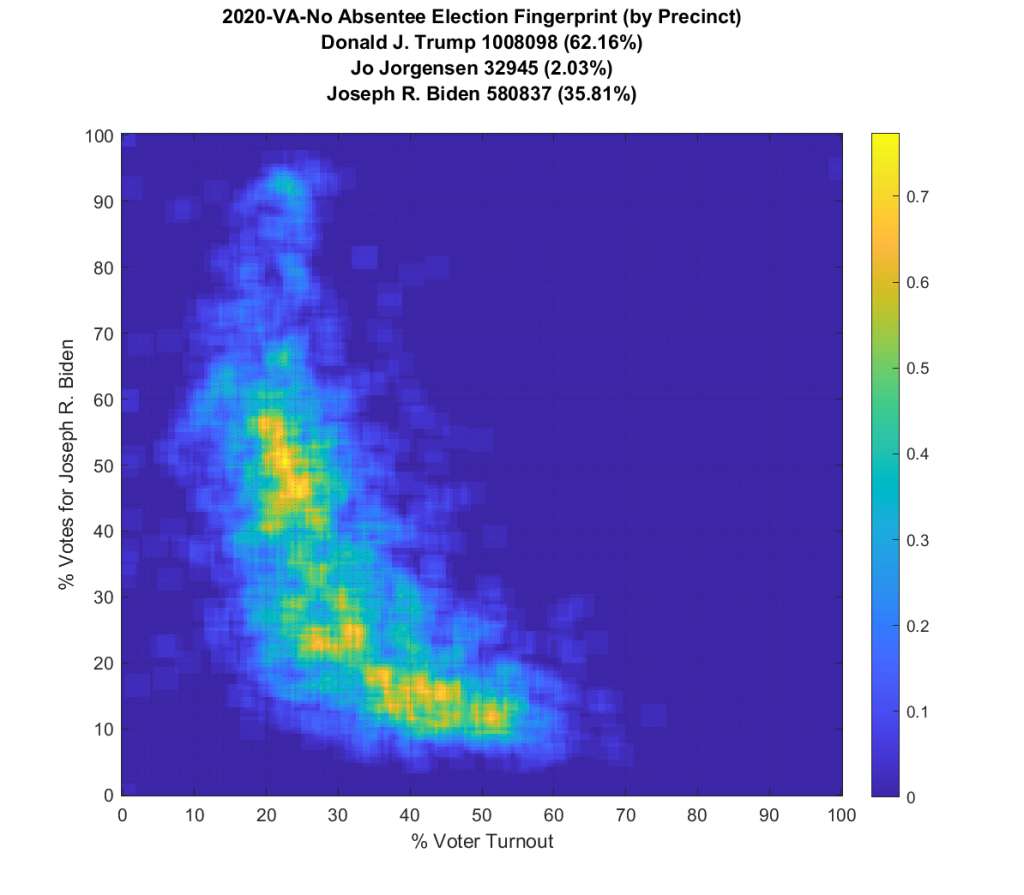
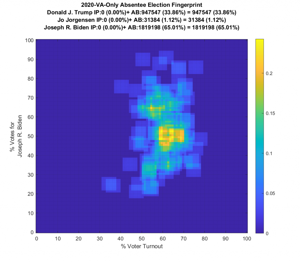
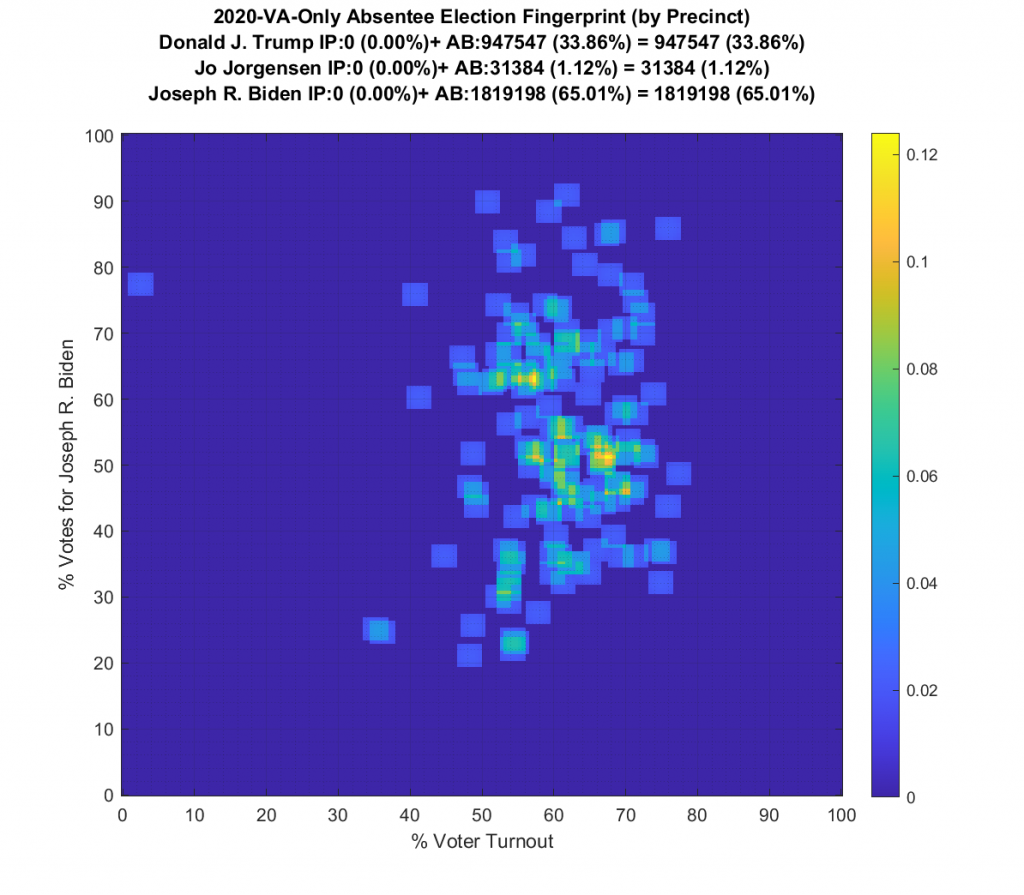
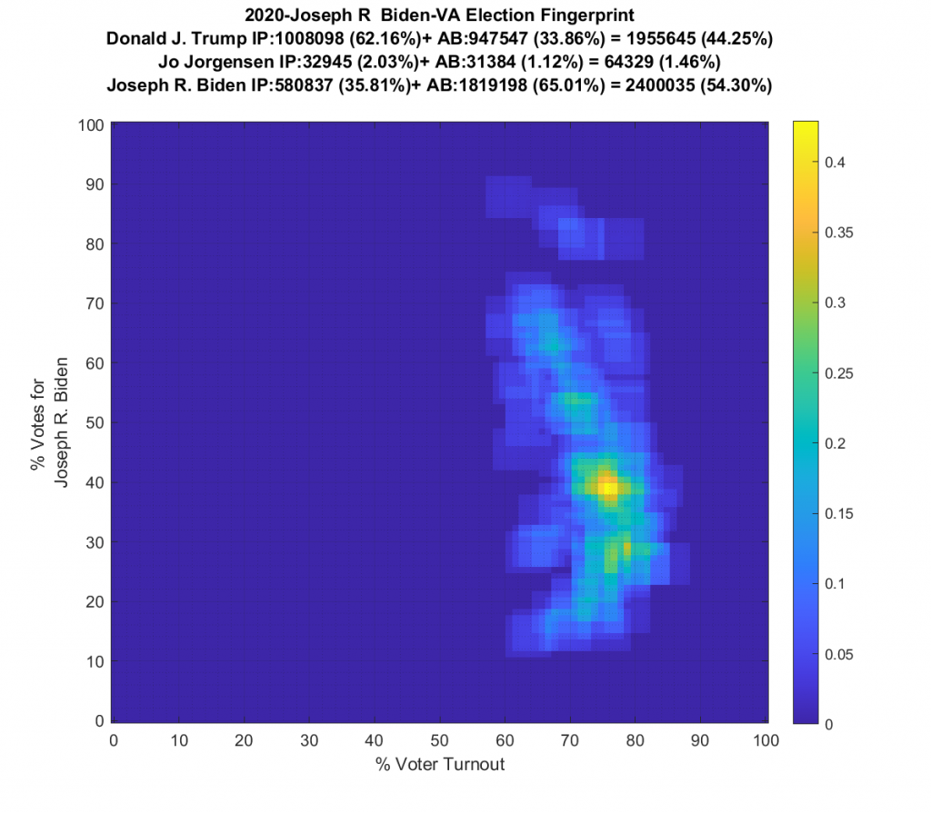
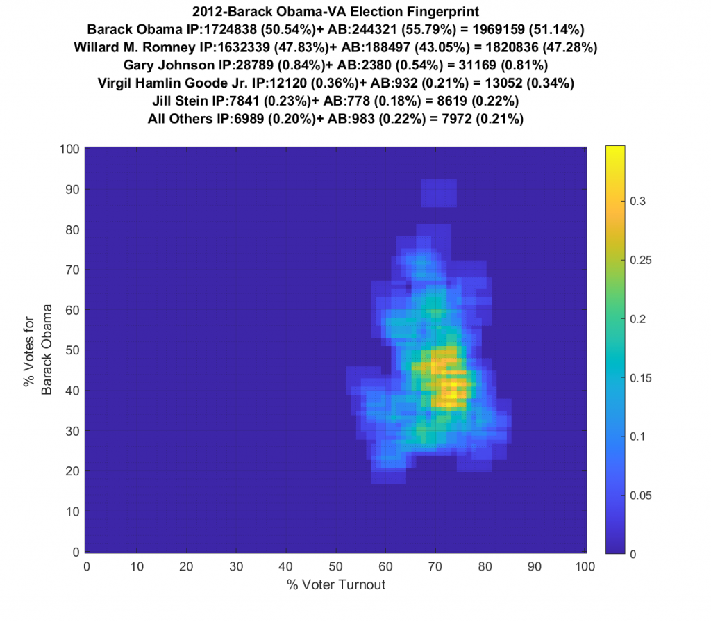
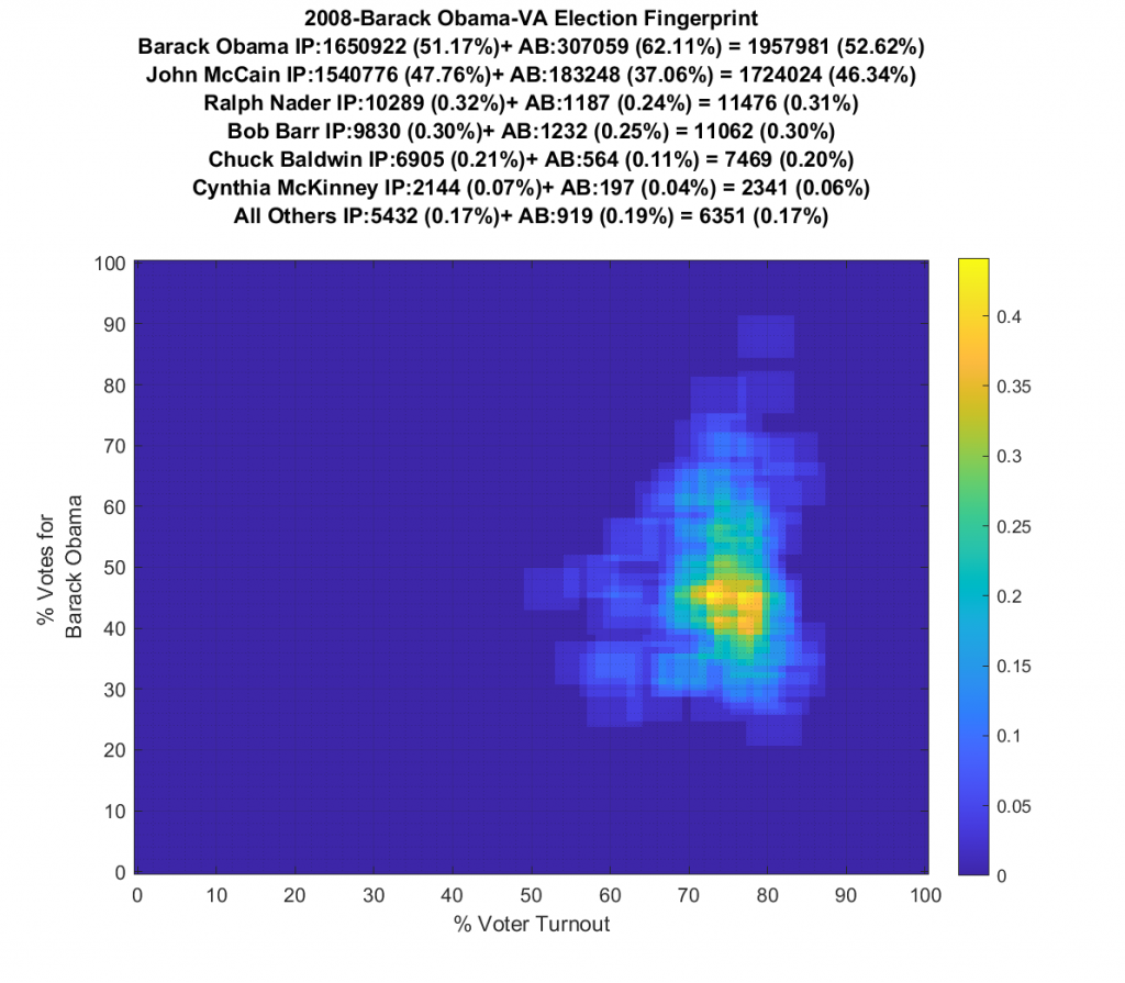
VIRGINIA (note there are multiple updates below):
Whoa buddy … what the heck is going on here!?!?! We’ve got a number of precincts with over 100% turnout, and some wacky distribution shapes and none of them even remotely approaching Gaussian!
The VA plot is just bonkers and I’m currently going back and checking my work. I am not sure what to make of the VA data. I’ve included the per precinct plots and per county below, but am currently double checking my work.
VA is the only state so far where I’ve been able to:
A – get per precinct data vs per county and
B – download the raw data directly from VA dept of elections (they publish json files per precinct) without having to hand-jam into a machine readable format.


VA Update (12:33am 11/13/2020):
I did find an error in how I was matching precinct names of the list of registered voters per precinct up with precinct vote counts. VA provides the registered voter count per precinct in a global JSON file and the vote tallies of precincts are provided 1 JSON file per county with multiple records per precinct. The challenge comes in that some precincts span multiple counties.
Another issue with the VA data is that absentee ballots for counties are counted centrally and the central counting facility is considered its own precinct, but there is no assigned count of registered voters for each absentee tallying facility, which are also split by VA congressional district. So if two counties straddle a congressional district, each county will have an absentee vote counting precinct listed for that district. The vote data is tallied by precincts, that each fall within a district, for which we have registration data on. So I have to compute the number of ‘residual’ registered voters that should be assigned to the absentee precincts for each county by summing the differences between registered voters and total votes for all of the other precincts in the county in the same district. (i.e. every in-person vote shouldn’t be considered as eligible to also vote absentee). It’s a record keeping pain, but its doable.
I additionally needed to fix some parsing functions, and issues between the two data sources (the registration files and vote records from VA secretary of state) that were treating ‘-‘ characters and spaces inconsistently, etc.
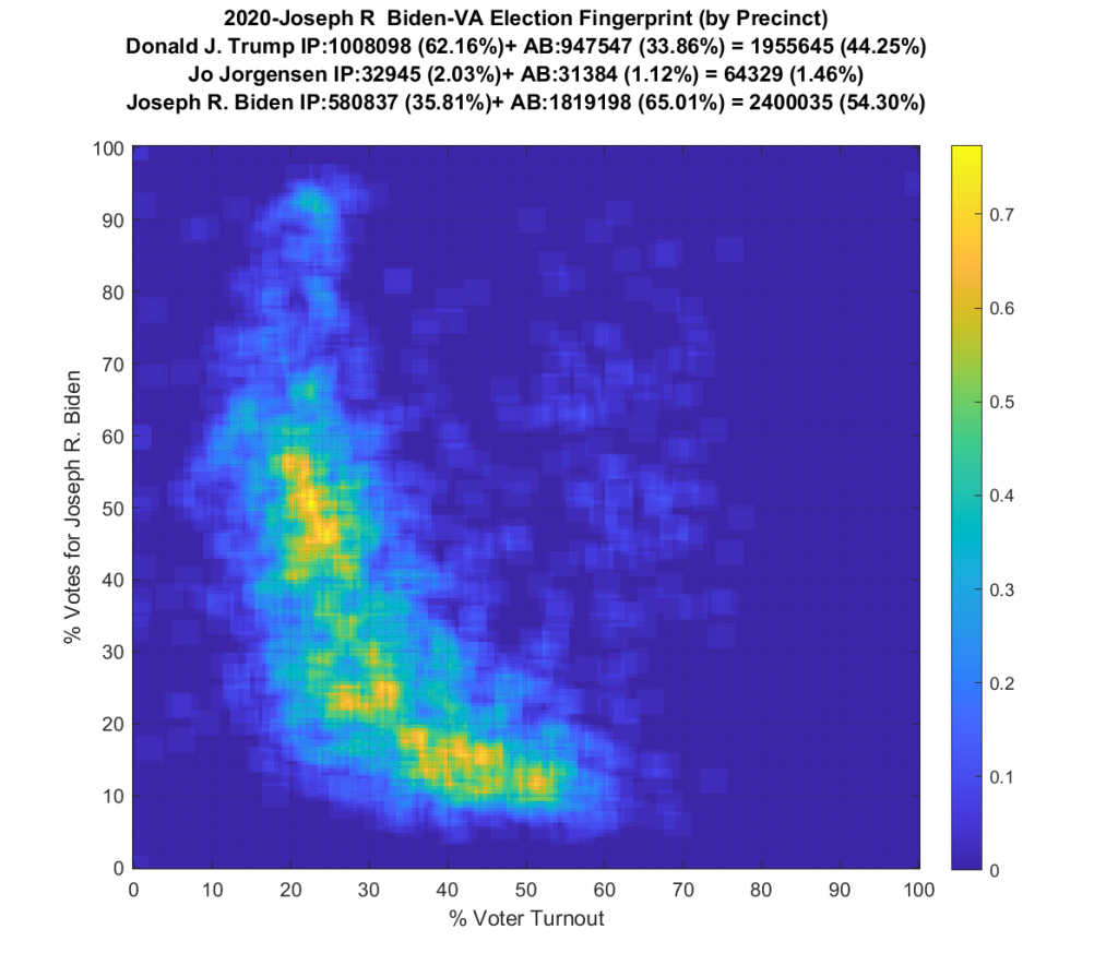
Ok … so all that’s now fixed … but VA still looks just bonkers at both the aggregate county and at the precinct level! The county level data doesn’t resemble Gaussian at all, and the precinct level has another large “boomerang” with one wing going upwards and another down and to the right. I still don’t know what to make of that, but its enough for me to say that it looks irregular and should therefore be investigated very very closely.
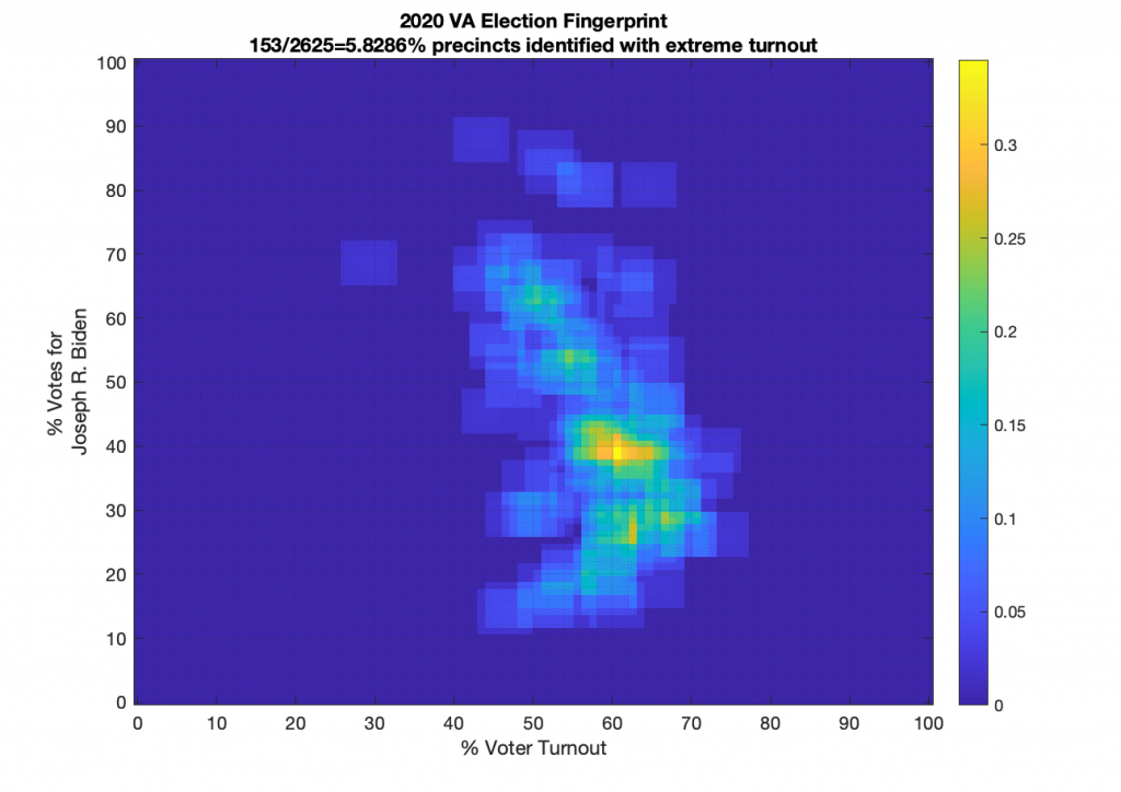
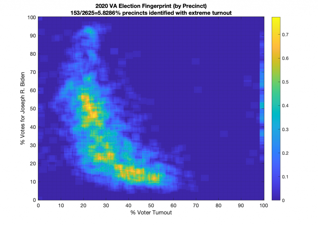
There were 153 precincts in VA … mostly county-wide absentee counting facilities … that had extreme voter Turnout (below 2% or above 98%). These can be seen on the far left and right of the per precinct graph. Now, again, that’s not necessarily conclusive of fraud, but it is a hyuuuuge red flag even though we had COVID to deal with. Especially since some of the turnout percentages are as high as 358%! The registration data I pulled from the VA dept of elections is dated 11/1, so it should presumably be including all registrations (absentee or otherwise) up until that point.
Three. Hundred. Fifty. Eight. Percent! That is statistically unbelievable even for a highly contested election. I’m going back and triple and quadruple checking again that I haven’t missed anything in the parsing of the data from VA dept of elections, I’ll update this page again if I find any more fat finger mistakes on my end.
VA Update (12:45pm 11/14/2020):
Horray! The sky is not falling in VA! … just some very dark and menacing storm clouds …
After having a couple of other independent looks at the data from two other stats-minded people, I discovered there was a nasty little bug in my “residual” registration number computations that was causing the residual registration numbers to be undercounted, and therefore the turnout numbers to be overestimated in the absentee districts. So thats a relief!
However … that doesn’t change the “boomerang” look to the per-precinct fingerprint or the fact that the per-county fingerprint is oddly shaped. So good news is the sky is not falling in VA … bad news is that it still looks like it might!

Update 2020-11-24 09:30:
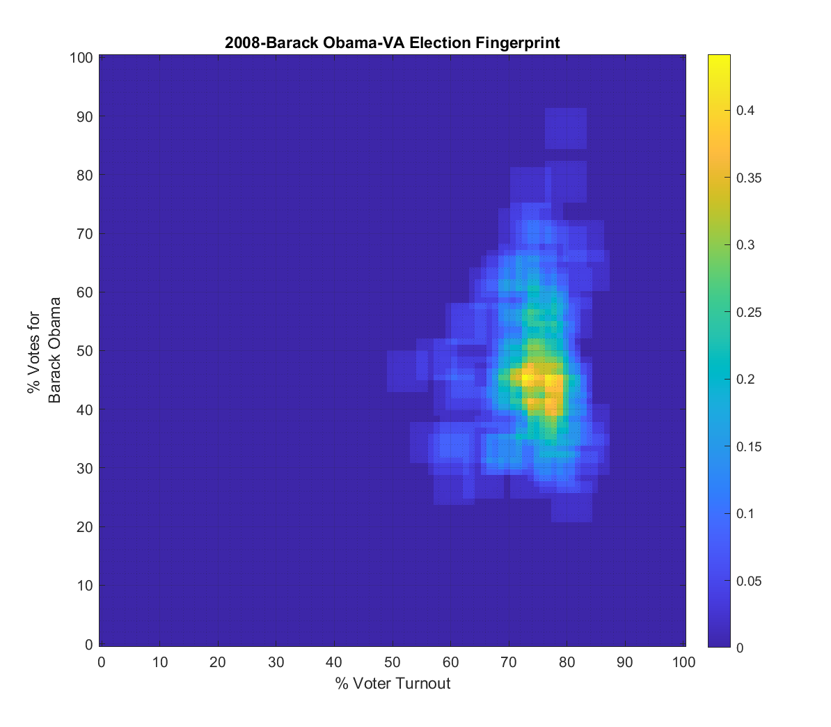
I finally got all the data together to do the 2016, 2012 and 2008 VA Elections as well for comparison…
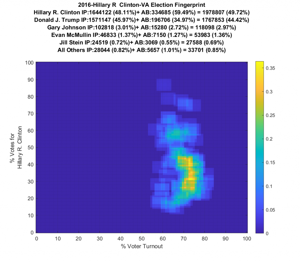
2016 VA fingerprint shows two clear distribution centers with fairly nominal looking tails that don’t have a ton of structure (but still some). Given how polarizing 2016 was, two distribution centers is not surprising. One centroid is above the 50% line for Trump. The other (presumably for Clinton) is below. (Yup … found and fixed another parser bug and updated the images below.)
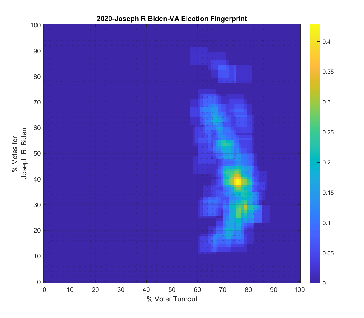
Both the 2016 and 2020 show a single distribution centroid with a highly directional set of smeared tails. 2012 looks a little less smeared, and 2008 looks even better and is approaching a Gaussian. So, over the last 4 presidential elections the plots for VA have gone from being fairly symmetric and Gaussian (but not quite), to being waaaaay smeared with linear artifacts.
Side by Side (Use Slider): 2008 to 2020
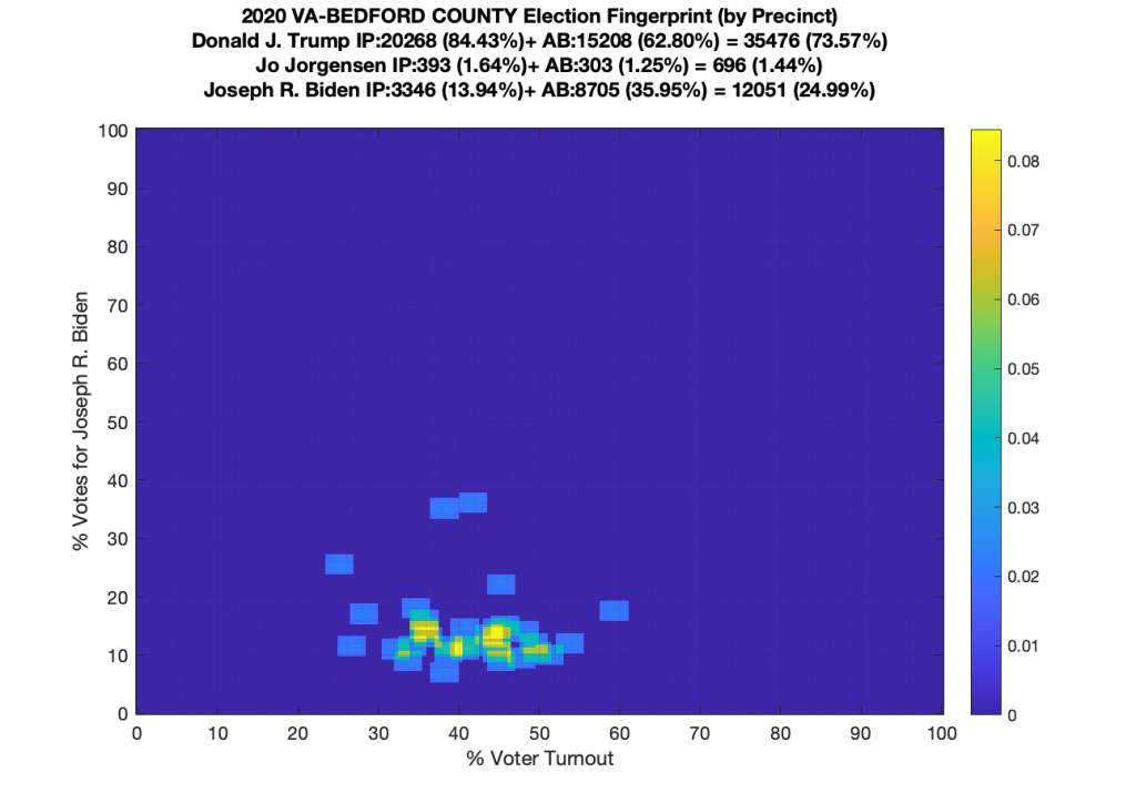
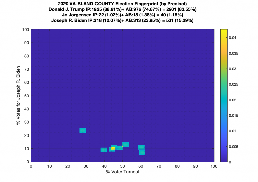
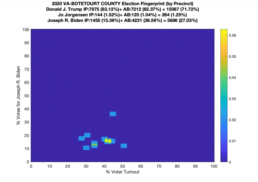
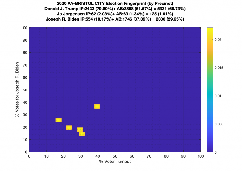
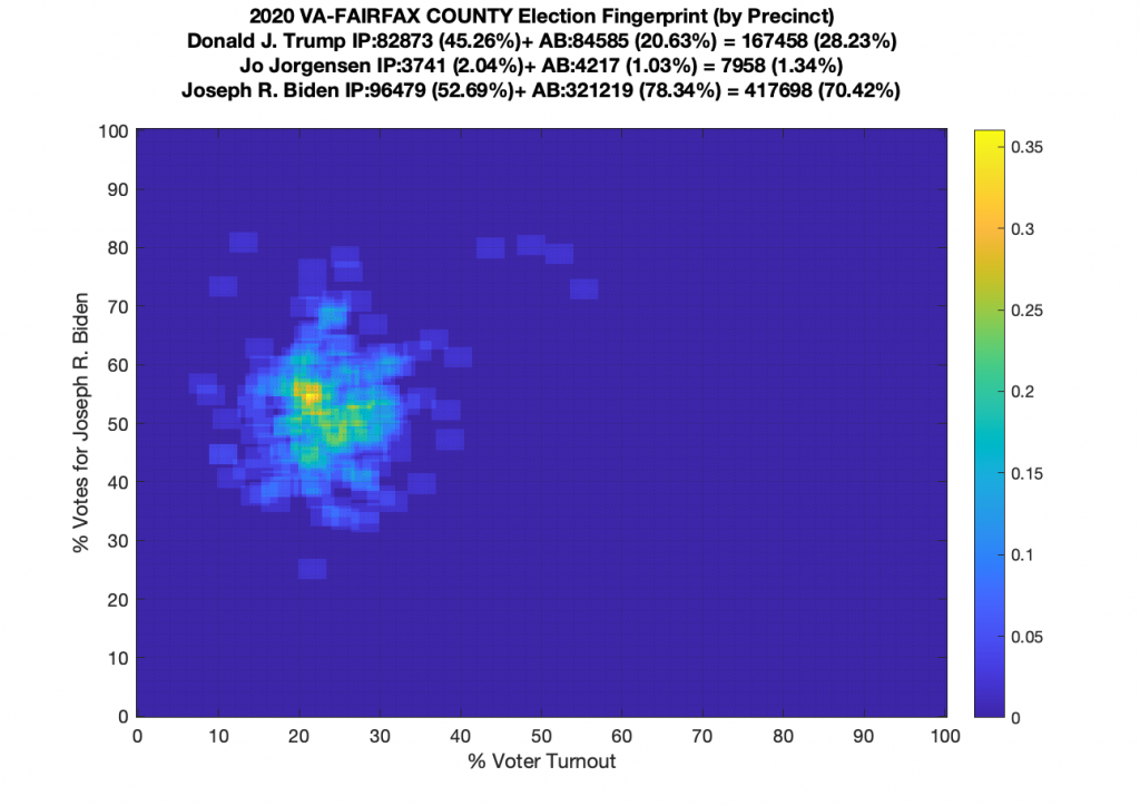
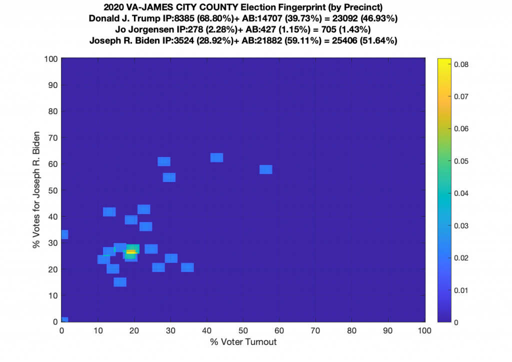
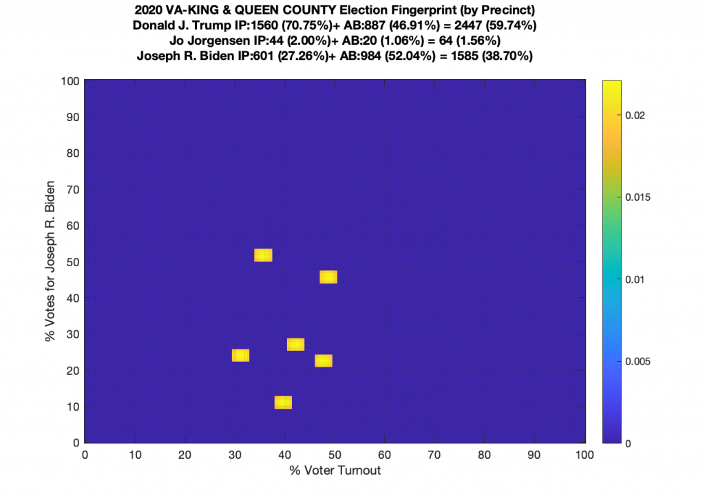
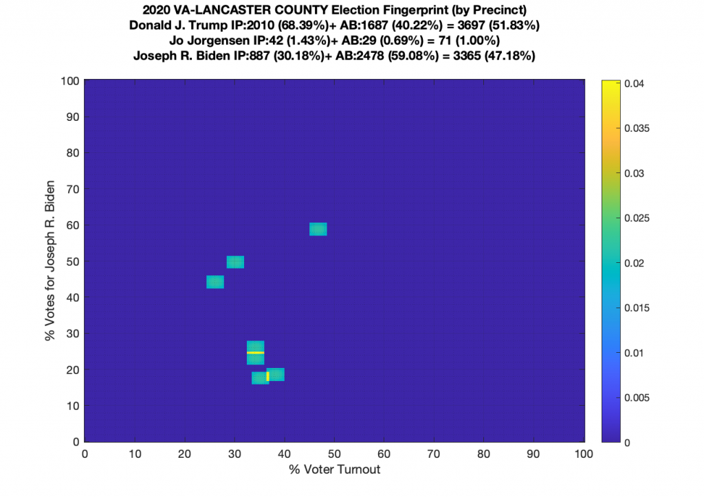
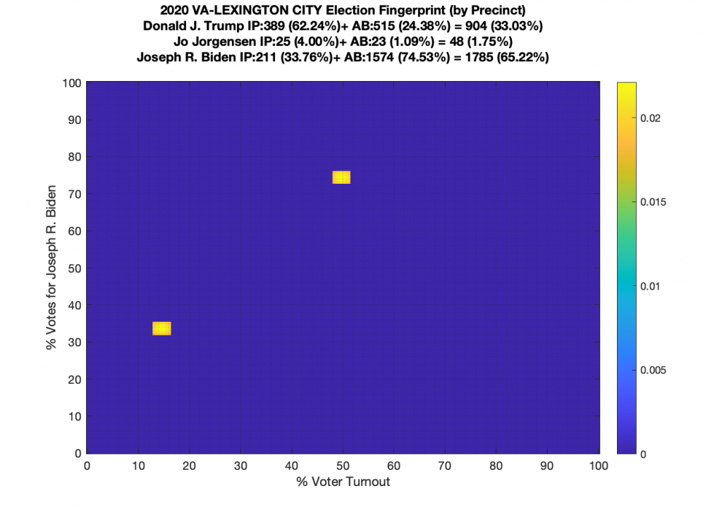
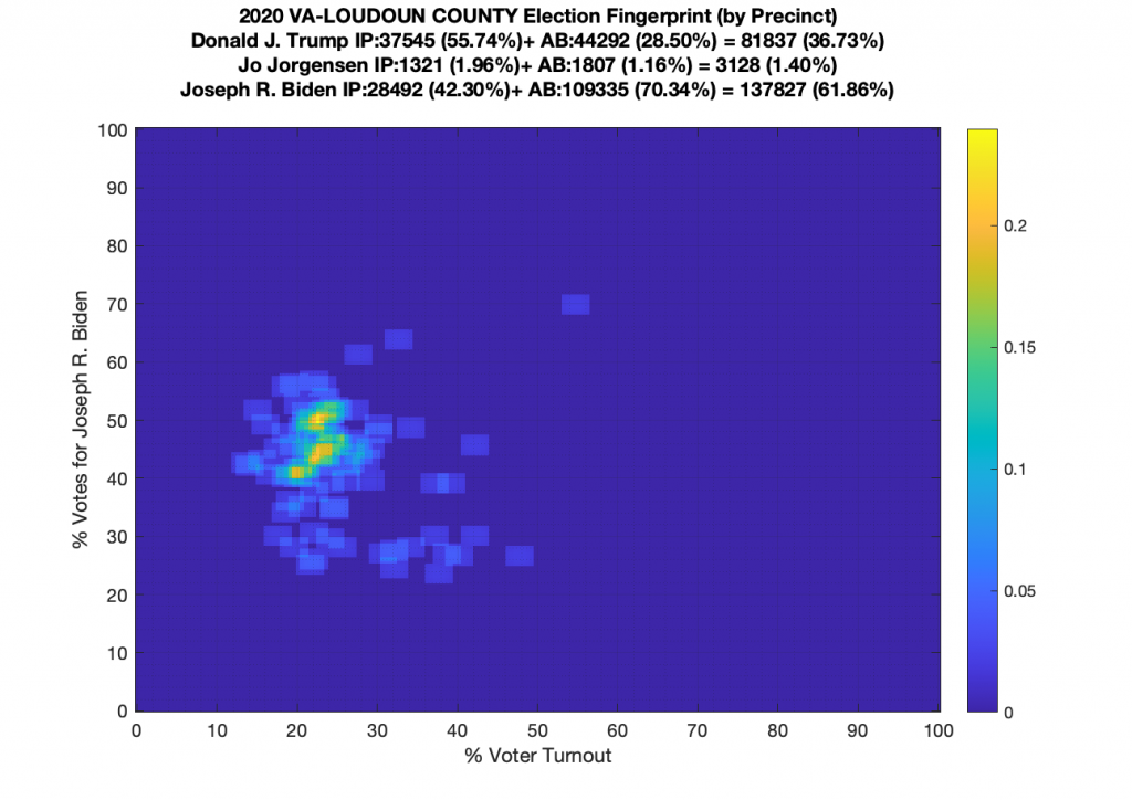
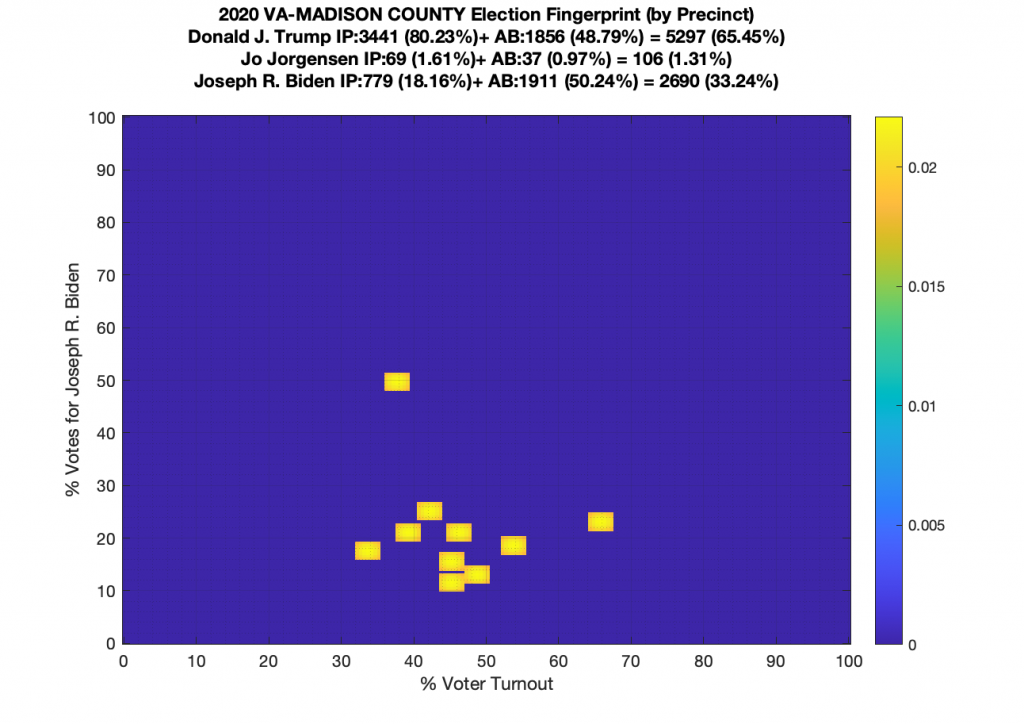
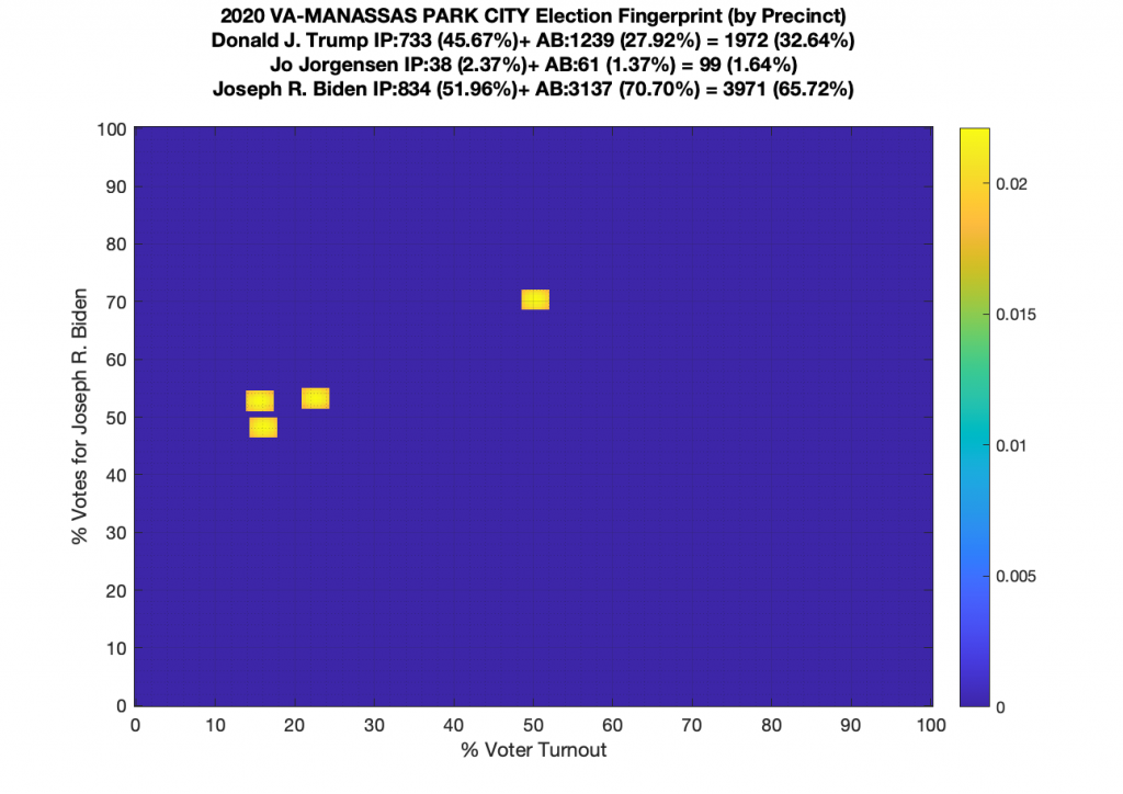
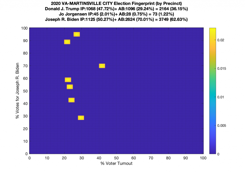
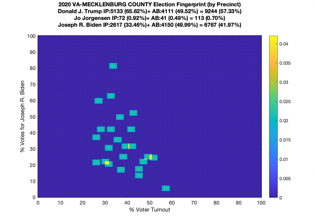
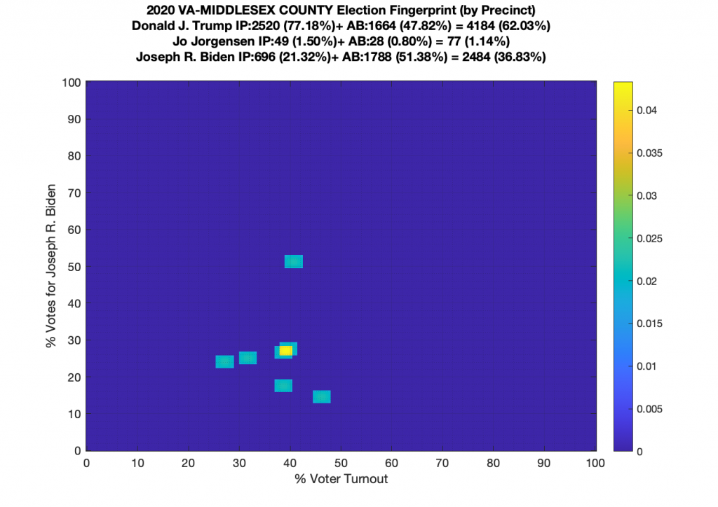
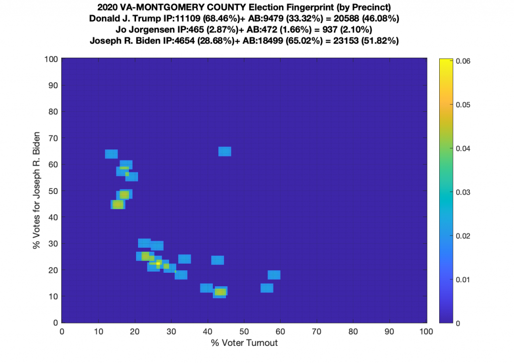
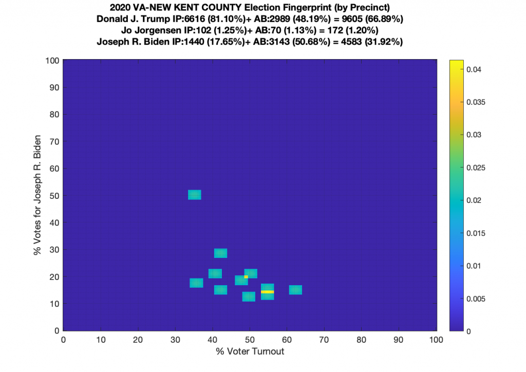
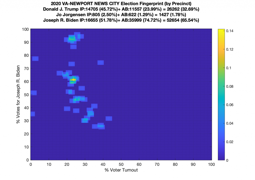
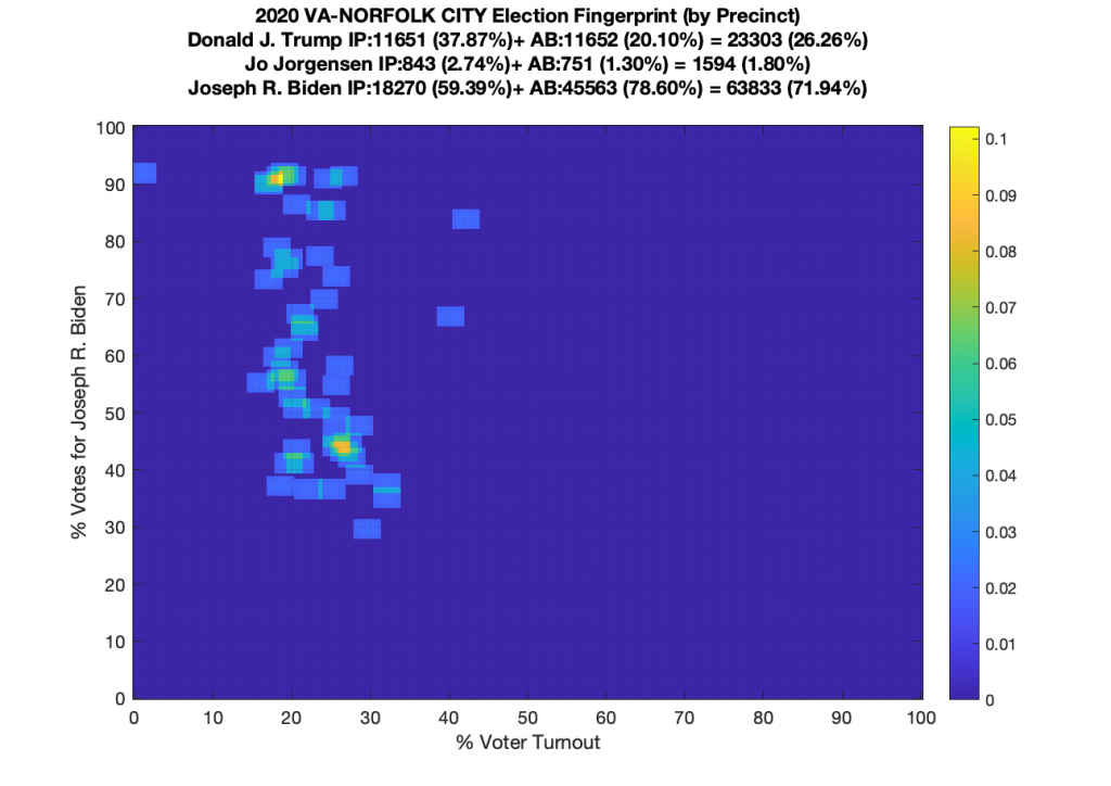
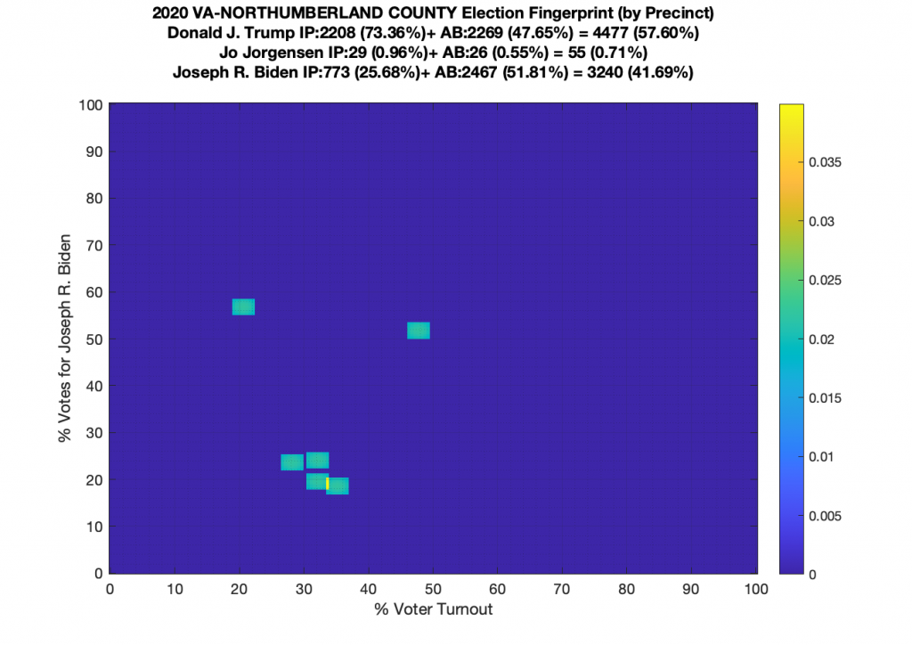
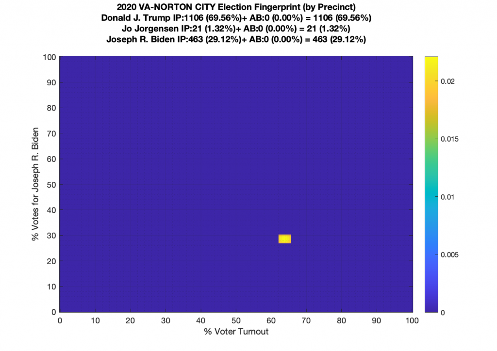
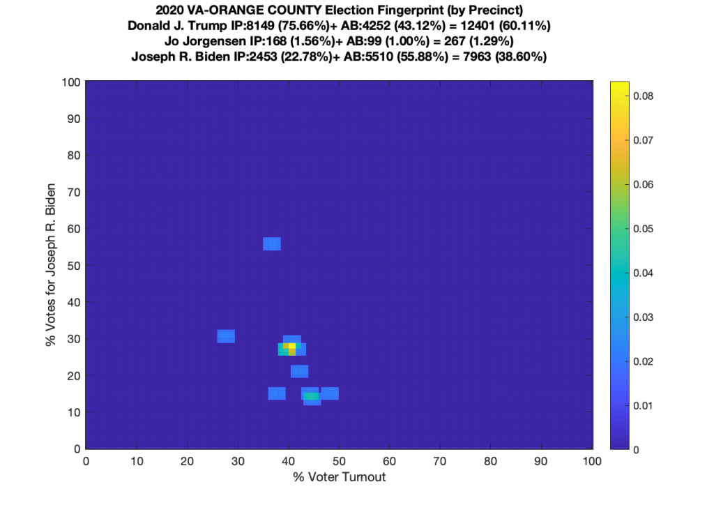
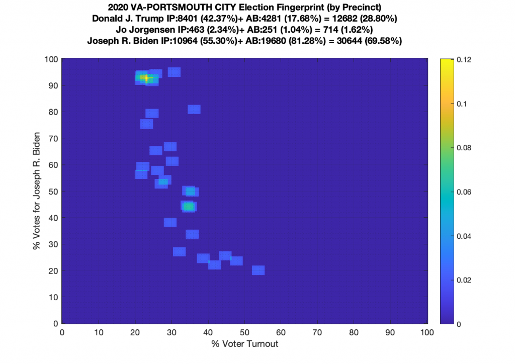
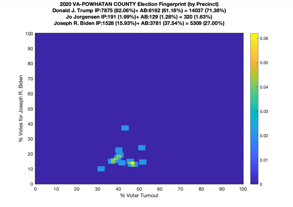
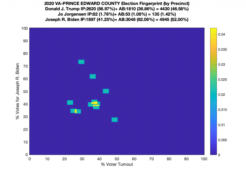
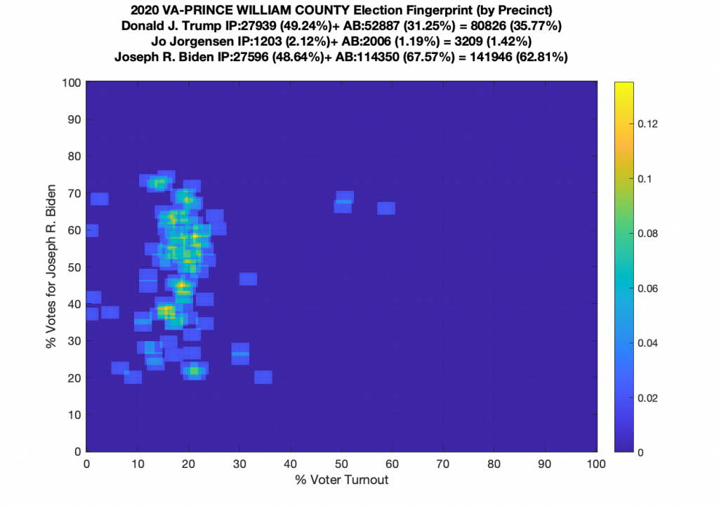
VA (2020) Per Precinct:
I am also generating plots for each individual county at the per precinct level. I care particularly about PWC as thats where I live … and with the correction above we can see below that the in-person vote has a fairly steady ~15% turnout number, but is smeared in the vertical. The 3 congressional absentee precincts for the county can be seen off in their own little cluster at around (65,70). What I’d really like to be able to do is “unwrap” the absentee ballot data from being grouped into congressional districts and instead have those numbers be included in the real precinct counts, but I don’t think thats possible given the data that VA dept of elections has made available.

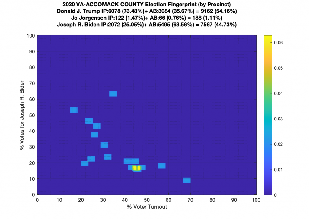
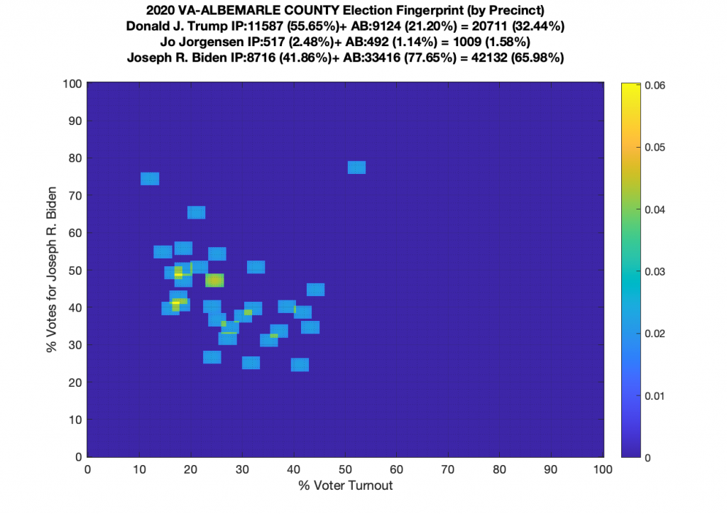
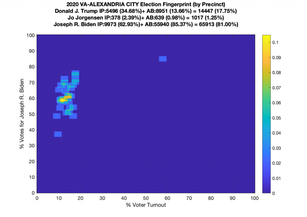
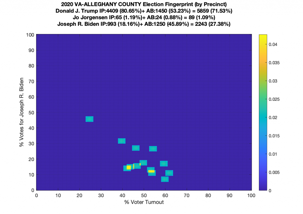
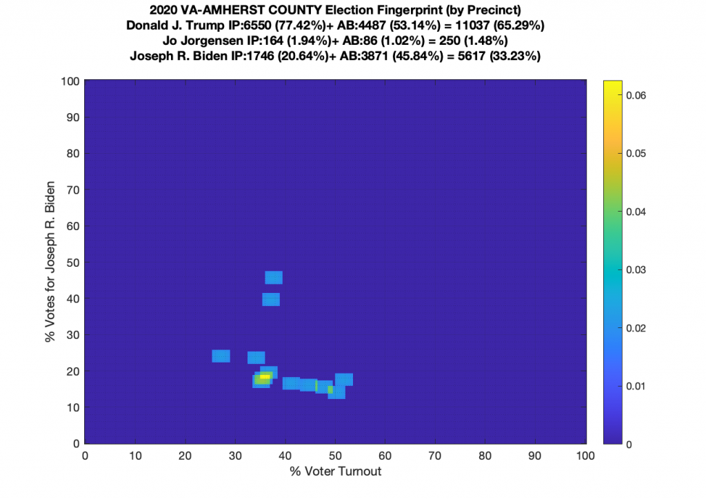
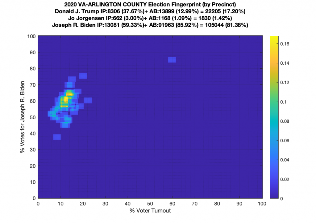
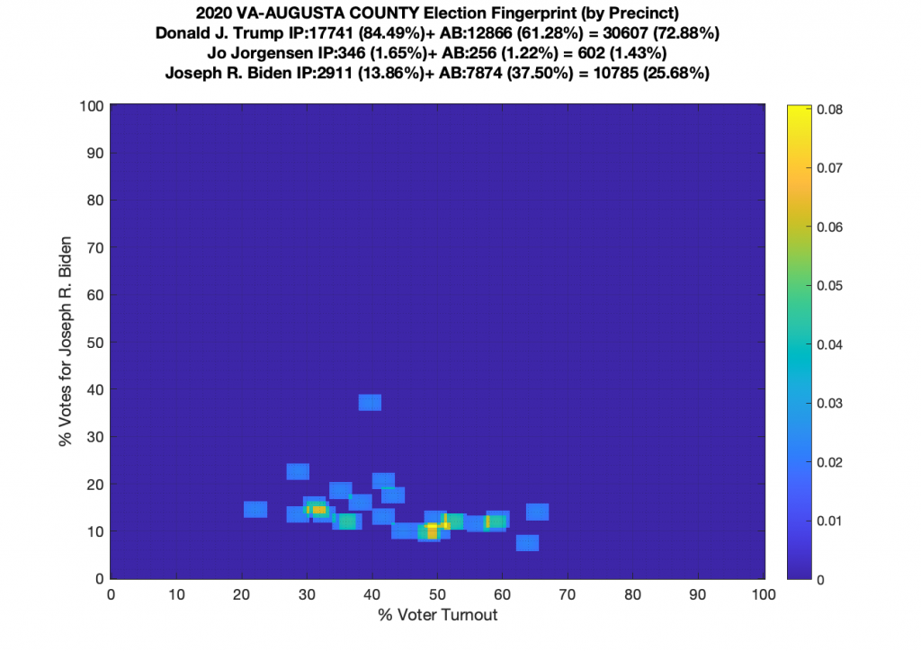
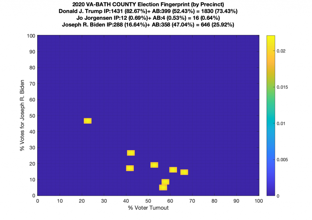
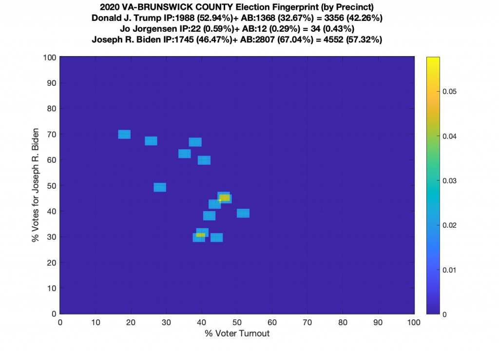
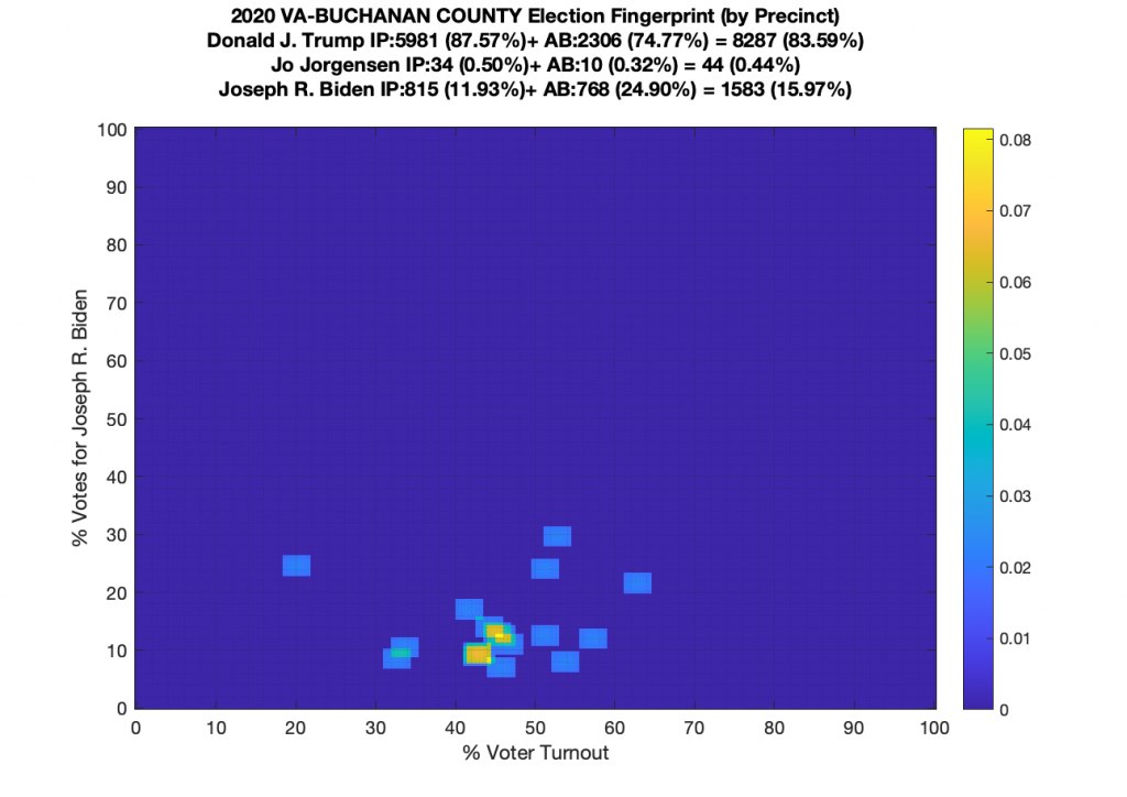
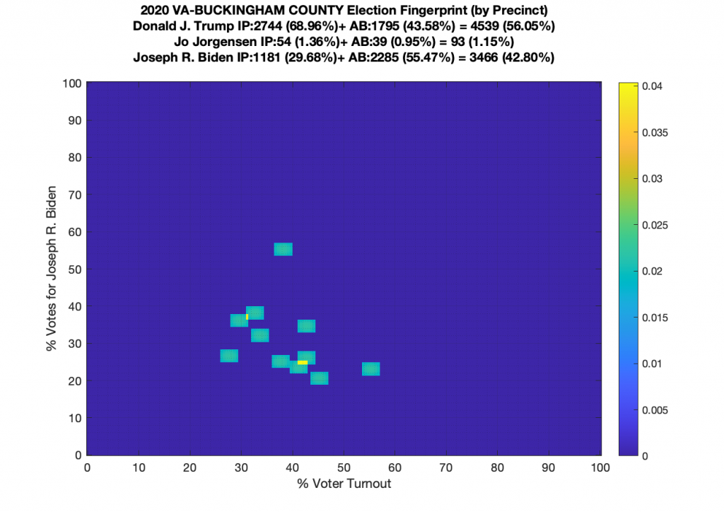
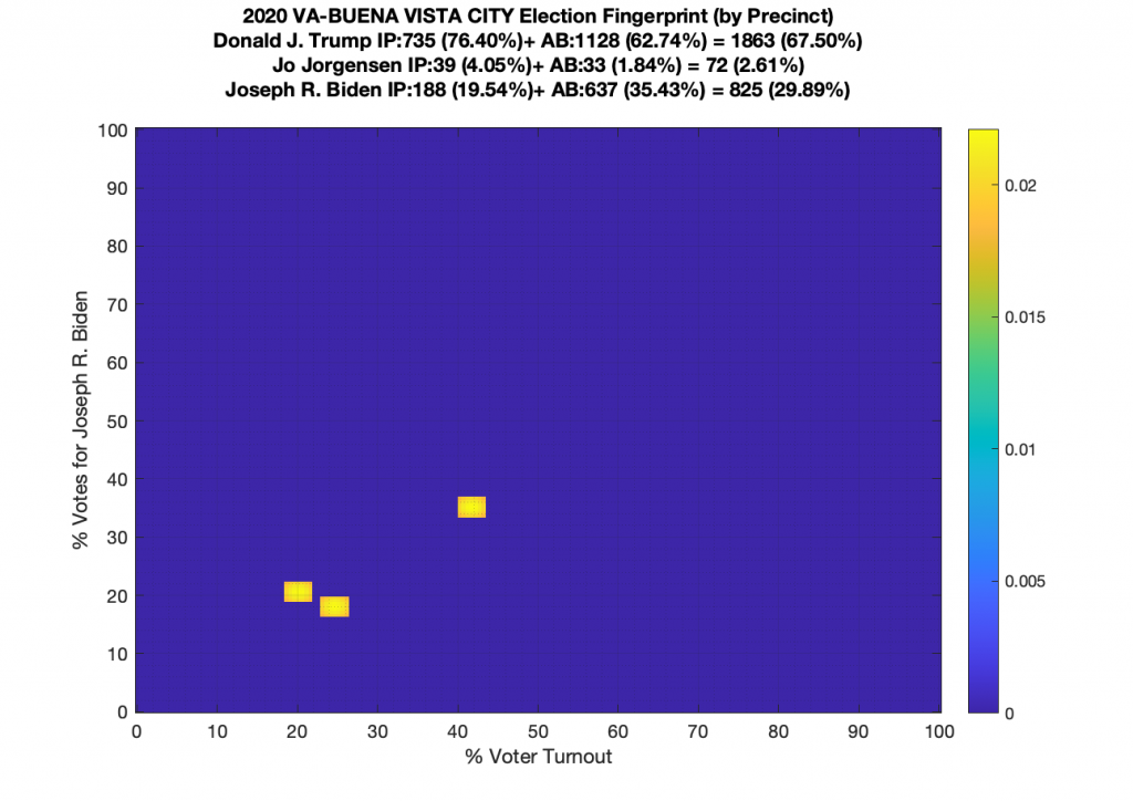
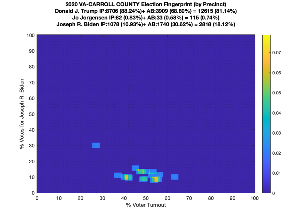
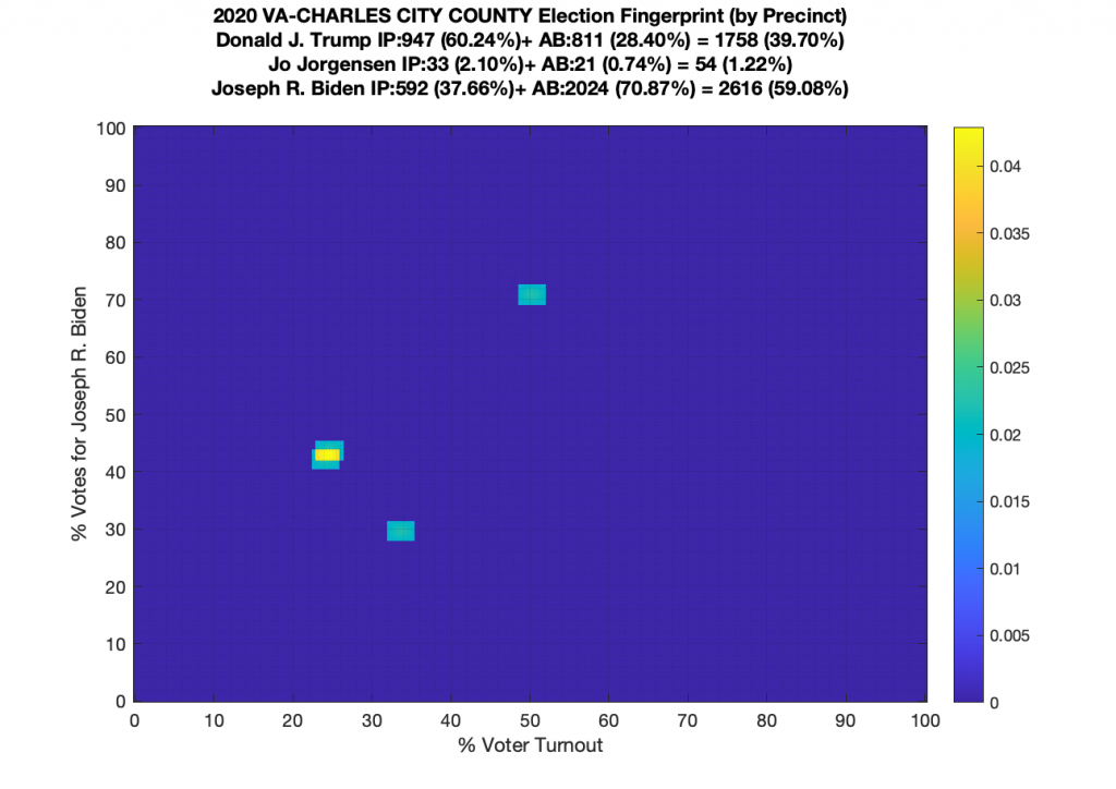
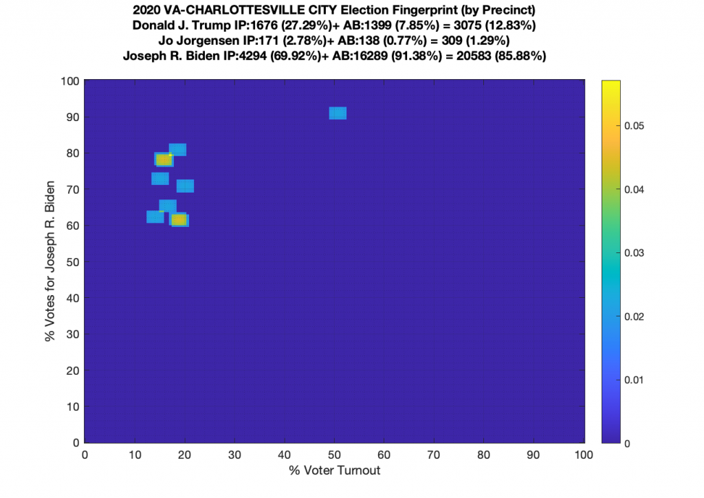
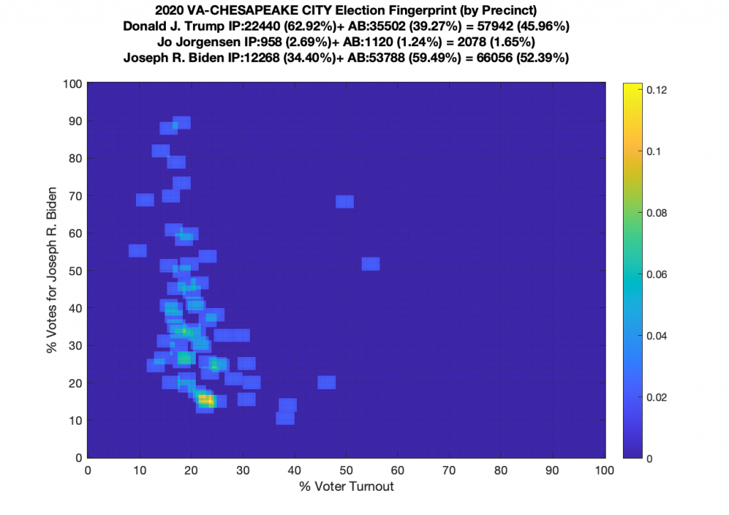
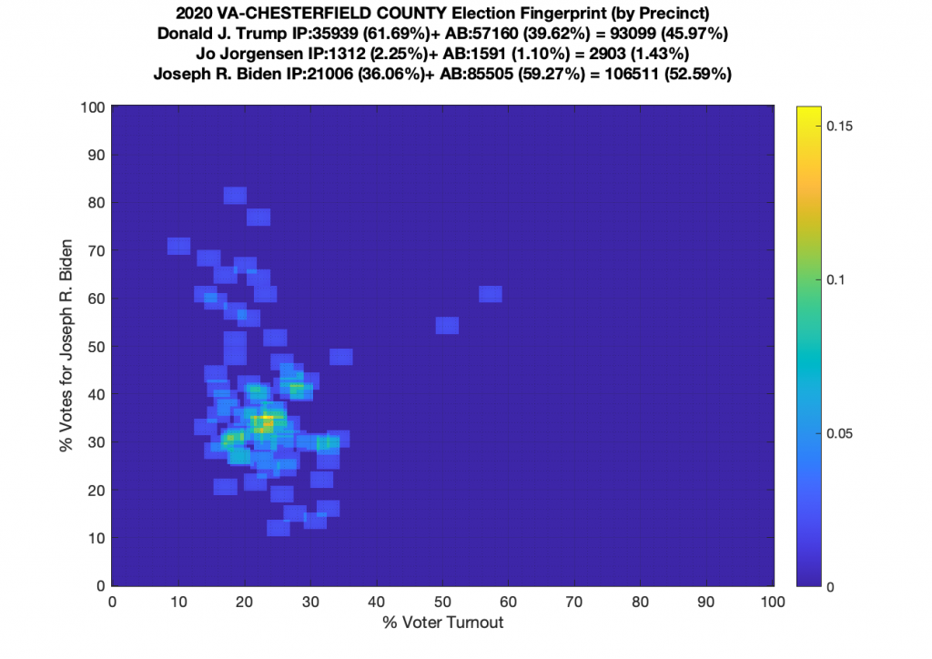
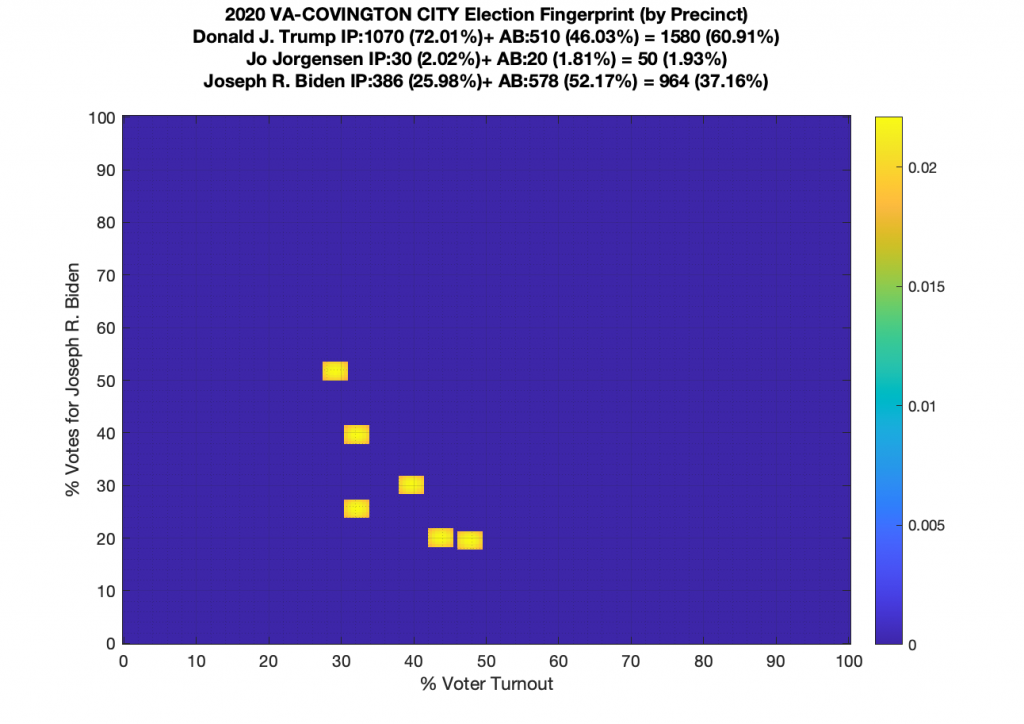
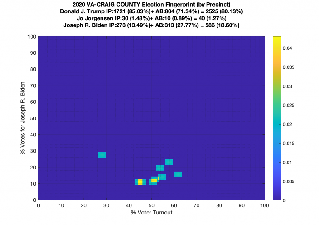
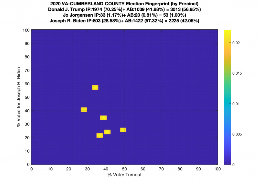
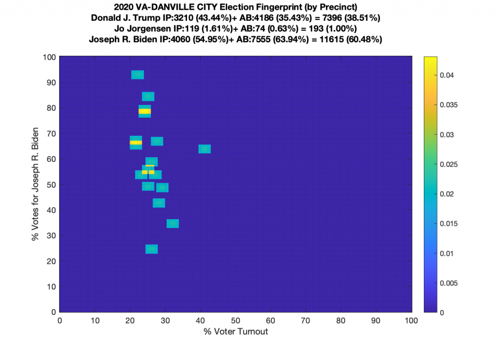
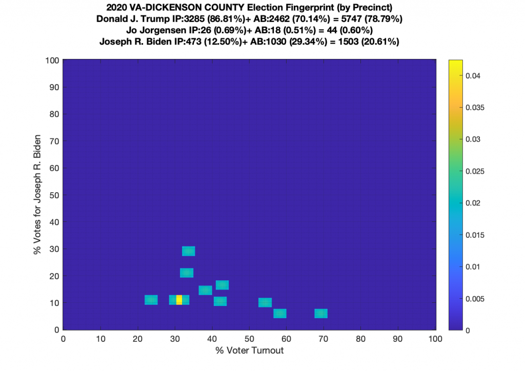
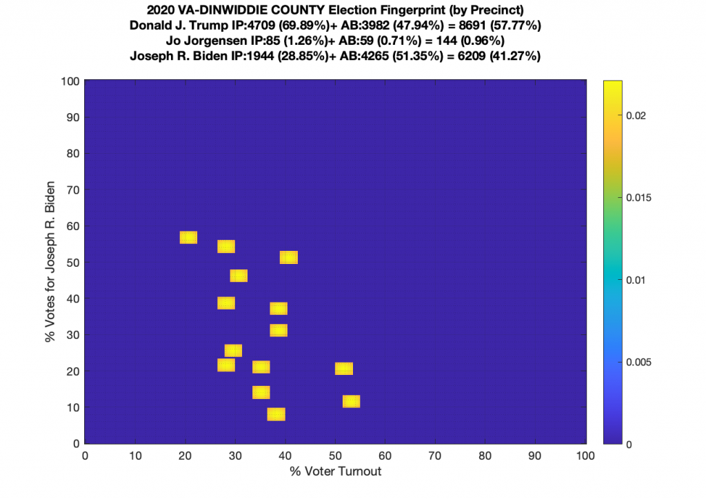
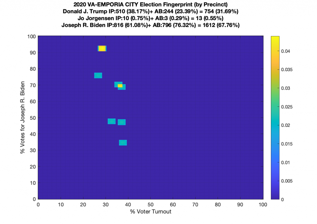
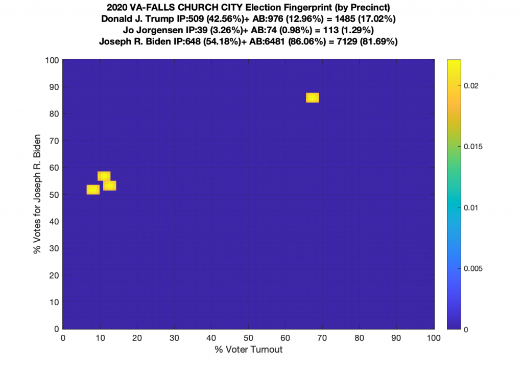
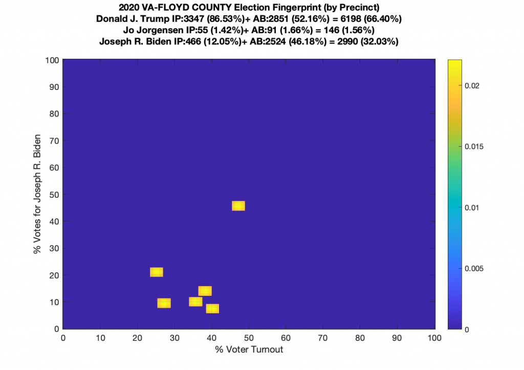
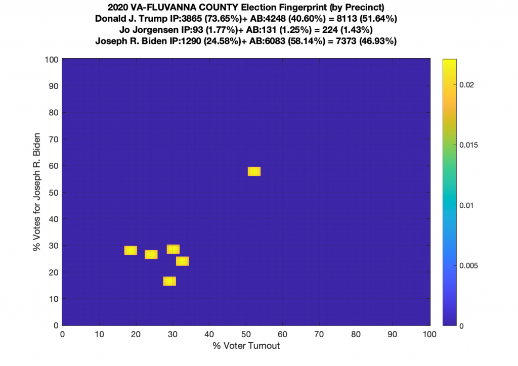
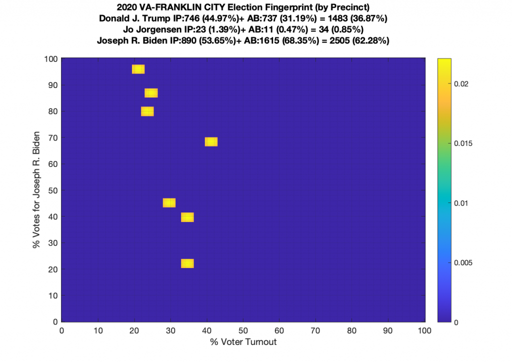
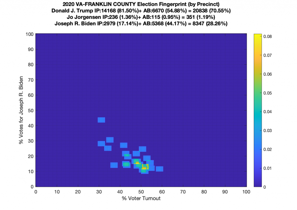
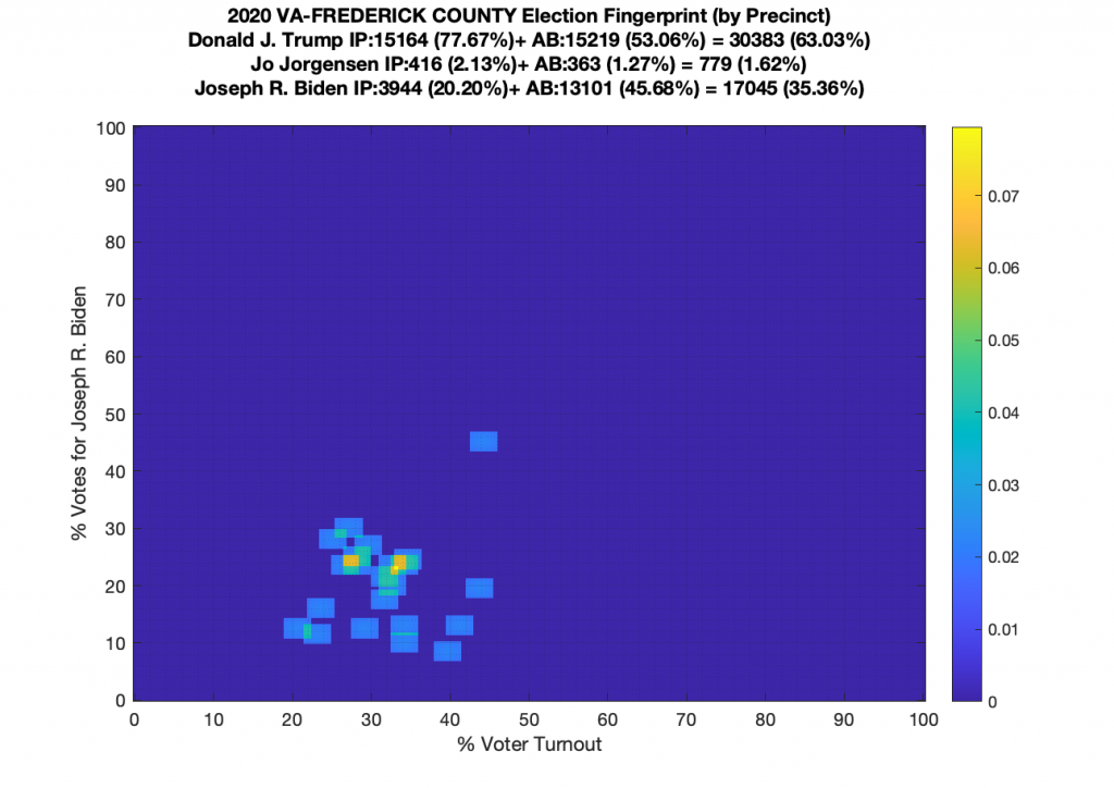
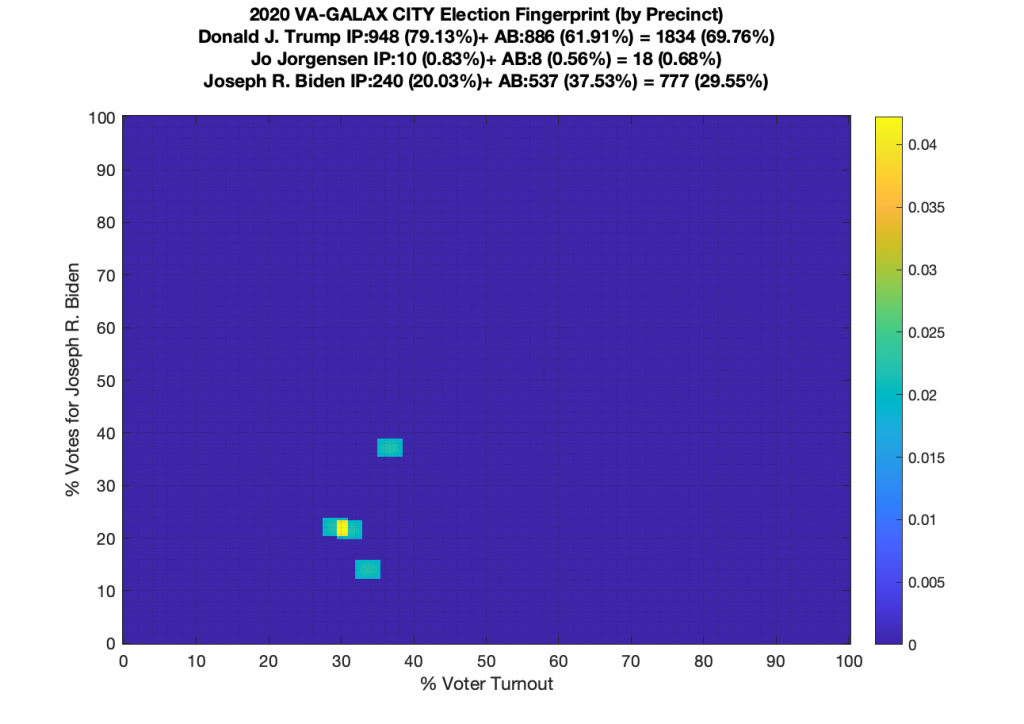
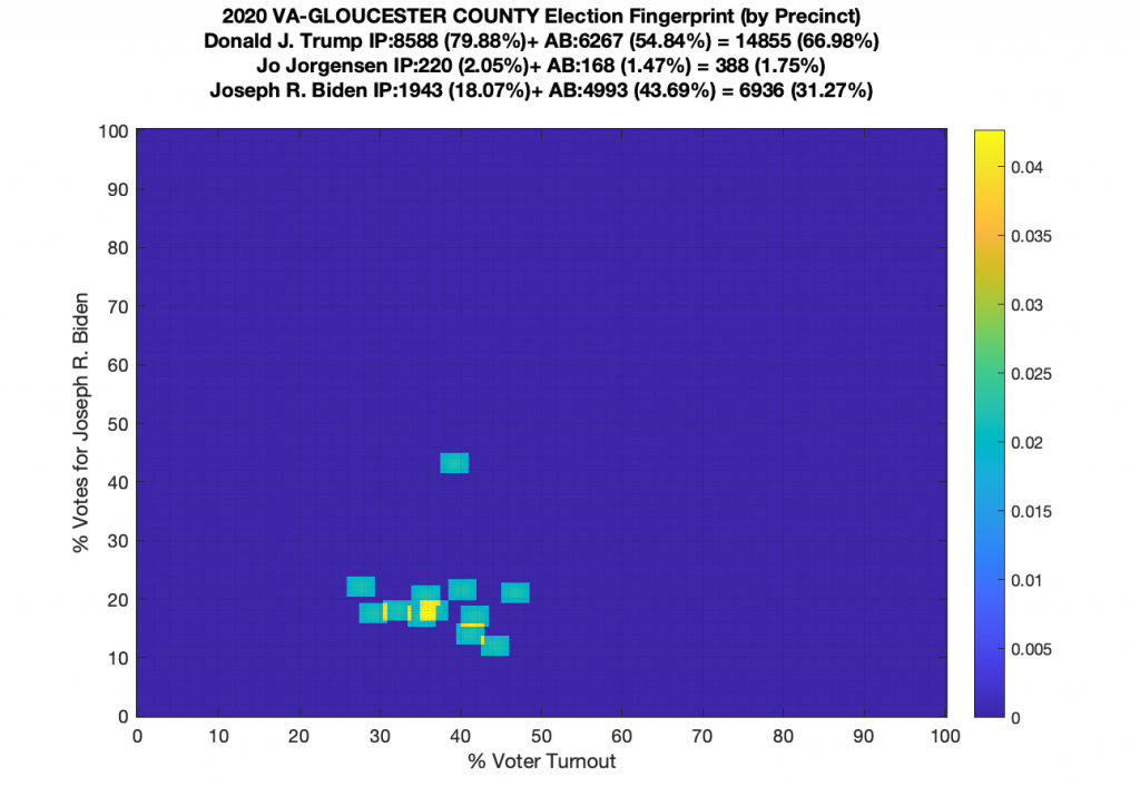
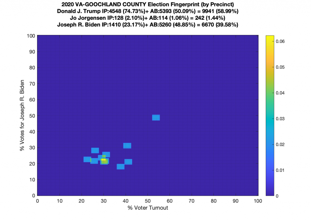
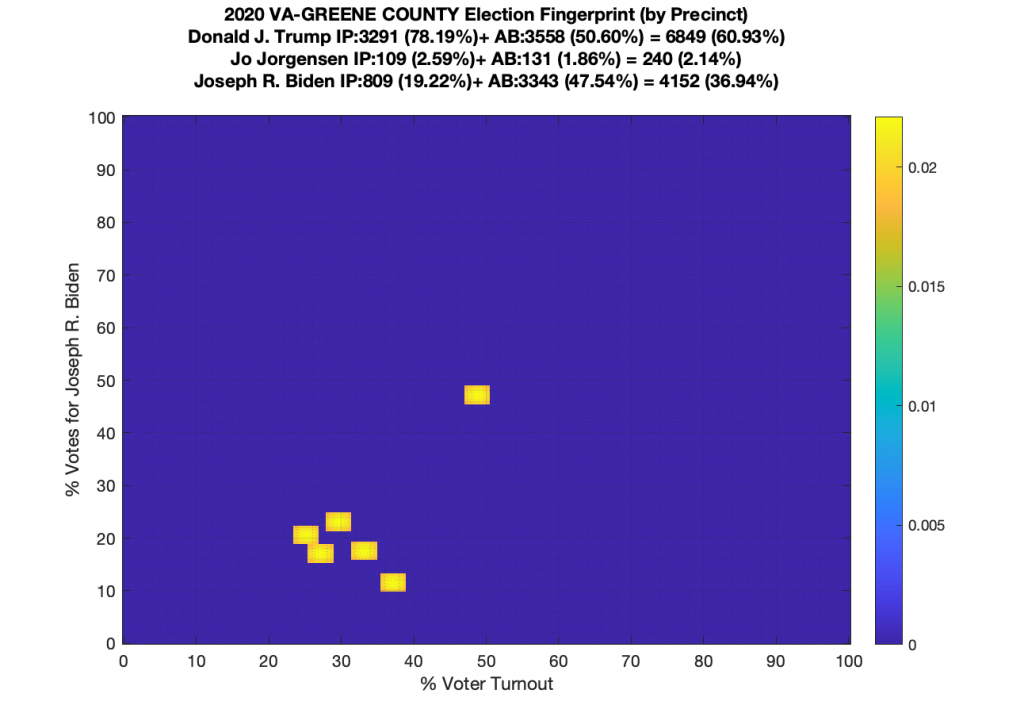
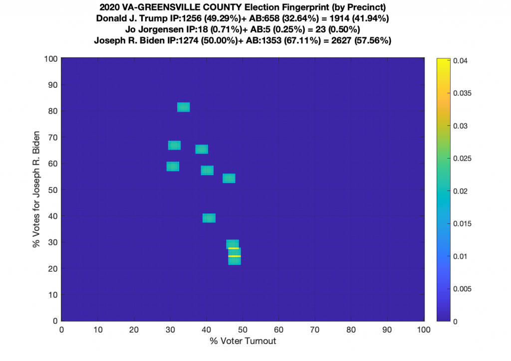
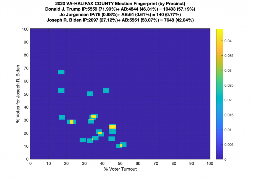
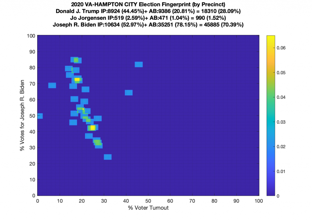
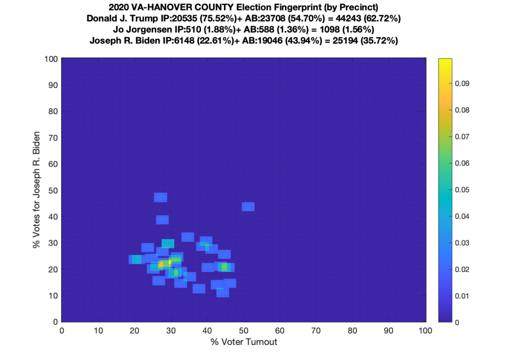
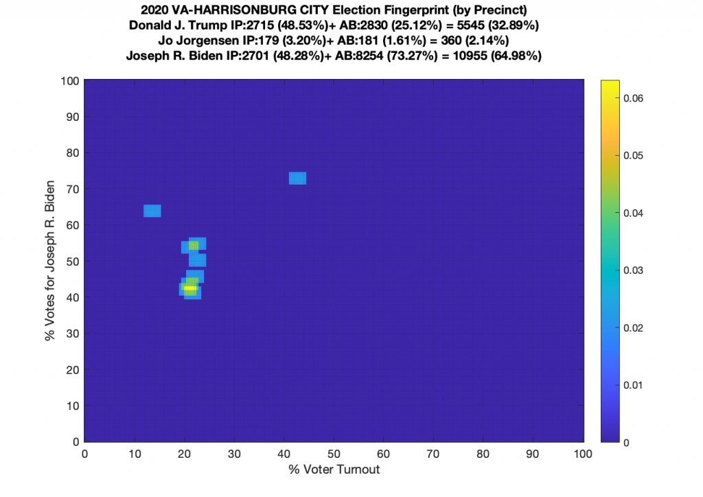
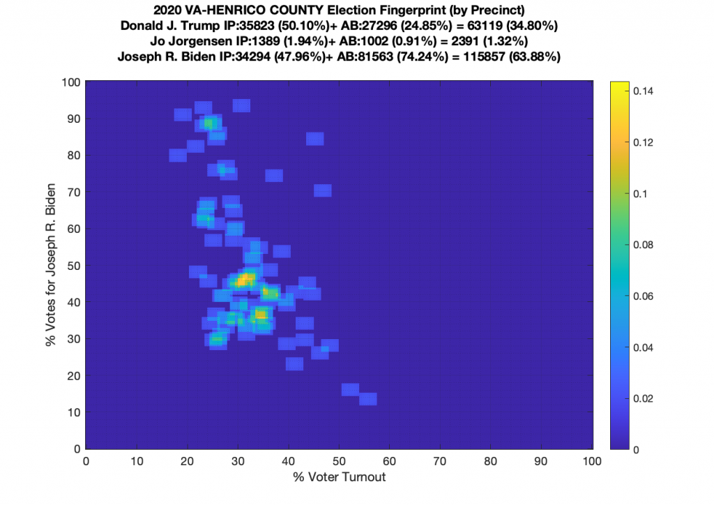
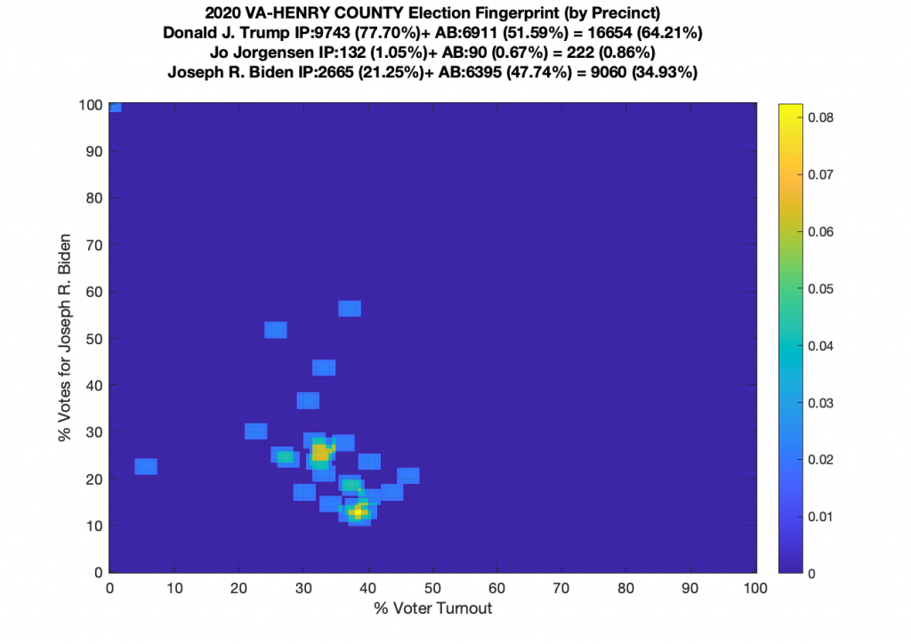
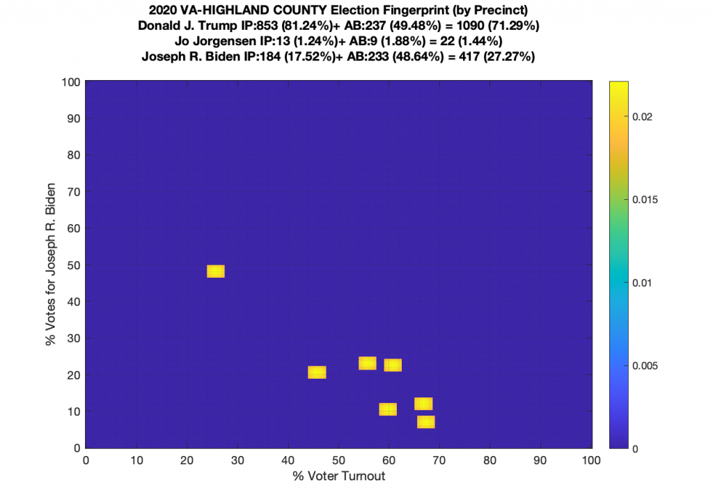
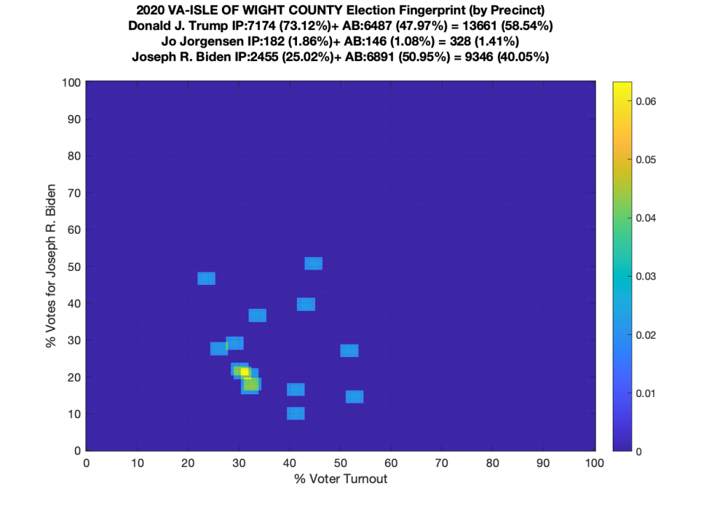
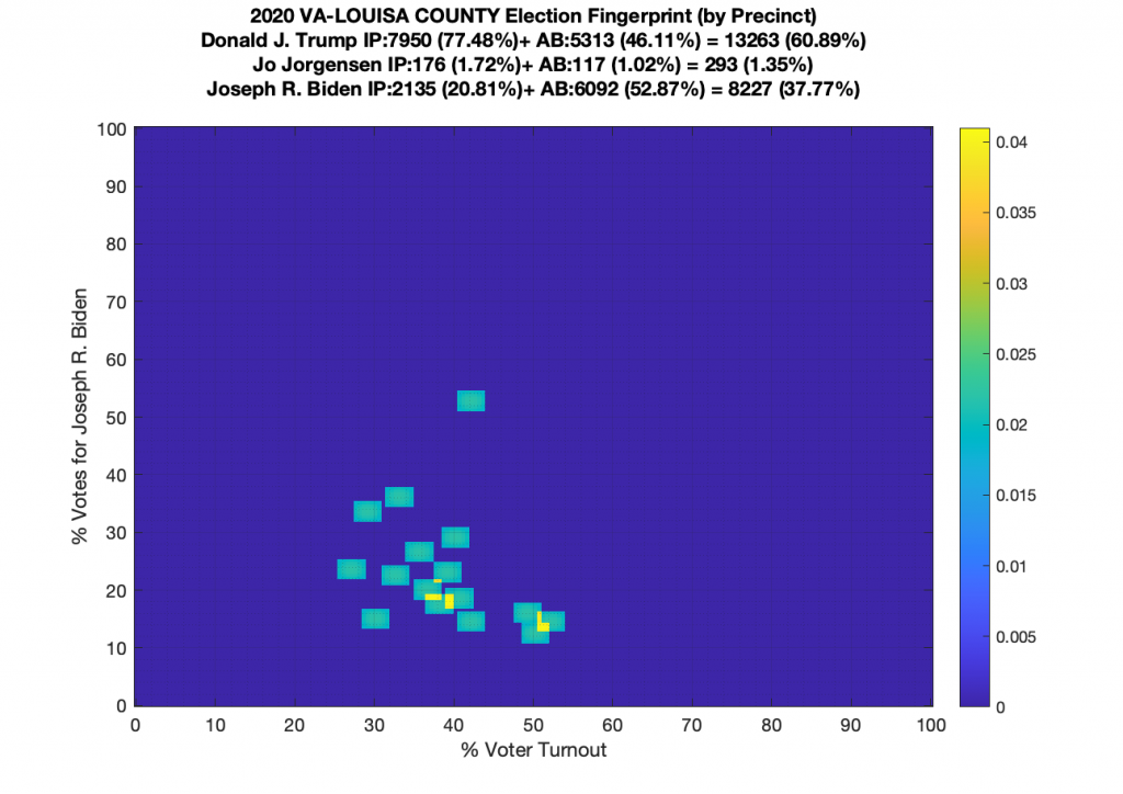
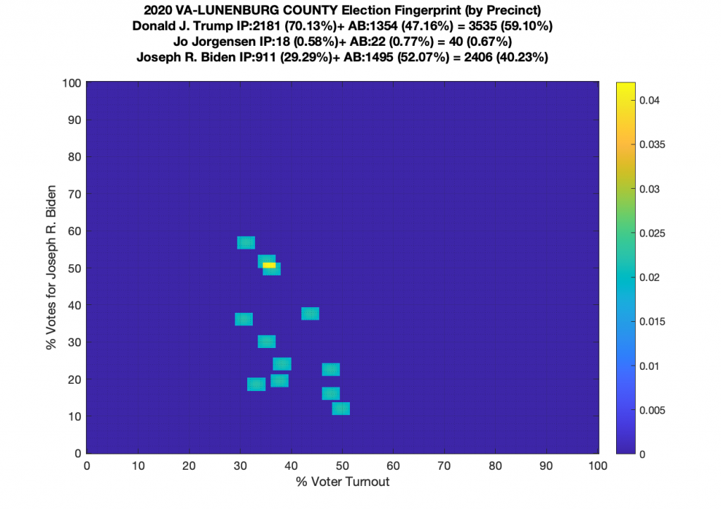
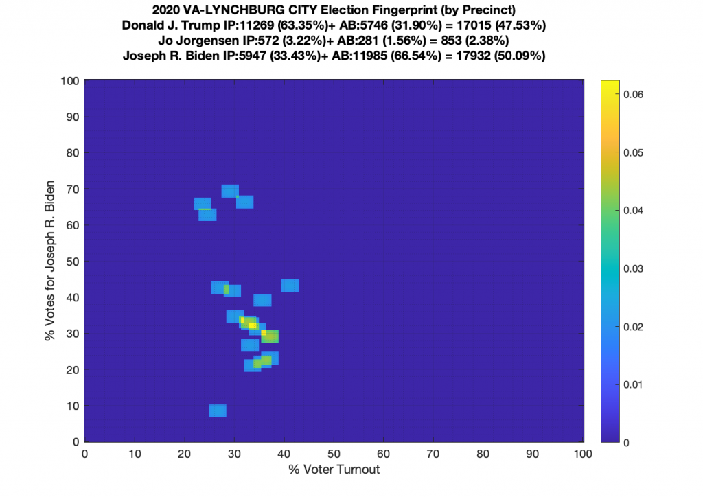
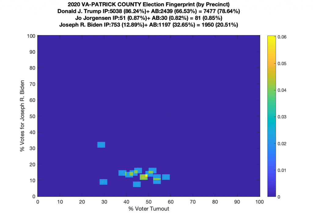
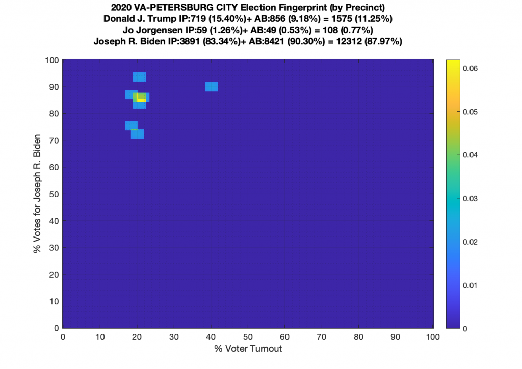
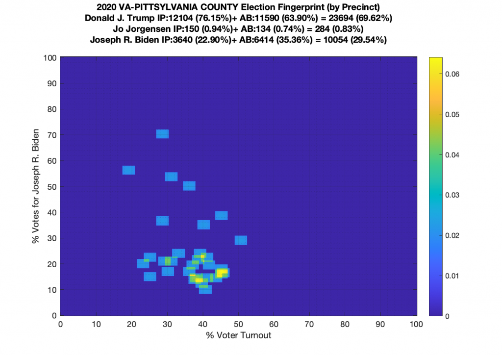
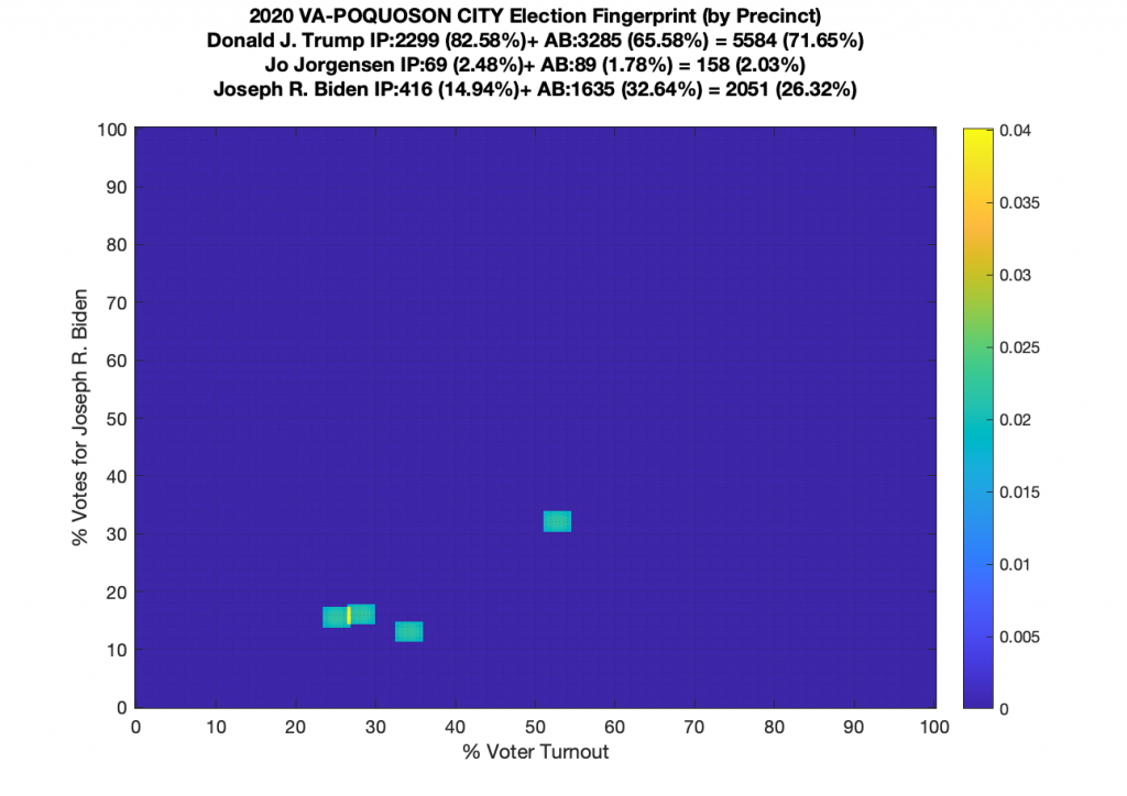
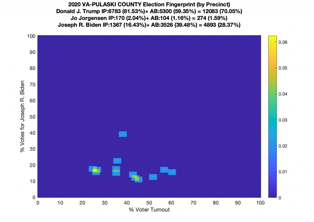
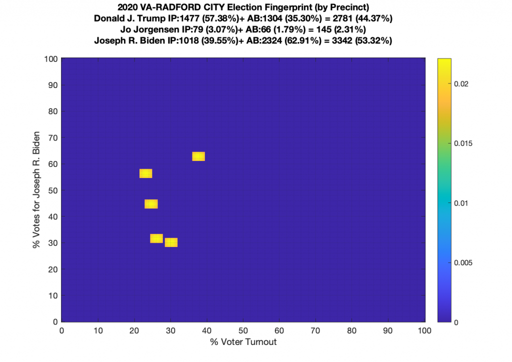
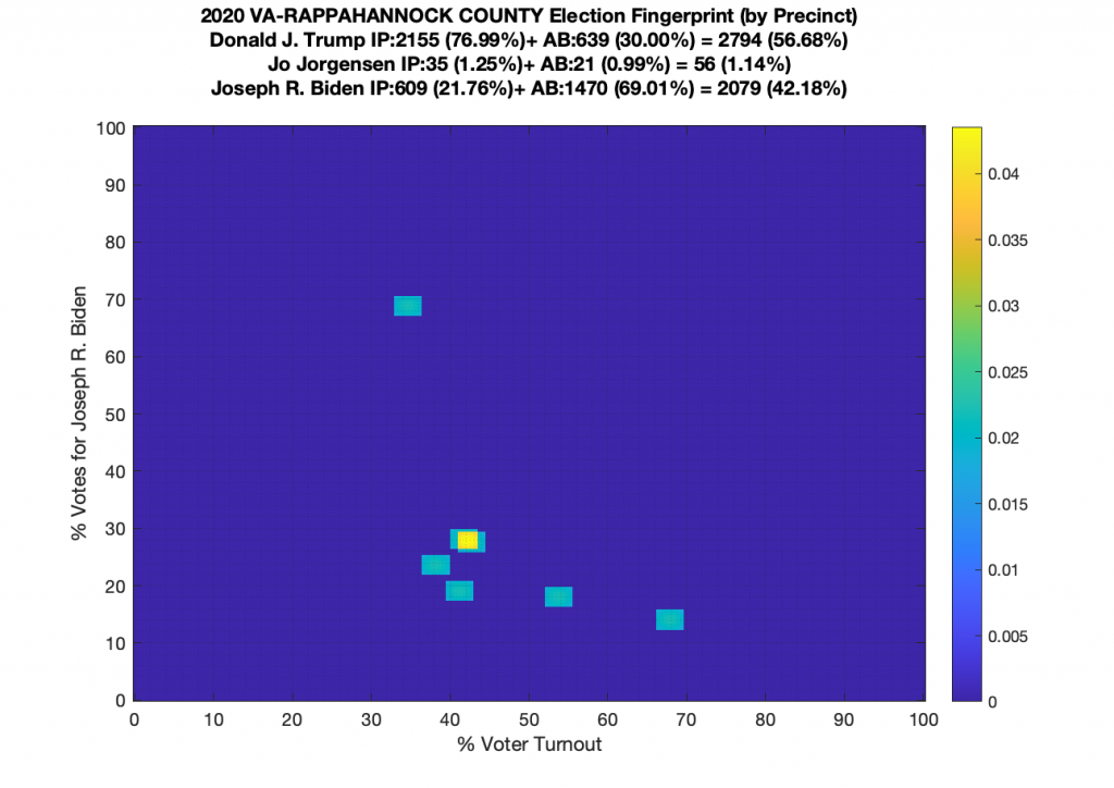
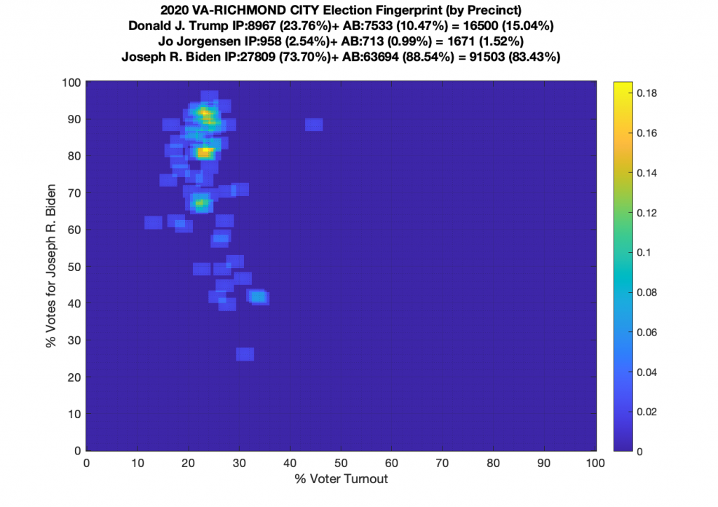
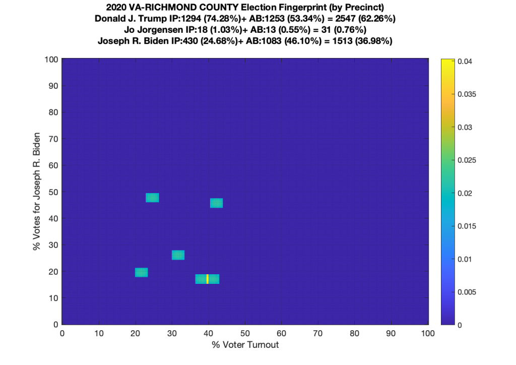
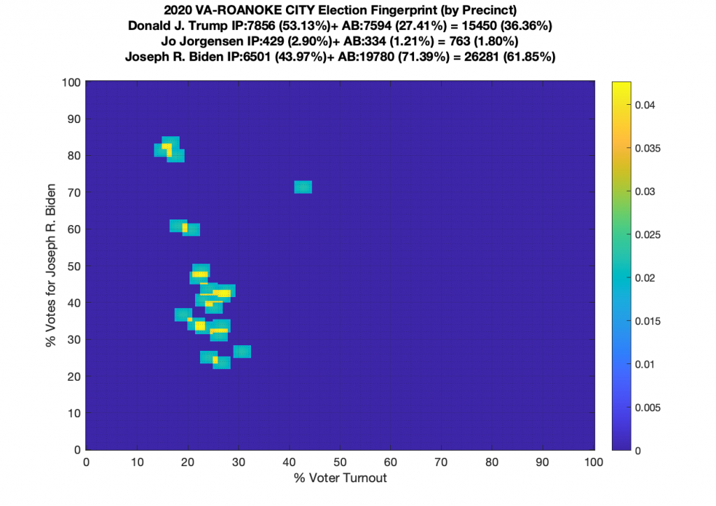
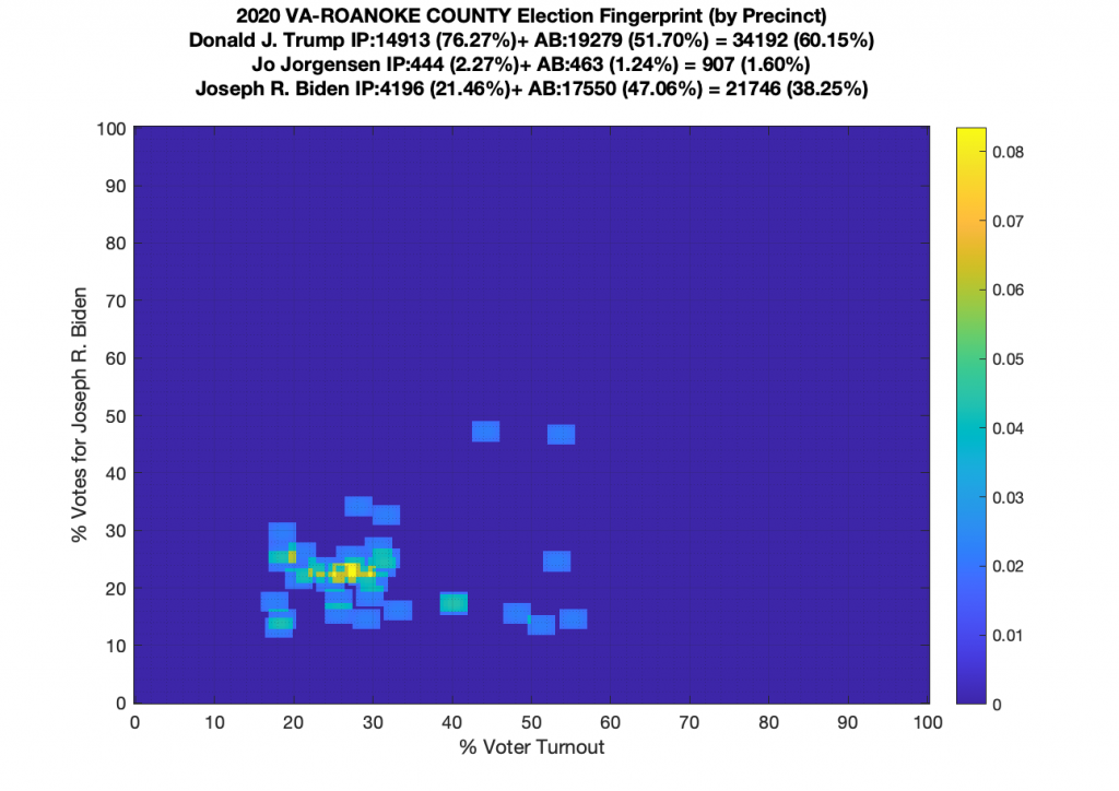
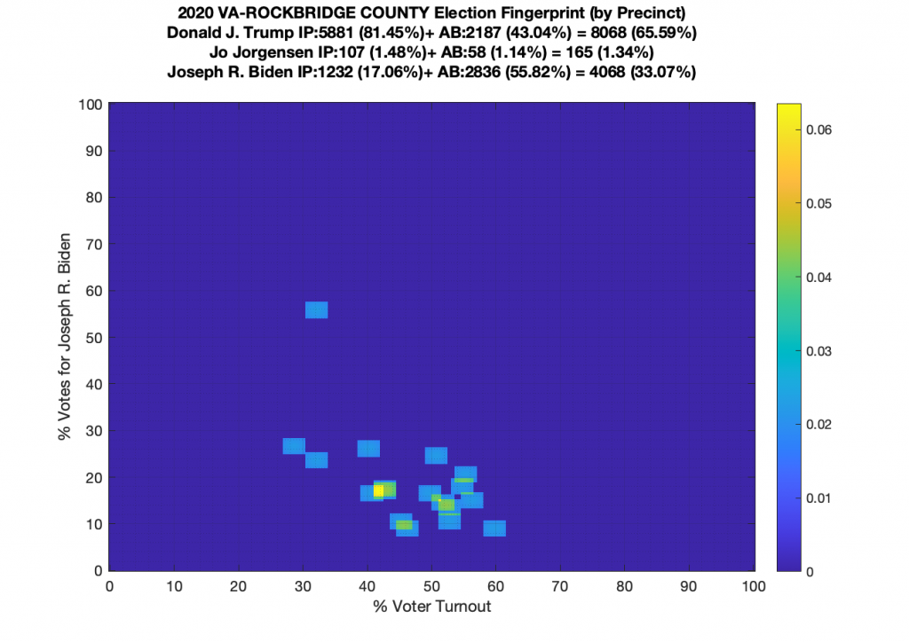
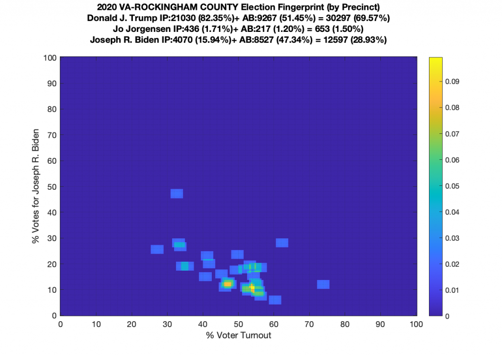
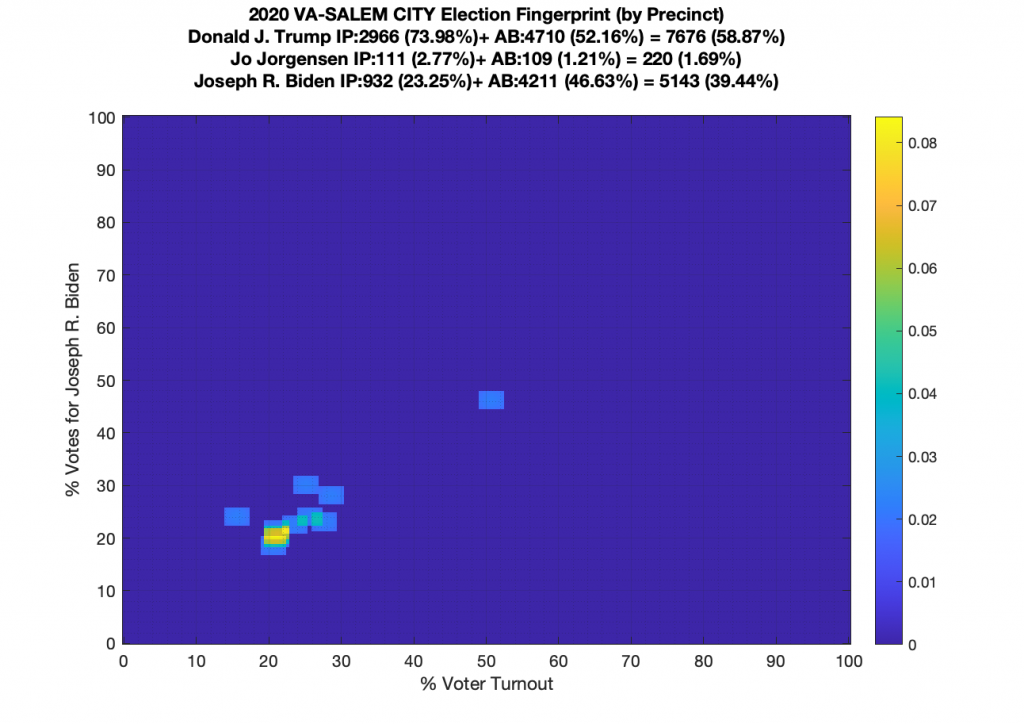
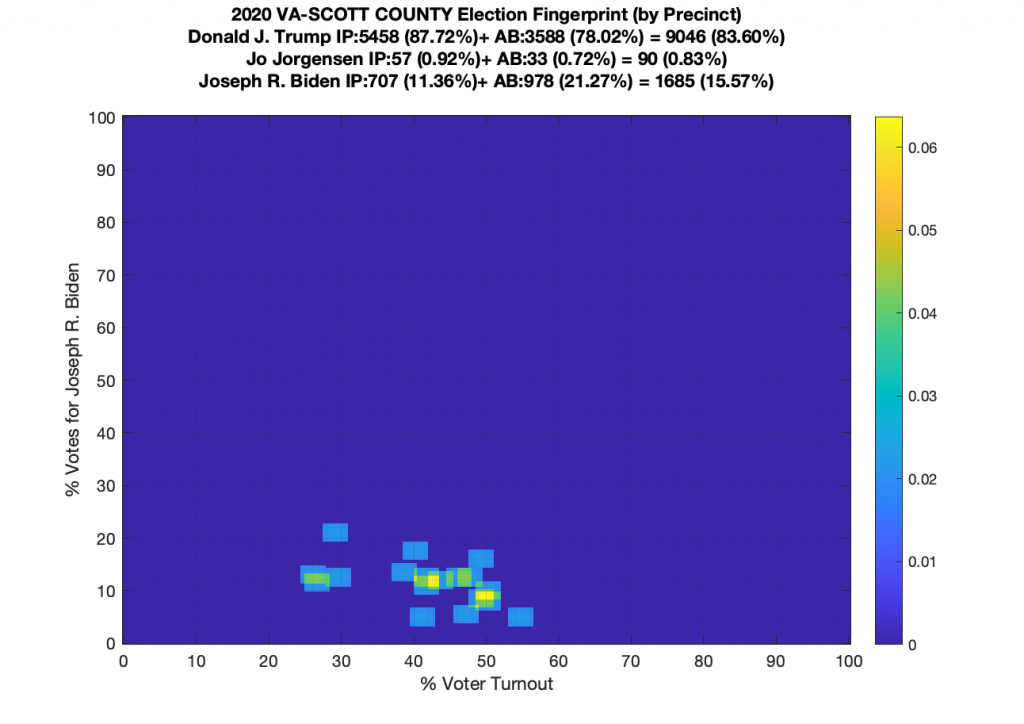
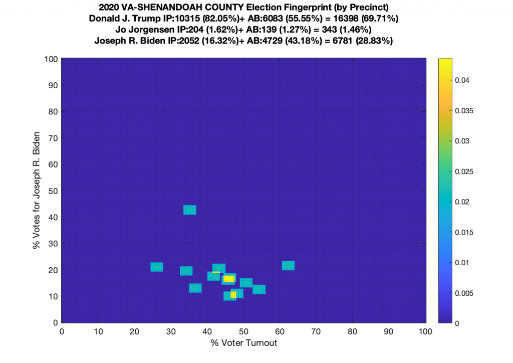
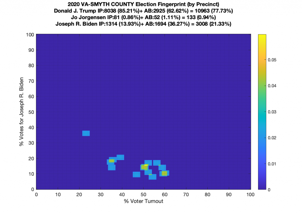
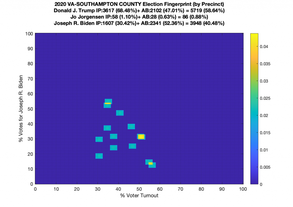
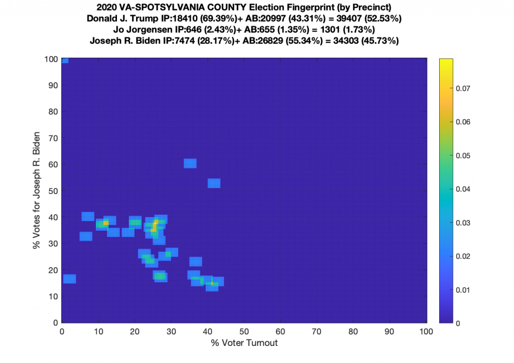
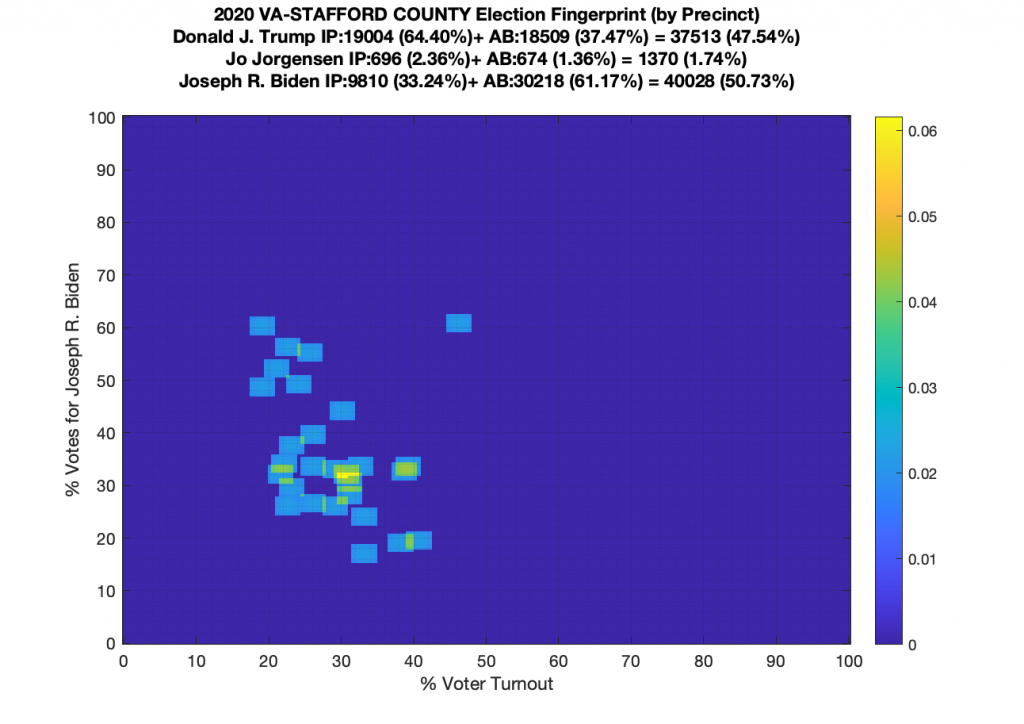
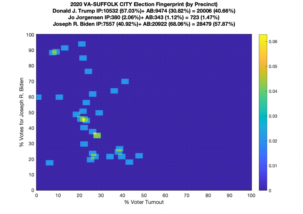
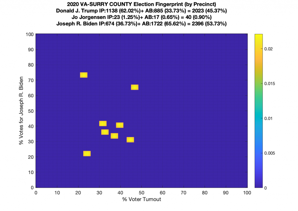
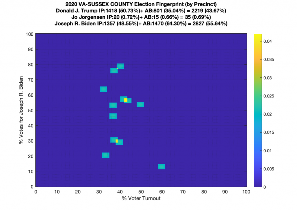
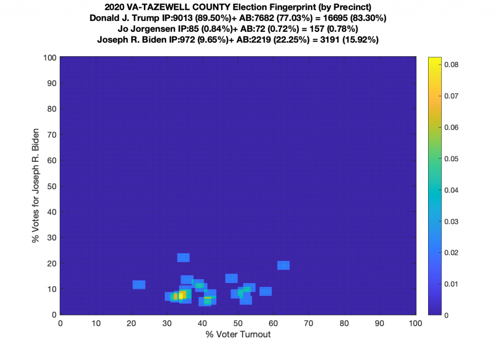
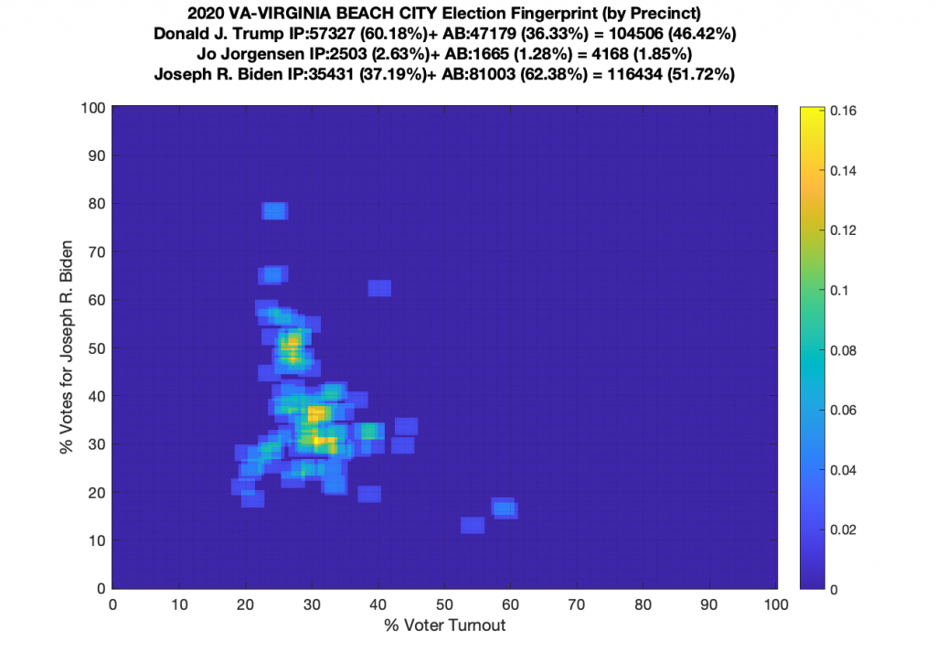
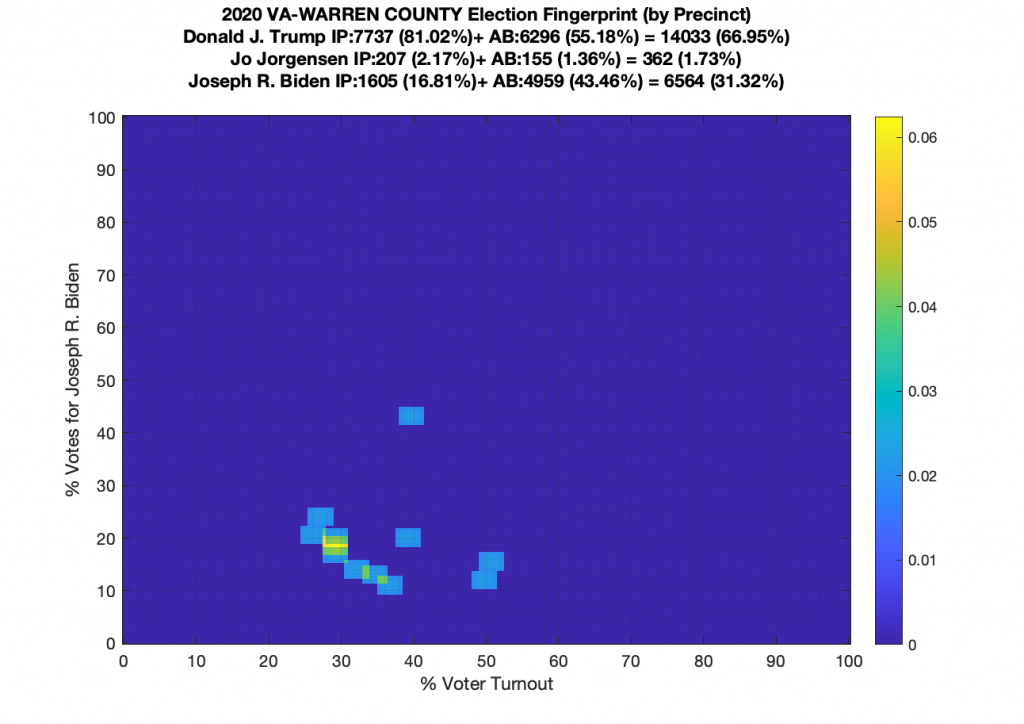
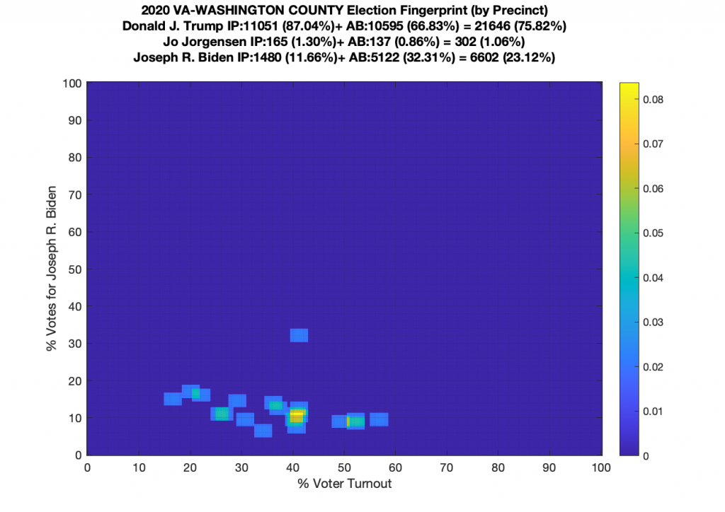
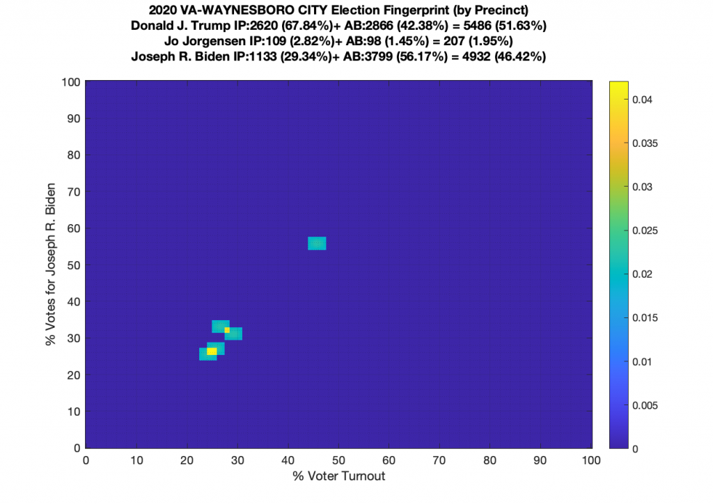
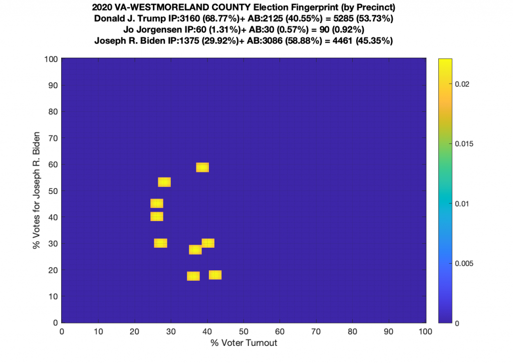
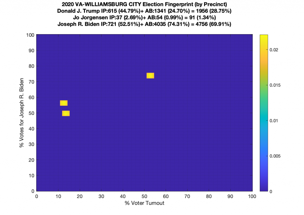
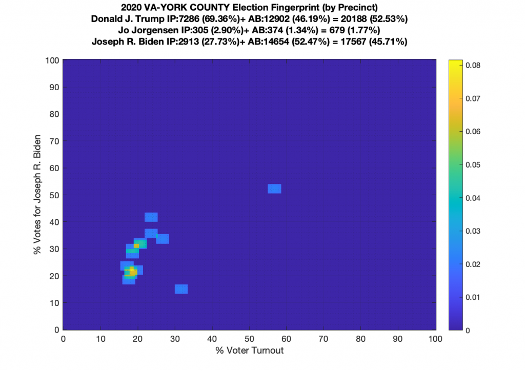
Gallery of every VA county’s per precinct data is below: