| Locality + Precinct Name | Number Of Injected “On Machine” DAL Records |
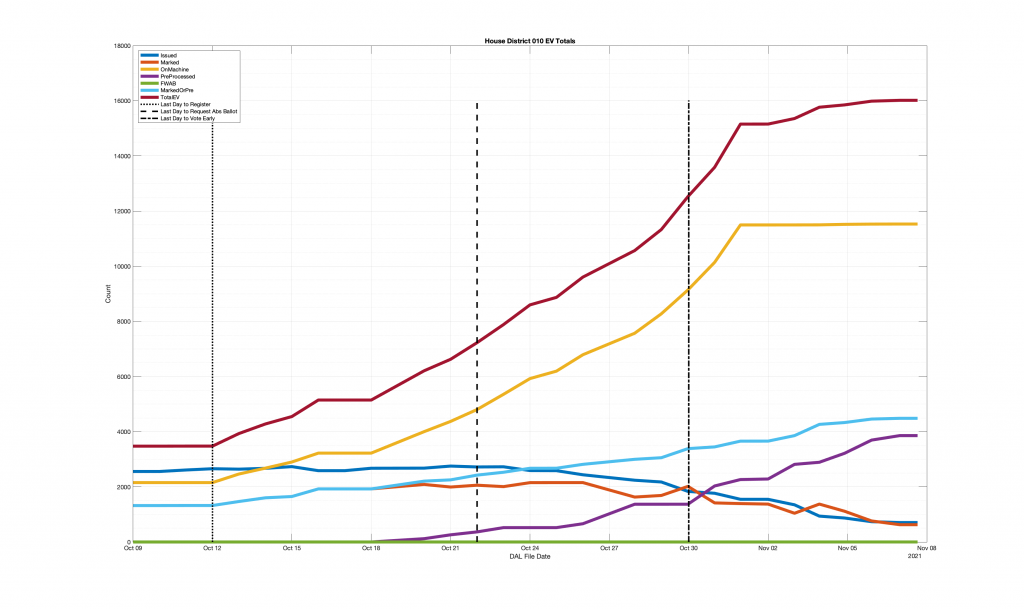
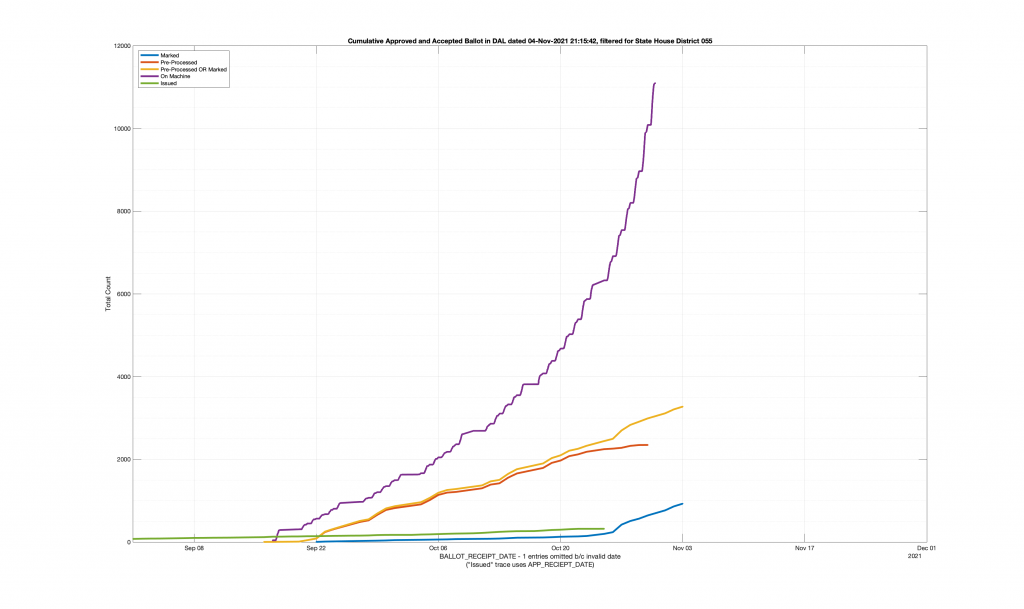
| HANOVER COUNTY 704 – ELMONT 055 | 667 |
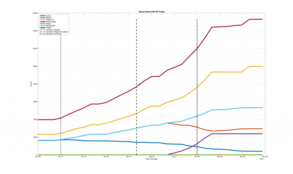
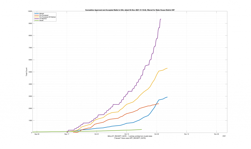
| HANOVER COUNTY 602 – LEE DAVIS 097 | 635 |
| LOUDOUN COUNTY 416 – HAMILTON 033 | 445 |
| LOUDOUN COUNTY 214 – SUGARLAND NORTH 034 | 349 |
| LOUDOUN COUNTY 708 – SENECA 034 | 320 |
| LOUDOUN COUNTY 628 – MOOREFIELD STATION 032 | 99 |
| LOUDOUN COUNTY 319 – JOHN CHAMPE 087 | 23 |
| LOUDOUN COUNTY 313 – PINEBROOK 087 | 18 |
| LOUDOUN COUNTY 112 – FREEDOM 087 | 17 |
| TAZEWELL COUNTY 209 – JEFFERSONVILLE 003 | 14 |
| GILES COUNTY 201 – PEARISBURG 012 | 13 |
| SHENANDOAH COUNTY 401 – WOODSTOCK 015 | 13 |
| KING GEORGE COUNTY 401 – SHILOH 099 | 12 |
| LOUDOUN COUNTY 107 – LITTLE RIVER 067 | 12 |
| LOUDOUN COUNTY 122 – HUTCHISON FARM 087 | 12 |
| LOUDOUN COUNTY 126-GOSHEN POST 087 | 12 |
| LOUDOUN COUNTY 316 – CREIGHTON’S CORNER 010 | 12 |
| ARLINGTON COUNTY 010 – WILSON 048 | 11 |
| ARLINGTON COUNTY 019 – ROSSLYN 048 | 11 |
| KING GEORGE COUNTY 201 – MONROE 099 | 11 |
| PULASKI COUNTY 401 – MASSIE 007 | 11 |
| ARLINGTON COUNTY 018 – PARK LANE 047 | 10 |
| NORTHAMPTON COUNTY 401 – PRECINCT 4-1 100 | 10 |
| RUSSELL COUNTY 501 – WEST LEBANON 004 | 10 |
| ARLINGTON COUNTY 041 – NAVY LEAGUE 047 | 9 |
| NORTHAMPTON COUNTY 101 – PRECINCT 1-1 100 | 9 |
| WASHINGTON COUNTY 302 – SOUTH ABINGDON 004 | 9 |
| ARLINGTON COUNTY 009 – COLUMBIA 049 | 8 |
| ARLINGTON COUNTY 048 – AUSA 047 | 8 |
| CHESAPEAKE CITY 055 – GEORGETOWN EAST 077 | 8 |
| FREDERICKSBURG CITY 401 – PRECINCT 1 – DISTRICT FOUR 028 | 8 |
| KING GEORGE COUNTY 101 – COURTHOUSE 099 | 8 |
| LOUDOUN COUNTY 114 – DULLES SOUTH 067 | 8 |
| LOUDOUN COUNTY 408 – EVERGREEN 010 | 8 |
| WILLIAMSBURG CITY 002 – MATOAKA 093 | 8 |
| WINCHESTER CITY 101 – MERRIMANS 029 | 8 |
| ARLINGTON COUNTY 004 – BALLSTON 047 | 7 |
| ARLINGTON COUNTY 016 – LYON VILLAGE 048 | 7 |
| ARLINGTON COUNTY 026 – FILLMORE 049 | 7 |
| ARLINGTON COUNTY 040 – VIRGINIA SQUARE 047 | 7 |
| BOTETOURT COUNTY 101 – DALEVILLE 019 | 7 |
| BOTETOURT COUNTY 406 – FINCASTLE 019 | 7 |
| CHESAPEAKE CITY 053 – FAIRWAYS 077 | 7 |
| GLOUCESTER COUNTY 302 – ROANES 098 | 7 |
| LOUDOUN COUNTY 121 – TOWN HALL 087 | 7 |
| LOUDOUN COUNTY 318 – MADISON’S TRUST 010 | 7 |
| LOUDOUN COUNTY 509 – TOLBERT 010 | 7 |
| LOUDOUN COUNTY 623 – WELLER 032 | 7 |
| MONTGOMERY COUNTY 202 – PRECINCT B-2 008 | 7 |
| MONTGOMERY COUNTY 203 – PRECINCT B-3 007 | 7 |
| PULASKI COUNTY 501 – ROBINSON 007 | 7 |
| YORK COUNTY 401 – HARWOODS MILL 093 | 7 |
| YORK COUNTY 402 – DARE 096 | 7 |
| CHARLOTTESVILLE CITY 102 – CLARK 057 | 6 |
| CHARLOTTESVILLE CITY 302 – JOHNSON 057 | 6 |
| CHESAPEAKE CITY 008 – SOUTH NORFOLK RECREATION 077 | 6 |
| CHESAPEAKE CITY 012 – GEORGETOWN 077 | 6 |
| FREDERICKSBURG CITY 201 – PRECINCT 1 – DISTRICT TWO 028 | 6 |
| GLOUCESTER COUNTY 401 – HAYES 098 | 6 |
| LOUDOUN COUNTY 124 – LIBERTY 087 | 6 |
| LOUDOUN COUNTY 320 – STONE HILL 087 | 6 |
| LOUDOUN COUNTY 409 – CLARKES GAP 033 | 6 |
| LOUDOUN COUNTY 817 – SANDERS CORNER 032 | 6 |
| MATHEWS COUNTY 003 – PIANKATANK 098 | 6 |
| NORFOLK CITY 211 – CHRYSLER MUSEUM 089 | 6 |
| TAZEWELL COUNTY 301 – CEDAR BLUFF 003 | 6 |
| TAZEWELL COUNTY 401 – RICHLANDS 003 | 6 |
| WILLIAMSBURG CITY 001 – STRYKER 093 | 6 |
| YORK COUNTY 201 – COVENTRY 093 | 6 |
| ACCOMACK COUNTY 502 – RUE 100 | 5 |
| ARLINGTON COUNTY 053 – MET PARK 049 | 5 |
| CAMPBELL COUNTY 402 – COURT HOUSE 059 | 5 |
| CAROLINE COUNTY 202 – SOUTH MADISON 055 | 5 |
| CAROLINE COUNTY 501 – WEST MATTAPONI 055 | 5 |
| CHESAPEAKE CITY 018 – INDIAN RIVER 077 | 5 |
| COLONIAL HEIGHTS CITY 002 – SECOND 066 | 5 |
| ESSEX COUNTY 101 – GREATER TAPPAHANNOCK 098 | 5 |
| FREDERICKSBURG CITY 101 – PRECINCT 1 – DISTRICT ONE 088 | 5 |
| LANCASTER COUNTY 401 – PRECINCT 4-1 099 | 5 |
| LOUDOUN COUNTY 119 – ARCOLA 087 | 5 |
| LOUDOUN COUNTY 322-BUFFALO TRAIL 087 | 5 |
| LOUDOUN COUNTY 616 – EAGLE RIDGE 032 | 5 |
| MANASSAS CITY 003 – METZ 050 | 5 |
| MANASSAS CITY 005 – BALDWIN 050 | 5 |
| MONTGOMERY COUNTY 701 – PRECINCT G-1 012 | 5 |
| TAZEWELL COUNTY 501 – SPRINGVILLE 003 | 5 |
| WASHINGTON COUNTY 101 – EAST ABINGDON 004 | 5 |
| WASHINGTON COUNTY 301 – WATAUGA 005 | 5 |
| WINCHESTER CITY 201 – VIRGINIA AVENUE 029 | 5 |
| YORK COUNTY 302 – YORKTOWN 096 | 5 |
| ARLINGTON COUNTY 008 – HUME 049 | 4 |
| ARLINGTON COUNTY 017 – OVERLEE KNOLLS 047 | 4 |
| ARLINGTON COUNTY 025 – ARLINGTON FOREST 047 | 4 |
| ARLINGTON COUNTY 029 – DOMINION HILLS 047 | 4 |
| ARLINGTON COUNTY 042 – SHIRLINGTON 045 | 4 |
| ARLINGTON COUNTY 046 – CENTRAL 047 | 4 |
| ARLINGTON COUNTY 054 – GARFIELD PARK 047 | 4 |
| BOTETOURT COUNTY 201 – BLUE RIDGE 019 | 4 |
| CHARLOTTESVILLE CITY 101 – Key Recreation 057 | 4 |
| CHARLOTTESVILLE CITY 201 – CARVER 057 | 4 |
| CHESAPEAKE CITY 029 – TANGLEWOOD 077 | 4 |
| CHESAPEAKE CITY 042 – PARKWAYS 077 | 4 |
| CHESAPEAKE CITY 059 – CLEARFIELD 078 | 4 |
| CHESAPEAKE CITY 065 – WATERWAY II 021 | 4 |
| CHESTERFIELD COUNTY 308 – SOUTH MANCHESTER 027 | 4 |
| FREDERICKSBURG CITY 301 – PRECINCT 1 – DISTRICT THREE 088 | 4 |
| FREDERICKSBURG CITY 402 – PRECINCT 2 – DISTRICT FOUR 088 | 4 |
| GILES COUNTY 103 – NARROWS 012 | 4 |
| GLOUCESTER COUNTY 101 – HARCUM 098 | 4 |
| GLOUCESTER COUNTY 201 – COURTHOUSE 098 | 4 |
| HENRICO COUNTY 106 – HERMITAGE 072 | 4 |
| HENRICO COUNTY 303 – INNSBROOK 072 | 4 |
| KING GEORGE COUNTY 301 – DAHLGREN 099 | 4 |
| LANCASTER COUNTY 201 – PRECINCT 2-1 099 | 4 |
| LOUDOUN COUNTY 123 – CARDINAL RIDGE 067 | 4 |
| LOUDOUN COUNTY 308 – ST LOUIS 010 | 4 |
| LOUDOUN COUNTY 420 – RIVER CREEK 010 | 4 |
| LOUDOUN COUNTY 813 – SELDENS LANDING 032 | 4 |
| MONTGOMERY COUNTY 101 – PRECINCT A-1 008 | 4 |
| MONTGOMERY COUNTY 102 – PRECINCT A-2 012 | 4 |
| MONTGOMERY COUNTY 204 – PRECINCT B-4 007 | 4 |
| MONTGOMERY COUNTY 602 – PRECINCT F-2 012 | 4 |
| ORANGE COUNTY 301 – THREE WEST 030 | 4 |
| PRINCE GEORGE COUNTY 201 – BLAND 064 | 4 |
| SHENANDOAH COUNTY 503 – TOMS BROOK 015 | 4 |
| WINCHESTER CITY 402 – ROLLING HILLS 029 | 4 |
| AMELIA COUNTY 301 – NUMBER THREE 061 | 3 |
| APPOMATTOX COUNTY 202 – SPOUT SPRING 059 | 3 |
| APPOMATTOX COUNTY 401 – COURTHOUSE 059 | 3 |
| ARLINGTON COUNTY 007 – CHERRYDALE 048 | 3 |
| ARLINGTON COUNTY 020 – THRIFTON 048 | 3 |
| ARLINGTON COUNTY 023 – WESTOVER 047 | 3 |
| ARLINGTON COUNTY 027 – JEFFERSON 049 | 3 |
| ARLINGTON COUNTY 028 – WAKEFIELD 049 | 3 |
| ARLINGTON COUNTY 035 – MADISON 048 | 3 |
| ARLINGTON COUNTY 036 – MARSHALL 048 | 3 |
| ARLINGTON COUNTY 039 – ASHLAWN 047 | 3 |
| ARLINGTON COUNTY 044 – DAWSON TERRACE 048 | 3 |
| ARLINGTON COUNTY 049 – MONROE 047 | 3 |
| ARLINGTON COUNTY 050 – CRYSTAL PLAZA 048 | 3 |
| BOTETOURT COUNTY 205 – ORCHARDS 017 | 3 |
| BRISTOL CITY 002 – SECOND WARD 005 | 3 |
| BRISTOL CITY 003 – THIRD WARD 005 | 3 |
| CHARLOTTESVILLE CITY 202 – WALKER 057 | 3 |
| CHARLOTTESVILLE CITY 301 – BENJAMIN TONSLER 057 | 3 |
| CHARLOTTESVILLE CITY 303 – BUFORD 057 | 3 |
| CHESAPEAKE CITY 005 – CRESTWOOD 077 | 3 |
| CHESAPEAKE CITY 016 – HICKORY GROVE 078 | 3 |
| CHESAPEAKE CITY 022 – NORFOLK HIGHLANDS 077 | 3 |
| CHESAPEAKE CITY 056 – GREEN TREE 077 | 3 |
| CHESAPEAKE CITY 057 – CYPRESS 077 | 3 |
| CHESTERFIELD COUNTY 109 – ELIZABETH SCOTT 062 | 3 |
| CUMBERLAND COUNTY 301 – PRECINCT 3 061 | 3 |
| DINWIDDIE COUNTY 402 – MCKENNEY 063 | 3 |
| FALLS CHURCH CITY 001 – FIRST WARD 053 | 3 |
| FREDERICK COUNTY 101 – MERRIMANS 029 | 3 |
| FREDERICK COUNTY 203 – REDLAND 029 | 3 |
| GILES COUNTY 102 – RICH CREEK 012 | 3 |
| GILES COUNTY 302 – PEMBROKE 012 | 3 |
| GLOUCESTER COUNTY 301 – WHITE MARSH 098 | 3 |
| GRAYSON COUNTY 203 – INDEPENDENCE 005 | 3 |
| HARRISONBURG CITY 305 – MASSANETTA SPRINGS 025 | 3 |
| HENRICO COUNTY 308 – RIVERS EDGE 056 | 3 |
| HENRICO COUNTY 514 – ROLFE 070 | 3 |
| HOPEWELL CITY 301 – WARD THREE 062 | 3 |
| LANCASTER COUNTY 101 – PRECINCT 1-1 099 | 3 |
| LOUDOUN COUNTY 108 – MERCER 087 | 3 |
| LOUDOUN COUNTY 118 – MOOREFIELD 032 | 3 |
| LOUDOUN COUNTY 120 – LUNSFORD 087 | 3 |
| LOUDOUN COUNTY 201 – BERRYVILLE 033 | 3 |
| LOUDOUN COUNTY 219 – GALILEE CHURCH 032 | 3 |
| LOUDOUN COUNTY 321 – BRAMBLETON MIDDLE 010 | 3 |
| LOUDOUN COUNTY 402 – WATERFORD 033 | 3 |
| LOUDOUN COUNTY 502 – EAST LEESBURG 010 | 3 |
| LOUDOUN COUNTY 505 – COOL SPRING 010 | 3 |
| LOUDOUN COUNTY 506 – BRANDON PARK 010 | 3 |
| LOUDOUN COUNTY 620 – RUSSELL BRANCH 032 | 3 |
| LOUDOUN COUNTY 627 – ASHBROOK 032 | 3 |
| LOUDOUN COUNTY 808 – STONE BRIDGE 032 | 3 |
| LOUDOUN COUNTY 814 – NEWTON – LEE 032 | 3 |
| MECKLENBURG COUNTY 903 – CLARKSVILLE 061 | 3 |
| MONTGOMERY COUNTY 301 – PRECINCT C-1 008 | 3 |
| MONTGOMERY COUNTY 304 – PRECINCT C-4 008 | 3 |
| MONTGOMERY COUNTY 405 – PRECINCT D-5 007 | 3 |
| MONTGOMERY COUNTY 501 – PRECINCT E-1 007 | 3 |
| MONTGOMERY COUNTY 601 – PRECINCT F-1 012 | 3 |
| NORTHAMPTON COUNTY 201 – PRECINCT 2-1 100 | 3 |
| NORTHAMPTON COUNTY 501 – PRECINCT 5-1 100 | 3 |
| NORTHUMBERLAND COUNTY 501 – 5A 099 | 3 |
| PORTSMOUTH CITY 001 – EMANUEL A. M. E. CHURCH 080 | 3 |
| PRINCE EDWARD COUNTY 101 – FARMVILLE 060 | 3 |
| PRINCE EDWARD COUNTY 701 – WEST END 060 | 3 |
| PULASKI COUNTY 102 – NEW RIVER 012 | 3 |
| PULASKI COUNTY 103 – WEST CLOYD 007 | 3 |
| ROANOKE COUNTY 507 – HUNTING HILLS 017 | 3 |
| ROCKINGHAM COUNTY 202 – EDOM 026 | 3 |
| ROCKINGHAM COUNTY 503 – MCGAHEYSVILLE 058 | 3 |
| SHENANDOAH COUNTY 103 – NEW MARKET 015 | 3 |
| SHENANDOAH COUNTY 302 – EDINBURG 015 | 3 |
| SHENANDOAH COUNTY 303 – ST LUKE 015 | 3 |
| SHENANDOAH COUNTY 601 – STRASBURG 015 | 3 |
| SPOTSYLVANIA COUNTY 101 – PRECINCT 1 – DISTRICT ONE 088 | 3 |
| SPOTSYLVANIA COUNTY 505 – BROCK 054 | 3 |
| TAZEWELL COUNTY 103 – MUNDY TOWN 003 | 3 |
| TAZEWELL COUNTY 303 – PAINT LICK 003 | 3 |
| WARREN COUNTY 202 – LINDEN 018 | 3 |
| WASHINGTON COUNTY 402 – MEADOWVIEW 005 | 3 |
| WASHINGTON COUNTY 502 – DAMASCUS 005 | 3 |
| WISE COUNTY 202 – WISE 001 | 3 |
| WISE COUNTY 302 – EAST STONE GAP 001 | 3 |
| YORK COUNTY 101 – QUEENS LAKE 096 | 3 |
| YORK COUNTY 103 – MAGRUDER 096 | 3 |
| YORK COUNTY 303 – EDGEHILL 093 | 3 |
| YORK COUNTY 502 – BETHEL 091 | 3 |
| ALBEMARLE COUNTY 101 – ZION 056 | 2 |
| ALLEGHANY COUNTY 101 – ARRITT 019 | 2 |
| ALLEGHANY COUNTY 701 – DISTRICT 2 019 | 2 |
| AMELIA COUNTY 501 – NUMBER FIVE 061 | 2 |
| AMHERST COUNTY 201 – COURT HOUSE 024 | 2 |
| AMHERST COUNTY 501 – MADISON 023 | 2 |
| APPOMATTOX COUNTY 102 – PAMPLIN 059 | 2 |
| APPOMATTOX COUNTY 301 – US 460 059 | 2 |
| ARLINGTON COUNTY 002 – ASHTON HEIGHTS 047 | 2 |
| ARLINGTON COUNTY 006 – CRYSTAL CITY 048 | 2 |
| ARLINGTON COUNTY 014 – CLARENDON 047 | 2 |
| ARLINGTON COUNTY 015 – LYON PARK 047 | 2 |
| ARLINGTON COUNTY 024 – WOODLAWN 048 | 2 |
| ARLINGTON COUNTY 030 – GLEBE 049 | 2 |
| ARLINGTON COUNTY 032 – OAKRIDGE 045 | 2 |
| ARLINGTON COUNTY 034 – YORKTOWN 048 | 2 |
| ARLINGTON COUNTY 038 – ARLINGTON VIEW 049 | 2 |
| ARLINGTON COUNTY 045 – BUCKINGHAM 047 | 2 |
| ARLINGTON COUNTY 047 – FOUR MILE RUN 049 | 2 |
| AUGUSTA COUNTY 301 – FORT DEFIANCE 025 | 2 |
| AUGUSTA COUNTY 501 – GREENVILLE 024 | 2 |
| AUGUSTA COUNTY 801 – DOOMS 025 | 2 |
| BATH COUNTY 201 – HOT SPRINGS 024 | 2 |
| BOTETOURT COUNTY 301 – 3A 099 | 2 |
| BOTETOURT COUNTY 302 – MILL CREEK 019 | 2 |
| BRISTOL CITY 004 – FOURTH WARD 005 | 2 |
| BRUNSWICK COUNTY 501 – TOTARO 075 | 2 |
| BUCHANAN COUNTY 403 – SOUTH GRUNDY 003 | 2 |
| BUCKINGHAM COUNTY 101 – PRECINCT 1 061 | 2 |
| BUCKINGHAM COUNTY 302 – MT PLEASANT 060 | 2 |
| CAMPBELL COUNTY 201 – WALKER 022 | 2 |
| CAMPBELL COUNTY 601 – KINGS 022 | 2 |
| CAMPBELL COUNTY 602 – CONCORD 059 | 2 |
| CAROLINE COUNTY 102 – SPARTA 099 | 2 |
| CAROLINE COUNTY 201 – NORTH MADISON 055 | 2 |
| CAROLINE COUNTY 302 – WOODFORD 054 | 2 |
| CARROLL COUNTY 105 – FANCY GAP 006 | 2 |
| CARROLL COUNTY 201 – HILLSVILLE B 006 | 2 |
| CHARLES CITY COUNTY 101 – PRECINCT 1-1 070 | 2 |
| CHARLES CITY COUNTY 301 – PRECINCT 3-1 070 | 2 |
| CHARLOTTE COUNTY 702 – BACON/SAXE 060 | 2 |
| CHARLOTTESVILLE CITY 401 – VENABLE 057 | 2 |
| CHESAPEAKE CITY 010 – OSCAR SMITH 077 | 2 |
| CHESAPEAKE CITY 014 – GRASSFIELD 078 | 2 |
| CHESAPEAKE CITY 015 – GREENBRIER MIDDLE SCHOOL 077 | 2 |
| CHESAPEAKE CITY 023 – OAK GROVE 078 | 2 |
| CHESAPEAKE CITY 024 – OAKLETTE 077 | 2 |
| CHESAPEAKE CITY 031 – CARVER SCHOOL 077 | 2 |
| CHESAPEAKE CITY 032 – PROVIDENCE 077 | 2 |
| CHESAPEAKE CITY 034 – HICKORY MIDDLE SCHOOL 078 | 2 |
| CHESAPEAKE CITY 043 – PLEASANT CROSSING 078 | 2 |
| CHESAPEAKE CITY 201 – BARTLETT 064 | 2 |
| CHESTERFIELD COUNTY 202 – SUTHERLAND 063 | 2 |
| CHESTERFIELD COUNTY 204 – COURTS BLDG 064 | 2 |
| CHESTERFIELD COUNTY 214 – LONGDALE 074 | 2 |
| CHESTERFIELD COUNTY 304 – WINFREES STORE 063 | 2 |
| CHESTERFIELD COUNTY 316 – SPRING RUN 027 | 2 |
| CHESTERFIELD COUNTY 319 – MAGNOLIA 065 | 2 |
| CHESTERFIELD COUNTY 404 – PROVIDENCE 027 | 2 |
| CHESTERFIELD COUNTY 501 – FIFTH WARD FIRST PRECINCT 063 | 2 |
| CHESTERFIELD COUNTY 518 – WHITLOCKS 070 | 2 |
| CLARKE COUNTY 401 – MINERAL 056 | 2 |
| COLONIAL HEIGHTS CITY 001 – FIRST 066 | 2 |
| COLONIAL HEIGHTS CITY 004 – FOURTH 066 | 2 |
| COLONIAL HEIGHTS CITY 101 – WARD ONE 062 | 2 |
| DINWIDDIE COUNTY 202 – SUTHERLAND 063 | 2 |
| DINWIDDIE COUNTY 303 – LITTLE ZION 063 | 2 |
| EMPORIA CITY 601 – DISTRICT 6 075 | 2 |
| ESSEX COUNTY 201 – NORTH 098 | 2 |
| FAIRFAX CITY 040 – VIRGINIA SQUARE 047 | 2 |
| FAIRFAX COUNTY 318 – WESTMORELAND 048 | 2 |
| FAIRFAX COUNTY 501 – BAILEYS #1 038 | 2 |
| FAIRFAX COUNTY 502 – BENTONVILLE 015 | 2 |
| FALLS CHURCH CITY 003 – THIRD WARD 053 | 2 |
| FAUQUIER COUNTY 101 – ZION 056 | 2 |
| FAUQUIER COUNTY 404 – SPRINGS VALLEY 018 | 2 |
| FAUQUIER COUNTY 501 – THE PLAINS 018 | 2 |
| FLUVANNA COUNTY 101 – PALMYRA 058 | 2 |
| FRANKLIN COUNTY 415 – SKIPWITH 073 | 2 |
| FREDERICK COUNTY 401 – CARPERS VALLEY 010 | 2 |
| FREDERICK COUNTY 503 – CANTERBURG 029 | 2 |
| FREDERICK COUNTY 603 – GREENWOOD 033 | 2 |
| GILES COUNTY 301 – EGGLESTON 012 | 2 |
| GILES COUNTY 303 – NEWPORT 012 | 2 |
| GLOUCESTER COUNTY 202 – BOTETOURT 098 | 2 |
| GLOUCESTER COUNTY 402 – SARAHS CREEK 098 | 2 |
| GLOUCESTER COUNTY 501 – ACHILLES 098 | 2 |
| GOOCHLAND COUNTY 202 – SANDY HOOK 065 | 2 |
| GOOCHLAND COUNTY 402 – CENTERVILLE 056 | 2 |
| GREENE COUNTY 201 – RUCKERSVILLE 058 | 2 |
| GREENSVILLE COUNTY 202 – PRECINCT 2-B 075 | 2 |
| GREENSVILLE COUNTY 402 – PRECINCT 4-B 075 | 2 |
| HALIFAX COUNTY 403 – CENTER 060 | 2 |
| HALIFAX COUNTY 801 – SOUTH BOSTON 060 | 2 |
| HAMPTON CITY 103 – MAGRUDER 096 | 2 |
| HAMPTON CITY 211 – PALMER 095 | 2 |
| HANOVER COUNTY 408 – LAUDERDALE 072 | 2 |
| HENRICO COUNTY 102 – DUMBARTON 072 | 2 |
| HENRICO COUNTY 105 – GREENDALE 072 | 2 |
| HENRICO COUNTY 110 – JOHNSON 073 | 2 |
| HENRICO COUNTY 215 – MAPLEWOOD 074 | 2 |
| HENRICO COUNTY 216 – MOODY 074 | 2 |
| HENRICO COUNTY 301 – CAUSEWAY 056 | 2 |
| HENRICO COUNTY 302 – CEDARFIELD 073 | 2 |
| HENRICO COUNTY 304 – JACKSON DAVIS 073 | 2 |
| HENRICO COUNTY 402 – CENTERVILLE 056 | 2 |
| HENRICO COUNTY 504 – DONAHOE 074 | 2 |
| HENRICO COUNTY 506 – EANES 070 | 2 |
| HENRICO COUNTY 508 – HIGHLAND SPRINGS 074 | 2 |
| HENRICO COUNTY 516 – SULLIVANS 070 | 2 |
| HENRY COUNTY 505 – DYERS STORE 016 | 2 |
| HOPEWELL CITY 401 – WARD FOUR 062 | 2 |
| ISLE OF WIGHT COUNTY 101 – SMITHFIELD 064 | 2 |
| ISLE OF WIGHT COUNTY 302 – PONS 064 | 2 |
| JAMES CITY COUNTY 403 – STONEHOUSE C 096 | 2 |
| KING WILLIAM COUNTY 101 – HARTWOOD 088 | 2 |
| KING WILLIAM COUNTY 202 – COURTHOUSE 097 | 2 |
| LOUDOUN COUNTY 117 – CARTER 087 | 2 |
| LOUDOUN COUNTY 207 – RIVER BEND 034 | 2 |
| LOUDOUN COUNTY 208 – ALGONKIAN 032 | 2 |
| LOUDOUN COUNTY 217 – SOUTH BANK 034 | 2 |
| LOUDOUN COUNTY 218 – UNIVERSITY CENTER 032 | 2 |
| LOUDOUN COUNTY 301 – PURCELLVILLE 033 | 2 |
| LOUDOUN COUNTY 302 – ROUND HILL 033 | 2 |
| LOUDOUN COUNTY 309 – ALDIE 010 | 2 |
| LOUDOUN COUNTY 310 – MOUNTAIN VIEW 033 | 2 |
| LOUDOUN COUNTY 311 – ROUND HILL ELEMENTARY 033 | 2 |
| LOUDOUN COUNTY 422 – SYCOLIN CREEK 010 | 2 |
| LOUDOUN COUNTY 501 – WEST LEESBURG 010 | 2 |
| LOUDOUN COUNTY 504 – SMARTS MILL 010 | 2 |
| LOUDOUN COUNTY 617 – OAK GROVE 087 | 2 |
| LOUDOUN COUNTY 619 – RIDGETOP 087 | 2 |
| LOUDOUN COUNTY 621 – DOMINION TRAIL 032 | 2 |
| LOUDOUN COUNTY 629 – DISCOVERY 087 | 2 |
| LOUDOUN COUNTY 815 – BELMONT RIDGE 032 | 2 |
| LOUDOUN COUNTY 819 – HERITAGE CHURCH 032 | 2 |
| LOUISA COUNTY 301 – PATRICK HENRY NO 1 056 | 2 |
| LOUISA COUNTY 401 – MINERAL 056 | 2 |
| LYNCHBURG CITY 404 – FOURTH WARD FOURTH PRECINCT 023 | 2 |
| MANASSAS CITY 001 – DEAN 050 | 2 |
| MANASSAS CITY 006 – ROUND 050 | 2 |
| MECKLENBURG COUNTY 202 – BLUESTONE SENIOR HIGH SCHOOL 061 | 2 |
| MECKLENBURG COUNTY 501 – SOUTH HILL 061 | 2 |
| MONTGOMERY COUNTY 103 – PRECINCT A-3 012 | 2 |
| MONTGOMERY COUNTY 201 – LITTLE RIVER 007 | 2 |
| MONTGOMERY COUNTY 403 – PRECINCT D-3 007 | 2 |
| MONTGOMERY COUNTY 502 – PRECINCT E-2 012 | 2 |
| MONTGOMERY COUNTY 702 – PRECINCT G-2 012 | 2 |
| NELSON COUNTY 301 – SHIPMAN 059 | 2 |
| NEWPORT NEWS CITY 102 – STONEY RUN 094 | 2 |
| NEWPORT NEWS CITY 104 – MCINTOSH 094 | 2 |
| NEWPORT NEWS CITY 205 – DEEP CREEK 094 | 2 |
| NEWPORT NEWS CITY 219 – DEER PARK 095 | 2 |
| NEWPORT NEWS CITY 304 – CHESTNUT 095 | 2 |
| NEWPORT NEWS CITY 315 – SEDGEFIELD 095 | 2 |
| NEWPORT NEWS CITY 320 – WATKINS 095 | 2 |
| NORFOLK CITY 306 – LINDENWOOD 089 | 2 |
| NORFOLK CITY 507 – PRETLOW 100 | 2 |
| NORTHAMPTON COUNTY 301 – PRECINCT 3-1 100 | 2 |
| NORTHAMPTON COUNTY 307 – CROSSROADS 025 | 2 |
| NORTHUMBERLAND COUNTY 101 – 1A 099 | 2 |
| ORANGE COUNTY 101 – ONE WEST 030 | 2 |
| ORANGE COUNTY 102 – ONE EAST 030 | 2 |
| ORANGE COUNTY 202 – TWO EAST 030 | 2 |
| PORTSMOUTH CITY 031 – WEST PARK CHURCH OF CHRIST 080 | 2 |
| POWHATAN COUNTY 101 – VERA 059 | 2 |
| PRINCE EDWARD COUNTY 302 – MT PLEASANT 060 | 2 |
| PRINCE EDWARD COUNTY 302 – PRECINCT 3-2 061 | 2 |
| PRINCE GEORGE COUNTY 102 – TEMPLETON 064 | 2 |
| PRINCE GEORGE COUNTY 204 – COURTS BLDG 064 | 2 |
| PRINCE WILLIAM COUNTY 203 – RUBY 002 | 2 |
| PRINCE WILLIAM COUNTY 409 – TYLER 013 | 2 |
| PRINCE WILLIAM COUNTY 513 – LYNNWOOD 051 | 2 |
| PRINCE WILLIAM COUNTY 712 – LEESYLVANIA 002 | 2 |
| PULASKI COUNTY 202 – SOUTH PULASKI 007 | 2 |
| PULASKI COUNTY 301 – DUBLIN 007 | 2 |
| RICHMOND CITY 402 – CRESTVIEW 073 | 2 |
| ROANOKE COUNTY 202 – BURLINGTON 017 | 2 |
| ROANOKE COUNTY 205 – ORCHARDS 017 | 2 |
| ROANOKE COUNTY 503 – CAVE SPRING 008 | 2 |
| ROANOKE COUNTY 504 – OGDEN 017 | 2 |
| ROANOKE COUNTY 506 – MOUNT VERNON 017 | 2 |
| ROCKBRIDGE COUNTY 101 – AIRPORT 024 | 2 |
| ROCKBRIDGE COUNTY 402 – MOUNTAIN VIEW 024 | 2 |
| ROCKINGHAM COUNTY 204 – MT CLINTON 026 | 2 |
| ROCKINGHAM COUNTY 303 – MELROSE 026 | 2 |
| ROCKINGHAM COUNTY 307 – CROSSROADS 025 | 2 |
| ROCKINGHAM COUNTY 502 – SWIFT RUN 058 | 2 |
| RUSSELL COUNTY 304 – CLEVELAND 004 | 2 |
| RUSSELL COUNTY 602 – ELK GARDEN 004 | 2 |
| SHENANDOAH COUNTY 201 – CONICVILLE 015 | 2 |
| SHENANDOAH COUNTY 202 – MT JACKSON 015 | 2 |
| STAFFORD COUNTY 302 – WIDEWATER 002 | 2 |
| STAFFORD COUNTY 402 – COURTHOUSE 028 | 2 |
| STAFFORD COUNTY 502 – FLINT HILL 018 | 2 |
| SUFFOLK CITY 504 – LAKE COHOON 076 | 2 |
| SUFFOLK CITY 602 – OLDE TOWNE 076 | 2 |
| TAZEWELL COUNTY 102 – TIP TOP 003 | 2 |
| TAZEWELL COUNTY 104 – FALLS MILLS 003 | 2 |
| TAZEWELL COUNTY 502 – GRAHAM 003 | 2 |
| VIRGINIA BEACH CITY 010 – GREAT NECK 082 | 2 |
| VIRGINIA BEACH CITY 502 – BETHEL 091 | 2 |
| WARREN COUNTY 501 – SOUTH RIVER 018 | 2 |
| WARREN COUNTY 504 – BROWNTOWN 015 | 2 |
| WARREN COUNTY 601 – STRASBURG 015 | 2 |
| WASHINGTON COUNTY 603 – VALLEY INSTITUTE 004 | 2 |
| WASHINGTON COUNTY 701 – HIGH POINT 005 | 2 |
| WAYNESBORO CITY 603 – LYNDHURST 020 | 2 |
| WINCHESTER CITY 102 – OLD TOWN 029 | 2 |
| WINCHESTER CITY 103 – KERNSTOWN 029 | 2 |
| WISE COUNTY 401 – CLINCH VALLEY 001 | 2 |
| WYTHE COUNTY 401 – FRIES 005 | 2 |
| YORK COUNTY 301 – SEAFORD 096 | 2 |
| YORK COUNTY 303 – EDGEHILL 096 | 2 |
| YORK COUNTY 403 – GRAFTON 096 | 2 |
| YORK COUNTY 501 – TABB 093 | 2 |
| ACCOMACK COUNTY 301 – NEW CHURCH 100 | 1 |
| ACCOMACK COUNTY 701 – NANDUA 100 | 1 |
| ACCOMACK COUNTY 802 – MELFA 100 | 1 |
| ACCOMACK COUNTY 901 – PAINTER 100 | 1 |
| ALBEMARLE COUNTY 101 – Key Recreation 057 | 1 |
| ALBEMARLE COUNTY 101 – ROCKFISH 020 | 1 |
| ALBEMARLE COUNTY 102 – CLARK 057 | 1 |
| ALBEMARLE COUNTY 301 – BENJAMIN TONSLER 057 | 1 |
| ALBEMARLE COUNTY 401 – MIDWAY 058 | 1 |
| ALBEMARLE COUNTY 502 – BETHEL 091 | 1 |
| ALBEMARLE COUNTY 502 – NELLYSFORD 020 | 1 |
| ALEXANDRIA CITY 101 – HARTWOOD 088 | 1 |
| ALEXANDRIA CITY 102 – CITY HALL 045 | 1 |
| ALEXANDRIA CITY 110 – CHARLES HOUSTON CENTER 045 | 1 |
| ALEXANDRIA CITY 201 – NAOMI L. BROOKS SCHOOL 045 | 1 |
| ALEXANDRIA CITY 304 – SAMUEL TUCKER SCHOOL 046 | 1 |
| ALEXANDRIA CITY 318 – MADISON’S TRUST 010 | 1 |
| ALEXANDRIA CITY 616 – EAGLE RIDGE 032 | 1 |
| AMELIA COUNTY 301 – BENJAMIN TONSLER 057 | 1 |
| AMELIA COUNTY 401 – NUMBER FOUR 061 | 1 |
| AMHERST COUNTY 102 – NEW GLASGOW 024 | 1 |
| APPOMATTOX COUNTY 501 – DARLINGTON HTS 060 | 1 |
| APPOMATTOX COUNTY 501 – OAKVILLE 059 | 1 |
| ARLINGTON COUNTY 001 – ARLINGTON 049 | 1 |
| ARLINGTON COUNTY 003 – AURORA HILLS 045 | 1 |
| ARLINGTON COUNTY 005 – BARCROFT 047 | 1 |
| ARLINGTON COUNTY 011 – EAST FALLS CHURCH 047 | 1 |
| ARLINGTON COUNTY 012 – FAIRLINGTON 045 | 1 |
| ARLINGTON COUNTY 013 – GLEN CARLYN 047 | 1 |
| ARLINGTON COUNTY 022 – ABINGDON 045 | 1 |
| ARLINGTON COUNTY 031 – LEXINGTON 047 | 1 |
| ARLINGTON COUNTY 033 – ROCK SPRING 048 | 1 |
| ARLINGTON COUNTY 043 – CAMPBELL 049 | 1 |
| ARLINGTON COUNTY 101 – ZION 056 | 1 |
| ARLINGTON COUNTY 301 – THREE WEST 030 | 1 |
| ARLINGTON COUNTY 401 – THREE FORKS 059 | 1 |
| ARLINGTON COUNTY 407 – HARPER PARK 010 | 1 |
| AUGUSTA COUNTY 103 – VERONA 025 | 1 |
| AUGUSTA COUNTY 503 – SPOTTSWOOD 024 | 1 |
| AUGUSTA COUNTY 504 – WHITE HILL 024 | 1 |
| AUGUSTA COUNTY 601 – SHERANDO 020 | 1 |
| AUGUSTA COUNTY 602 – RIDGEVIEW 024 | 1 |
| AUGUSTA COUNTY 603 – LYNDHURST 020 | 1 |
| BATH COUNTY 101 – WARM SPRINGS 024 | 1 |
| BATH COUNTY 501 – HEALING SPRINGS 024 | 1 |
| BEDFORD COUNTY 101 – BROOKVILLE 022 | 1 |
| BEDFORD COUNTY 205 – SAUNDERS VOL FIRE CO 022 | 1 |
| BEDFORD COUNTY 502 – WASSONA 006 | 1 |
| BEDFORD COUNTY 701 – GOODE VOL RESCUE SQUAD 019 | 1 |
| BEDFORD COUNTY 703 – THAXTON BAPTIST CHURCH #2 023 | 1 |
| BLAND COUNTY 301 – HOLLYBROOK 003 | 1 |
| BOTETOURT COUNTY 301 – BUCHANAN 019 | 1 |
| BOTETOURT COUNTY 403 – EAGLE ROCK 019 | 1 |
| BOTETOURT COUNTY 403 – NORTH VINTON 017 | 1 |
| BOTETOURT COUNTY 404 – SOUTH VINTON 017 | 1 |
| BOTETOURT COUNTY 505 – CLEARBROOK 017 | 1 |
| BRISTOL CITY 001 – FIRST WARD 005 | 1 |
| BRUNSWICK COUNTY 402 – KING’S STORE 075 | 1 |
| BUCHANAN COUNTY 301 – SLATE 003 | 1 |
| BUCHANAN COUNTY 302 – NORTH GRUNDY 003 | 1 |
| CAMPBELL COUNTY 102 – NEW LONDON 022 | 1 |
| CAMPBELL COUNTY 201 – LOVINGSTON 059 | 1 |
| CAMPBELL COUNTY 401 – FOURTH WARD FIRST PRECINCT 023 | 1 |
| CAMPBELL COUNTY 501 – MADISON 023 | 1 |
| CAMPBELL COUNTY 501 – SPRING HILL 022 | 1 |
| CAMPBELL COUNTY 502 – YELLOW BRANCH 059 | 1 |
| CAROLINE COUNTY 101 – BOWLING GREEN 099 | 1 |
| CAROLINE COUNTY 401 – DAWN 055 | 1 |
| CAROLINE COUNTY 401 – SHILOH 099 | 1 |
| CAROLINE COUNTY 502 – MILFORD 055 | 1 |
| CAROLINE COUNTY 602 – LAKE 055 | 1 |
| CARROLL COUNTY 202 – PRECINCT B-2 008 | 1 |
| CARROLL COUNTY 202 – WISE 001 | 1 |
| CARROLL COUNTY 501 – VAUGHAN 006 | 1 |
| CARROLL COUNTY 502 – GLADEVILLE 006 | 1 |
| CHARLES CITY COUNTY 201 – PRECINCT 2-1 070 | 1 |
| CHARLOTTE COUNTY 201 – RED OAK WYLLIESBURG 060 | 1 |
| CHARLOTTE COUNTY 702 – SOUTH ANNA 056 | 1 |
| CHARLOTTESVILLE CITY 314 – THREE CHOPT 073 | 1 |
| CHARLOTTESVILLE CITY 402 – ALUMNI HALL 057 | 1 |
| CHESAPEAKE CITY 006 – DEEP CREEK 081 | 1 |
| CHESAPEAKE CITY 009 – BELLS MILL 078 | 1 |
| CHESAPEAKE CITY 011 – GENEVA PARK 081 | 1 |
| CHESAPEAKE CITY 020 – E W CHITTUM 081 | 1 |
| CHESAPEAKE CITY 027 – CAVALIER MANOR RECREATION CENTER 080 | 1 |
| CHESAPEAKE CITY 033 – WESTOVER 077 | 1 |
| CHESAPEAKE CITY 046 – BELLS MILL II 078 | 1 |
| CHESAPEAKE CITY 048 – JOLLIFF MIDDLE SCHOOL 081 | 1 |
| CHESAPEAKE CITY 049 – WATERWAY 021 | 1 |
| CHESAPEAKE CITY 050 – RIVER WALK 077 | 1 |
| CHESAPEAKE CITY 051 – COOPERS WAY 078 | 1 |
| CHESAPEAKE CITY 062 – FENTRESS 078 | 1 |
| CHESAPEAKE CITY 063 – POPLAR BRANCH 078 | 1 |
| CHESAPEAKE CITY 064 – DEEP CREEK II 081 | 1 |
| CHESAPEAKE CITY 121 – TOWN HALL 087 | 1 |
| CHESAPEAKE CITY 218 – WILLARD 089 | 1 |
| CHESTERFIELD COUNTY 001 – FIRST 066 | 1 |
| CHESTERFIELD COUNTY 101 – PRECINCT 1 061 | 1 |
| CHESTERFIELD COUNTY 102 – IVOR 075 | 1 |
| CHESTERFIELD COUNTY 103 – ENON 062 | 1 |
| CHESTERFIELD COUNTY 108 – ECOFF 062 | 1 |
| CHESTERFIELD COUNTY 202 – GRACELAND 065 | 1 |
| CHESTERFIELD COUNTY 206 – BELMONT 066 | 1 |
| CHESTERFIELD COUNTY 209 – SALEM CHURCH 062 | 1 |
| CHESTERFIELD COUNTY 210 – FIVE FORKS 066 | 1 |
| CHESTERFIELD COUNTY 301 – ETTRICK 066 | 1 |
| CHESTERFIELD COUNTY 301 – NUMBER THREE 061 | 1 |
| CHESTERFIELD COUNTY 303 – MATOACA 066 | 1 |
| CHESTERFIELD COUNTY 310 – TOMAHAWK 065 | 1 |
| CHESTERFIELD COUNTY 313 – WOOLRIDGE 065 | 1 |
| CHESTERFIELD COUNTY 314 – LONGHOUSE 066 | 1 |
| CHESTERFIELD COUNTY 315 – BAILEY BRIDGE 027 | 1 |
| CHESTERFIELD COUNTY 316 – COLONIAL TRAIL 056 | 1 |
| CHESTERFIELD COUNTY 317 – BIRKDALE 063 | 1 |
| CHESTERFIELD COUNTY 401 – HAMPDEN 060 | 1 |
| CHESTERFIELD COUNTY 405 – LA PRADE 027 | 1 |
| CHESTERFIELD COUNTY 407 – MONACAN 027 | 1 |
| CHESTERFIELD COUNTY 410 – WAGSTAFF 027 | 1 |
| CHESTERFIELD COUNTY 413 – RIDGEFIELD 072 | 1 |
| CHESTERFIELD COUNTY 415 – EVERGREEN 027 | 1 |
| CHESTERFIELD COUNTY 416 – EVERGREEN WEST 065 | 1 |
| CHESTERFIELD COUNTY 417 – EDGEWATER 065 | 1 |
| CHESTERFIELD COUNTY 503 – CHICKAHOMINY 074 | 1 |
| CHESTERFIELD COUNTY 504 – ROBIOUS 068 | 1 |
| CHESTERFIELD COUNTY 505 – DOREY 070 | 1 |
| CHESTERFIELD COUNTY 510 – SYCAMORE 068 | 1 |
| CHESTERFIELD COUNTY 513 – BEAUFONT 027 | 1 |
| CHESTERFIELD COUNTY 601 – CHILESBURG 055 | 1 |
| CHESTERFIELD COUNTY 603 – WHITE OAK 028 | 1 |
| CHESTERFIELD COUNTY 903 – CLARKSVILLE 061 | 1 |
| CLARKE COUNTY 301 – MILLWOOD 010 | 1 |
| CLARKE COUNTY 401 – WHITE POST 010 | 1 |
| CLARKE COUNTY 501 – PRECINCT E-1 007 | 1 |
| COLONIAL HEIGHTS CITY 005 – FIFTH 066 | 1 |
| COLONIAL HEIGHTS CITY 102 – RICH CREEK 012 | 1 |
| COVINGTON CITY 401 – PRECINCT 4-1 019 | 1 |
| CULPEPER COUNTY 201 – TWO WEST 030 | 1 |
| CULPEPER COUNTY 303 – CARDOVA 030 | 1 |
| CUMBERLAND COUNTY 501 – PRECINCT 5 061 | 1 |
| DANVILLE CITY 103 – TWIN SPRINGS 016 | 1 |
| DANVILLE CITY 405 – RINGGOLD 014 | 1 |
| DICKENSON COUNTY 101 – SOUTH CLINTWOOD 004 | 1 |
| DICKENSON COUNTY 104 – WEST POUND 004 | 1 |
| DICKENSON COUNTY 303 – RIDGE 004 | 1 |
| DINWIDDIE COUNTY 502 – CHESDIN 063 | 1 |
| EMPORIA CITY 201 – PRECINCT 2-1 075 | 1 |
| EMPORIA CITY 302 – PRECINCT 3-A 075 | 1 |
| EMPORIA CITY 401 – PRECINCT 4-1 075 | 1 |
| ESSEX COUNTY 301 – SOUTH 098 | 1 |
| ESSEX COUNTY 401 – CENTRAL 098 | 1 |
| FAIRFAX CITY 001 – ONE 037 | 1 |
| FAIRFAX COUNTY 046 – CENTRAL 047 | 1 |
| FAIRFAX COUNTY 101 – ZION 056 | 1 |
| FAIRFAX COUNTY 102 – OLD TOWN 029 | 1 |
| FAIRFAX COUNTY 113 – CANTERBURY 039 | 1 |
| FAIRFAX COUNTY 126-GOSHEN POST 087 | 1 |
| FAIRFAX COUNTY 132 – MONUMENT 037 | 1 |
| FAIRFAX COUNTY 201 – AMISSVILLE 018 | 1 |
| FAIRFAX COUNTY 201 – ROCK HILL 002 | 1 |
| FAIRFAX COUNTY 202 – TWO EAST 030 | 1 |
| FAIRFAX COUNTY 208 – RESTON #1 036 | 1 |
| FAIRFAX COUNTY 209 – RESTON #2 036 | 1 |
| FAIRFAX COUNTY 219 – WESTBRIAR 034 | 1 |
| FAIRFAX COUNTY 302 – JOHNSON 057 | 1 |
| FAIRFAX COUNTY 310 – KIRBY 048 | 1 |
| FAIRFAX COUNTY 311 – ROUND HILL ELEMENTARY 033 | 1 |
| FAIRFAX COUNTY 319 – JOHN CHAMPE 087 | 1 |
| FAIRFAX COUNTY 328 – HICKORY 034 | 1 |
| FAIRFAX COUNTY 401 – 4A 099 | 1 |
| FAIRFAX COUNTY 401 – WOODSTOCK 015 | 1 |
| FAIRFAX COUNTY 403 – BROOKE 028 | 1 |
| FAIRFAX COUNTY 404 – FRANCONIA 043 | 1 |
| FAIRFAX COUNTY 410 – ROSE HILL 043 | 1 |
| FAIRFAX COUNTY 421 – KINGSTOWNE 043 | 1 |
| FAIRFAX COUNTY 502 – BETHEL 091 | 1 |
| FAIRFAX COUNTY 502 – FIVE NORTH 030 | 1 |
| FAIRFAX COUNTY 622 – FARMWELL STATION 032 | 1 |
| FAIRFAX COUNTY 627 – ASHBROOK 032 | 1 |
| FAIRFAX COUNTY 701 – WOODLANDS 088 | 1 |
| FAIRFAX COUNTY 721 – MERRIFIELD 053 | 1 |
| FAIRFAX COUNTY 804 – COLCHESTER 040 | 1 |
| FAIRFAX COUNTY 918 – CENTREVILLE 040 | 1 |
| FALLS CHURCH CITY 002 – SECOND WARD 053 | 1 |
| FALLS CHURCH CITY 401 – VENABLE 057 | 1 |
| FAUQUIER COUNTY 026 – FILLMORE 049 | 1 |
| FAUQUIER COUNTY 101 – KETTLE RUN 031 | 1 |
| FAUQUIER COUNTY 102 – PASSAPATANZY 099 | 1 |
| FAUQUIER COUNTY 104 – LOIS 088 | 1 |
| FAUQUIER COUNTY 202 – AIRLIE 018 | 1 |
| FAUQUIER COUNTY 203 – WARRENTON 018 | 1 |
| FAUQUIER COUNTY 303 – BEALETON 018 | 1 |
| FAUQUIER COUNTY 401 – WOODSTOCK 015 | 1 |
| FAUQUIER COUNTY 402 – LEEDS 018 | 1 |
| FAUQUIER COUNTY 403 – WATERLOO 018 | 1 |
| FAUQUIER COUNTY 503 – BROAD RUN 018 | 1 |
| FLOYD COUNTY 203 – PRECINCT B-3 007 | 1 |
| FLOYD COUNTY 301 – COURTHOUSE 007 | 1 |
| FLUVANNA COUNTY 101 – FIRST WARD FIRST PRECINCT 023 | 1 |
| FLUVANNA COUNTY 202 – LOUISA #2 056 | 1 |
| FLUVANNA COUNTY 301 – PATRICK HENRY NO 1 056 | 1 |
| FRANKLIN CITY 201 – PRECINCT 2-1 075 | 1 |
| FRANKLIN CITY 403 – SOUTHSIDE 076 | 1 |
| FRANKLIN CITY 601 – PRECINCT 6-1 075 | 1 |
| FRANKLIN COUNTY 204 – SANDY LEVEL 016 | 1 |
| FRANKLIN COUNTY 401 – SOUTH LINDENWOOD 017 | 1 |
| FRANKLIN COUNTY 601 – BOONES MILL 009 | 1 |
| FREDERICK COUNTY 102 – OLD TOWN 029 | 1 |
| FREDERICK COUNTY 103 – KERNSTOWN 029 | 1 |
| FREDERICK COUNTY 201 – VIRGINIA AVENUE 029 | 1 |
| FREDERICK COUNTY 202 – ALBIN 029 | 1 |
| FREDERICK COUNTY 204 – NAIN 029 | 1 |
| FREDERICK COUNTY 302 – NEFF’S TOWN 033 | 1 |
| FREDERICK COUNTY 303 – WHITE HALL 029 | 1 |
| FREDERICK COUNTY 402 – SHENANDOAH 010 | 1 |
| FREDERICK COUNTY 403 – PARKIN’S MILL 010 | 1 |
| FREDERICK COUNTY 502 – NEWTOWN 029 | 1 |
| FREDERICK COUNTY 601 – MILLBROOK 033 | 1 |
| FREDERICKSBURG CITY 201 – MONROE 099 | 1 |
| FREDERICKSBURG CITY 201 – PRECINCT 1 – DISTRICT TWO 088 | 1 |
| GILES COUNTY 102 – PRECINCT A-2 012 | 1 |
| GILES COUNTY 202 – STAFFORDSVILLE 012 | 1 |
| GLOUCESTER COUNTY 101 – FARMVILLE 060 | 1 |
| GLOUCESTER COUNTY 102 – SALEM 098 | 1 |
| GLOUCESTER COUNTY 502 – WALKER 098 | 1 |
| GLOUCESTER COUNTY 510 – MEHFOUD 070 | 1 |
| GOOCHLAND COUNTY 101 – SUBLETTS 065 | 1 |
| GOOCHLAND COUNTY 201 – CARVER 057 | 1 |
| GOOCHLAND COUNTY 302 – GOOCHLAND COURT HOUSE 2 065 | 1 |
| GOOCHLAND COUNTY 303 – INNSBROOK 072 | 1 |
| GOOCHLAND COUNTY 502 – BLAIR 056 | 1 |
| GOOCHLAND COUNTY 702 – SOUTH ANNA 056 | 1 |
| GRAYSON COUNTY 302 – FAIRVIEW 005 | 1 |
| GRAYSON COUNTY 402 – PROVIDENCE 005 | 1 |
| GREENE COUNTY 001 – NORTH SALEM NO 2 008 | 1 |
| GREENE COUNTY 102 – MANAKIN 065 | 1 |
| GREENE COUNTY 401 – MIDWAY 058 | 1 |
| GREENSVILLE COUNTY 201 – PRECINCT 2-1 075 | 1 |
| GREENSVILLE COUNTY 403 – PRECINCT 4-C 075 | 1 |
| GREENSVILLE COUNTY 501 – PRECINCT 5-1 075 | 1 |
| HALIFAX COUNTY 103 – REPUBLICAN GROVE 060 | 1 |
| HALIFAX COUNTY 103 – SOUTH CLARKSVILLE 061 | 1 |
| HALIFAX COUNTY 304 – VERNON HILL 060 | 1 |
| HALIFAX COUNTY 701 – HYCO 060 | 1 |
| HALIFAX COUNTY 703 – VIRGILINA 060 | 1 |
| HAMPTON CITY 108 – KATHERINE JOHNSON 094 | 1 |
| HAMPTON CITY 302 – YORKTOWN 096 | 1 |
| HAMPTON CITY 308 – JEFFERSON 095 | 1 |
| HANOVER COUNTY 001 – LEXINGTON 024 | 1 |
| HANOVER COUNTY 203 – BELMONT 074 | 1 |
| HANOVER COUNTY 218 – WILLARD 089 | 1 |
| HANOVER COUNTY 301 – CAUSEWAY 056 | 1 |
| HANOVER COUNTY 501 – MANGOHICK 097 | 1 |
| HANOVER COUNTY 701 – SHELTONS MILL 056 | 1 |
| HARRISONBURG CITY 101 – BROADWAY 026 | 1 |
| HARRISONBURG CITY 201 – SINGERS GLEN 026 | 1 |
| HARRISONBURG CITY 301 – KEEZLETOWN 026 | 1 |
| HARRISONBURG CITY 301 – MILLWOOD 033 | 1 |
| HARRISONBURG CITY 503 – MCGAHEYSVILLE 058 | 1 |
| HENRICO COUNTY 077 – BROOKWOOD 084 | 1 |
| HENRICO COUNTY 103 – GLEN ALLEN 072 | 1 |
| HENRICO COUNTY 111 – LAKESIDE 072 | 1 |
| HENRICO COUNTY 115 – STAPLES MILL 073 | 1 |
| HENRICO COUNTY 201 – ADAMS 070 | 1 |
| HENRICO COUNTY 203 – BELMONT 074 | 1 |
| HENRICO COUNTY 206 – CENTRAL GARDENS 074 | 1 |
| HENRICO COUNTY 207 – CHAMBERLAYNE 074 | 1 |
| HENRICO COUNTY 208 – FAIRFIELD 074 | 1 |
| HENRICO COUNTY 209 – GLEN LEA 074 | 1 |
| HENRICO COUNTY 212 – HOLLYBROOK 074 | 1 |
| HENRICO COUNTY 213 – HUNGARY 074 | 1 |
| HENRICO COUNTY 222 – WILDER 074 | 1 |
| HENRICO COUNTY 305 – NUCKOLS FARM 056 | 1 |
| HENRICO COUNTY 307 – RIDGE 073 | 1 |
| HENRICO COUNTY 311 – SHORT PUMP 056 | 1 |
| HENRICO COUNTY 313 – STONEY RUN 072 | 1 |
| HENRICO COUNTY 315 – TUCKER 073 | 1 |
| HENRICO COUNTY 316 – COLONIAL TRAIL 056 | 1 |
| HENRICO COUNTY 401 – QUIOCCASIN 073 | 1 |
| HENRICO COUNTY 404 – FREEMAN 068 | 1 |
| HENRICO COUNTY 404 – FREEMAN 073 | 1 |
| HENRICO COUNTY 406 – GODWIN 072 | 1 |
| HENRICO COUNTY 407 – LAKEWOOD 072 | 1 |
| HENRICO COUNTY 413 – RIDGEFIELD 072 | 1 |
| HENRICO COUNTY 415 – SKIPWITH 073 | 1 |
| HENRICO COUNTY 416 – SPOTTSWOOD 073 | 1 |
| HENRICO COUNTY 502 – BLAIR 056 | 1 |
| HENRICO COUNTY 505 – DOREY 070 | 1 |
| HENRICO COUNTY 509 – LABURNUM 074 | 1 |
| HENRICO COUNTY 511 – MONTROSE 070 | 1 |
| HENRICO COUNTY 512 – NINE MILE 074 | 1 |
| HENRICO COUNTY 513 – PLEASANTS 074 | 1 |
| HENRY COUNTY 005 – PRECINCT #5 016 | 1 |
| HENRY COUNTY 201 – FIELDALE 016 | 1 |
| HENRY COUNTY 203 – HORSEPASTURE #2 016 | 1 |
| HENRY COUNTY 501 – BASSETT NUMBER ONE 009 | 1 |
| HIGHLAND COUNTY 005 – BLUE GRASS 020 | 1 |
| HOPEWELL CITY 101 – WARD ONE 062 | 1 |
| HOPEWELL CITY 501 – WARD FIVE 062 | 1 |
| ISLE OF WIGHT COUNTY 032 – HODGES MANOR ELEMENTARY SCHOOL 080 | 1 |
| ISLE OF WIGHT COUNTY 201 – PRECINCT 2-1 075 | 1 |
| ISLE OF WIGHT COUNTY 202 – CARROLLTON 064 | 1 |
| ISLE OF WIGHT COUNTY 211 – CHRYSLER MUSEUM 089 | 1 |
| ISLE OF WIGHT COUNTY 403 – LONGVIEW 064 | 1 |
| ISLE OF WIGHT COUNTY 504 – ZUNI 064 | 1 |
| ISLE OF WIGHT COUNTY 601 – COURTLAND 075 | 1 |
| JAMES CITY COUNTY 101 – QUEENS LAKE 096 | 1 |
| JAMES CITY COUNTY 103 – BERKELEY C 096 | 1 |
| JAMES CITY COUNTY 104- BERKELEY D 093 | 1 |
| JAMES CITY COUNTY 202 – JAMESTOWN B 096 | 1 |
| JAMES CITY COUNTY 203 – JAMESTOWN C 096 | 1 |
| JAMES CITY COUNTY 304 – POWHATAN D 096 | 1 |
| JAMES CITY COUNTY 401 – STONEHOUSE A 096 | 1 |
| JAMES CITY COUNTY 412 – PINCHBECK 073 | 1 |
| JAMES CITY COUNTY 502 – NELLYSFORD 020 | 1 |
| KING & QUEEN COUNTY 101 – OWENTON 098 | 1 |
| KING & QUEEN COUNTY 503 – CHICKAHOMINY 074 | 1 |
| KING GEORGE COUNTY 301 – PRECINCT 1 – DISTRICT THREE 088 | 1 |
| KING GEORGE COUNTY 602 – SMITH STATION 054 | 1 |
| KING WILLIAM COUNTY 101 – WEST POINT 098 | 1 |
| KING WILLIAM COUNTY 301 – AYLETT 097 | 1 |
| KING WILLIAM COUNTY 401 – MANQUIN 097 | 1 |
| LANCASTER COUNTY 301 – PRECINCT 3-1 099 | 1 |
| LANCASTER COUNTY 302 – PRECINCT 3-2 099 | 1 |
| LANCASTER COUNTY 501 – PRECINCT 5-1 099 | 1 |
| LEXINGTON CITY 101 – AIRPORT 024 | 1 |
| LOUDOUN COUNTY 016 – LYON VILLAGE 048 | 1 |
| LOUDOUN COUNTY 209 – POTOMAC FALLS 034 | 1 |
| LOUDOUN COUNTY 303 – HILLSBORO 033 | 1 |
| LOUDOUN COUNTY 305 – PHILOMONT 010 | 1 |
| LOUDOUN COUNTY 312 – BRIAR WOODS 010 | 1 |
| LOUDOUN COUNTY 314 – LEGACY 087 | 1 |
| LOUDOUN COUNTY 401 – WEST LOVETTSVILLE 033 | 1 |
| LOUDOUN COUNTY 401 – WHITE POST 010 | 1 |
| LOUDOUN COUNTY 403 – LUCKETTS 033 | 1 |
| LOUDOUN COUNTY 407 – HARPER PARK 010 | 1 |
| LOUDOUN COUNTY 508 – BALLS BLUFF 033 | 1 |
| LOUDOUN COUNTY 622 – FARMWELL STATION 032 | 1 |
| LOUDOUN COUNTY 707 – CLAUDE MOORE PARK 087 | 1 |
| LOUDOUN COUNTY 709 – MIRROR RIDGE 087 | 1 |
| LOUDOUN COUNTY 710 – STERLING 087 | 1 |
| LOUDOUN COUNTY 818 – BROAD RUN 032 | 1 |
| LOUDOUN COUNTY 820 – BELMONT STATION 032 | 1 |
| LOUISA COUNTY 101 – PALMYRA 058 | 1 |
| LOUISA COUNTY 102 – MECHANICSVILLE 056 | 1 |
| LOUISA COUNTY 201 – COLUMBIA 065 | 1 |
| LOUISA COUNTY 202 – LOUISA #2 056 | 1 |
| LOUISA COUNTY 701 – SHELTONS MILL 056 | 1 |
| LUNENBURG COUNTY 301 – ROSEBUD 075 | 1 |
| LUNENBURG COUNTY 402 – PLEASANT GROVE 061 | 1 |
| LUNENBURG COUNTY 501 – REEDY CREEK 061 | 1 |
| LUNENBURG COUNTY 501 – SOUTH HILL 061 | 1 |
| LUNENBURG COUNTY 502 – PEOPLES COMMUNITY CENTER 061 | 1 |
| LUNENBURG COUNTY 601 – HOUNDS CREEK 075 | 1 |
| LYNCHBURG CITY 101 – BROOKVILLE 022 | 1 |
| LYNCHBURG CITY 102 – FIRST WARD SECOND PRECINCT 023 | 1 |
| LYNCHBURG CITY 102 – NEW LONDON 022 | 1 |
| LYNCHBURG CITY 201 – MONROE 099 | 1 |
| LYNCHBURG CITY 201 – WALKER 022 | 1 |
| LYNCHBURG CITY 301 – THIRD WARD FIRST PRECINCT 022 | 1 |
| LYNCHBURG CITY 303 – THIRD WARD THIRD PRECINCT 022 | 1 |
| LYNCHBURG CITY 401 – CUNNINGHAM 058 | 1 |
| LYNCHBURG CITY 501 – SPRING HILL 022 | 1 |
| LYNCHBURG CITY 506 – MOUNT VERNON 017 | 1 |
| MADISON COUNTY 006 – WOLFTOWN 030 | 1 |
| MANASSAS CITY 002 – WEEMS 050 | 1 |
| MANASSAS CITY 004 – HAYDON 050 | 1 |
| MANASSAS CITY 301 – GRIFFIS 028 | 1 |
| MANASSAS CITY 413 – RIDGEFIELD 072 | 1 |
| MECKLENBURG COUNTY 103 – SOUTH CLARKSVILLE 061 | 1 |
| MECKLENBURG COUNTY 301 – BRACEY 061 | 1 |
| MECKLENBURG COUNTY 502 – PEOPLES COMMUNITY CENTER 075 | 1 |
| MECKLENBURG COUNTY 701 – CHASE CITY 061 | 1 |
| MECKLENBURG COUNTY 702 – MIDWAY 060 | 1 |
| MECKLENBURG COUNTY 802 – BLUESTONE 061 | 1 |
| MIDDLESEX COUNTY 101 – WEST POINT 098 | 1 |
| MIDDLESEX COUNTY 203 – JAMESTOWN C 096 | 1 |
| MIDDLESEX COUNTY 501 – WILTON 098 | 1 |
| MONTGOMERY COUNTY 001 – EAST PRECINCT 012 | 1 |
| MONTGOMERY COUNTY 058 – GLENWOOD 021 | 1 |
| MONTGOMERY COUNTY 101 – PRECINCT A-1 012 | 1 |
| MONTGOMERY COUNTY 201 – PRECINCT B-1 012 | 1 |
| MONTGOMERY COUNTY 401 – PRECINCT D-1 007 | 1 |
| MONTGOMERY COUNTY 402 – PRECINCT D-2 007 | 1 |
| MONTGOMERY COUNTY 503 – PRECINCT E-3 007 | 1 |
| NELSON COUNTY 201 – LOVINGSTON 059 | 1 |
| NELSON COUNTY 216 – MOODY 074 | 1 |
| NELSON COUNTY 401 – ROSELAND 020 | 1 |
| NELSON COUNTY 502 – NELLYSFORD 020 | 1 |
| NEWPORT NEWS CITY 017 – OCEAN PARK 083 | 1 |
| NEWPORT NEWS CITY 107 – RICHNECK 093 | 1 |
| NEWPORT NEWS CITY 201 – BLAND 094 | 1 |
| NEWPORT NEWS CITY 209 – HILTON 095 | 1 |
| NEWPORT NEWS CITY 210 – KNOLLWOOD MEADOWS 094 | 1 |
| NEWPORT NEWS CITY 215 – WARWICK 094 | 1 |
| NEWPORT NEWS CITY 218 – KILN CREEK 093 | 1 |
| NEWPORT NEWS CITY 301 – SEAFORD 096 | 1 |
| NEWPORT NEWS CITY 302 – PRECINCT 3-2 099 | 1 |
| NEWPORT NEWS CITY 303 – CARVER 095 | 1 |
| NEWPORT NEWS CITY 305 – DOWNTOWN 095 | 1 |
| NEWPORT NEWS CITY 312 – NEWSOME PARK 095 | 1 |
| NORFOLK CITY 045 – TIMBERLAKE 021 | 1 |
| NORFOLK CITY 101 – GRANBY 079 | 1 |
| NORFOLK CITY 101 – GRANBY 100 | 1 |
| NORFOLK CITY 203 – GHENT SQUARE 089 | 1 |
| NORFOLK CITY 207 – LAMBERT’S POINT 089 | 1 |
| NORFOLK CITY 209 – HILTON 095 | 1 |
| NORFOLK CITY 212 – PARK PLACE 089 | 1 |
| NORFOLK CITY 215 – SUBURBAN PARK 100 | 1 |
| NORFOLK CITY 218 – WILLARD 079 | 1 |
| NORFOLK CITY 309 – NORVIEW 090 | 1 |
| NORFOLK CITY 402 – BERKLEY 089 | 1 |
| NORFOLK CITY 404 – CAMPOSTELLA 089 | 1 |
| NORFOLK CITY 408 – EASTON 090 | 1 |
| NORFOLK CITY 411 – RUFFNER ACADEMY 089 | 1 |
| NORFOLK CITY 501 – BAYVIEW 090 | 1 |
| NORFOLK CITY 506 – OCEAN VIEW CENTER 100 | 1 |
| NORTHUMBERLAND COUNTY 501 – PRECINCT 5-1 099 | 1 |
| NORTON CITY 004 – FOURTH WARD 005 | 1 |
| NOTTOWAY COUNTY 201 – PRECINCT 2-1 061 | 1 |
| NOTTOWAY COUNTY 401 – PRECINCT 4-1 061 | 1 |
| ORANGE COUNTY 001 – OAK PARK 030 | 1 |
| ORANGE COUNTY 101 – PRECINCT 1 – DISTRICT ONE 088 | 1 |
| ORANGE COUNTY 201 – 2A 099 | 1 |
| ORANGE COUNTY 201 – TWO WEST 030 | 1 |
| ORANGE COUNTY 302 – THREE EAST 030 | 1 |
| PATRICK COUNTY 102 – FLATRIDGE 005 | 1 |
| PATRICK COUNTY 302 – LIBERTY 009 | 1 |
| PETERSBURG CITY 101 – FIRST WARD FIRST PRECINCT 063 | 1 |
| PETERSBURG CITY 601 – SIXTH WARD FIRST PRECINCT 063 | 1 |
| PITTSYLVANIA COUNTY 103 – TWIN SPRINGS 016 | 1 |
| PITTSYLVANIA COUNTY 105 – CHATHAM 016 | 1 |
| PITTSYLVANIA COUNTY 108 – WEST BLAIRS 016 | 1 |
| PITTSYLVANIA COUNTY 207 – GRETNA 016 | 1 |
| PITTSYLVANIA COUNTY 305 – RICEVILLE 016 | 1 |
| POQUOSON CITY 001 – CENTRAL 091 | 1 |
| POQUOSON CITY 101 – BERLIN 075 | 1 |
| POQUOSON CITY 202 – KILN CREEK 093 | 1 |
| PORTSMOUTH CITY 014 – BRIGHTON ELEMENTARY SCHOOL 080 | 1 |
| PORTSMOUTH CITY 022 – ST. MARK DELIVERANCE CENTER 080 | 1 |
| PORTSMOUTH CITY 028 – LAKEVIEW ELEMENTARY SCHOOL 080 | 1 |
| PORTSMOUTH CITY 037 – CHURCHLAND MIDDLE SCHOOL 080 | 1 |
| PORTSMOUTH CITY 039 – CHURCHLAND PRIMARY AND INTERMEDIATE SCHOOL 079 | 1 |
| POWHATAN COUNTY 401 – POWHATAN COURTHOUSE 065 | 1 |
| POWHATAN COUNTY 413 – RIDGEFIELD 072 | 1 |
| POWHATAN COUNTY 503 – TOBACCOVILLE 065 | 1 |
| PRINCE EDWARD COUNTY 201 – LOCKETT 060 | 1 |
| PRINCE EDWARD COUNTY 301 – LEIGH 060 | 1 |
| PRINCE EDWARD COUNTY 501 – PRECINCT 5 061 | 1 |
| PRINCE GEORGE COUNTY 101 – RICHARD BLAND 064 | 1 |
| PRINCE GEORGE COUNTY 103 – UNION BRANCH 064 | 1 |
| PRINCE GEORGE COUNTY 202 – SUTHERLAND 063 | 1 |
| PRINCE GEORGE COUNTY 205 – JEFFERSON PARK 062 | 1 |
| PRINCE GEORGE COUNTY 205 – JEFFERSON PARK 064 | 1 |
| PRINCE WILLIAM COUNTY 004 – HAYDON 050 | 1 |
| PRINCE WILLIAM COUNTY 006 – WOLFTOWN 030 | 1 |
| PRINCE WILLIAM COUNTY 024 – LARKSPUR 085 | 1 |
| PRINCE WILLIAM COUNTY 101 – COURTHOUSE 099 | 1 |
| PRINCE WILLIAM COUNTY 102 – PRECINCT 1-2 099 | 1 |
| PRINCE WILLIAM COUNTY 103 – GLENKIRK 013 | 1 |
| PRINCE WILLIAM COUNTY 103 – SIMPSON 088 | 1 |
| PRINCE WILLIAM COUNTY 122 – HUTCHISON FARM 087 | 1 |
| PRINCE WILLIAM COUNTY 201 – MONROE 099 | 1 |
| PRINCE WILLIAM COUNTY 202 – AIRLIE 018 | 1 |
| PRINCE WILLIAM COUNTY 202 – ALBIN 029 | 1 |
| PRINCE WILLIAM COUNTY 210 – PENN 051 | 1 |
| PRINCE WILLIAM COUNTY 301 – DAHLGREN 099 | 1 |
| PRINCE WILLIAM COUNTY 301 – PRECINCT 1 – DISTRICT THREE 088 | 1 |
| PRINCE WILLIAM COUNTY 303 – BEALETON 018 | 1 |
| PRINCE WILLIAM COUNTY 305 – PATTIE 031 | 1 |
| PRINCE WILLIAM COUNTY 311 – SWANS CREEK 002 | 1 |
| PRINCE WILLIAM COUNTY 320 – STONE HILL 087 | 1 |
| PRINCE WILLIAM COUNTY 402 – FOUR EAST 030 | 1 |
| PRINCE WILLIAM COUNTY 409 – CLARKES GAP 033 | 1 |
| PRINCE WILLIAM COUNTY 622 – FARMWELL STATION 032 | 1 |
| PULASKI COUNTY 201 – DRAPER 007 | 1 |
| PULASKI COUNTY 203 – NEWBERN 007 | 1 |
| RADFORD CITY 004 – NEW RIVER PRECINCT 012 | 1 |
| RADFORD CITY 102 – NEW RIVER 012 | 1 |
| RADFORD CITY 103 – PRECINCT A-3 012 | 1 |
| RAPPAHANNOCK COUNTY 101 – WASHINGTON 018 | 1 |
| RAPPAHANNOCK COUNTY 201 – AMISSVILLE 018 | 1 |
| RAPPAHANNOCK COUNTY 401 – SCRABBLE 018 | 1 |
| RAPPAHANNOCK COUNTY 502 – FLINT HILL 018 | 1 |
| RICHMOND CITY 101 – FARMVILLE 060 | 1 |
| RICHMOND CITY 101 – OWENTON 098 | 1 |
| RICHMOND CITY 106 – HERMITAGE 072 | 1 |
| RICHMOND CITY 110 – JOHNSON 073 | 1 |
| RICHMOND CITY 111 – LAKESIDE 072 | 1 |
| RICHMOND CITY 209 – GLEN LEA 074 | 1 |
| RICHMOND CITY 220 – RATCLIFFE 074 | 1 |
| RICHMOND CITY 304 – JACKSON DAVIS 073 | 1 |
| RICHMOND CITY 309 – SADLER 056 | 1 |
| RICHMOND CITY 506 – EANES 070 | 1 |
| RICHMOND CITY 510 – MEHFOUD 070 | 1 |
| RICHMOND CITY 514 – ROLFE 070 | 1 |
| RICHMOND CITY 515 – DAVIS 066 | 1 |
| RICHMOND CITY 702 – PRECINCT G-2 012 | 1 |
| ROANOKE CITY 014 – Crystal Spring 011 | 1 |
| ROANOKE CITY 015 – Grandin Court 017 | 1 |
| ROANOKE CITY 019 – Forest Park 011 | 1 |
| ROANOKE CITY 202 – BURLINGTON 017 | 1 |
| ROANOKE CITY 406 – MOUNT PLEASANT 017 | 1 |
| ROANOKE CITY 506 – MOUNT VERNON 017 | 1 |
| ROANOKE COUNTY 102 – GREENFIELD 019 | 1 |
| ROANOKE COUNTY 105 – PETERS CREEK 017 | 1 |
| ROANOKE COUNTY 106 – GREEN HILL 008 | 1 |
| ROANOKE COUNTY 204 – BOTETOURT SPRINGS 017 | 1 |
| ROANOKE COUNTY 206 – HOLLINS 017 | 1 |
| ROANOKE COUNTY 305 – CASTLE ROCK 008 | 1 |
| ROANOKE COUNTY 402 – BONSACK 017 | 1 |
| ROANOKE COUNTY 405 – NORTH LINDENWOOD 017 | 1 |
| ROCKBRIDGE COUNTY 102 – BEN SALEM 024 | 1 |
| ROCKBRIDGE COUNTY 103 – PLANK ROAD 024 | 1 |
| ROCKBRIDGE COUNTY 301 – MAURY RIVER 024 | 1 |
| ROCKBRIDGE COUNTY 303 – WINDSOR HILLS 017 | 1 |
| ROCKBRIDGE COUNTY 504 – ROCKBRIDGE 024 | 1 |
| ROCKINGHAM COUNTY 101 – FARMVILLE 060 | 1 |
| ROCKINGHAM COUNTY 102 – TIMBERVILLE 026 | 1 |
| ROCKINGHAM COUNTY 105 – LACEY SPRING 015 | 1 |
| ROCKINGHAM COUNTY 108 – LITTLE NORTH MOUNTAIN 026 | 1 |
| ROCKINGHAM COUNTY 201 – SINGERS GLEN 026 | 1 |
| ROCKINGHAM COUNTY 301 – KEEZLETOWN 026 | 1 |
| ROCKINGHAM COUNTY 302 – PORT REPUBLIC 025 | 1 |
| ROCKINGHAM COUNTY 401 – WEST BRIDGEWATER 025 | 1 |
| ROCKINGHAM COUNTY 402 – MONTEZUMA 025 | 1 |
| ROCKINGHAM COUNTY 404 – NORTH RIVER 025 | 1 |
| ROCKINGHAM COUNTY 406 – EAST BRIDGEWATER 025 | 1 |
| ROCKINGHAM COUNTY 501 – ELKTON 058 | 1 |
| ROCKINGHAM COUNTY 504 – SOUTH FORK 058 | 1 |
| ROCKINGHAM COUNTY 505 – STONY RUN 026 | 1 |
| RUSSELL COUNTY 101 – MOCCASIN 004 | 1 |
| RUSSELL COUNTY 302 – DAUGHERTY 004 | 1 |
| RUSSELL COUNTY 303 – NEW GARDEN 003 | 1 |
| RUSSELL COUNTY 403 – ST PAUL 004 | 1 |
| RUSSELL COUNTY 601 – EAST LEBANON 004 | 1 |
| SALEM CITY 004 – WEST SALEM 008 | 1 |
| SALEM CITY 010 – HIDDEN VALLEY 008 | 1 |
| SHENANDOAH COUNTY 101 – ORKNEY SPRINGS 015 | 1 |
| SMYTH COUNTY 502 – WASSONA 006 | 1 |
| SOUTHAMPTON COUNTY 102 – WALLER MILL 096 | 1 |
| SOUTHAMPTON COUNTY 501 – HUNTERDALE 075 | 1 |
| SPOTSYLVANIA COUNTY 101 – COURTHOUSE 099 | 1 |
| SPOTSYLVANIA COUNTY 201 – PRECINCT 1 – DISTRICT TWO 088 | 1 |
| SPOTSYLVANIA COUNTY 202 – SOUTH MADISON 055 | 1 |
| SPOTSYLVANIA COUNTY 301 – PRECINCT 1 – DISTRICT THREE 088 | 1 |
| SPOTSYLVANIA COUNTY 303 – RIVERBEND 088 | 1 |
| SPOTSYLVANIA COUNTY 401 – DAWN 055 | 1 |
| SPOTSYLVANIA COUNTY 402 – FOUR EAST 030 | 1 |
| SPOTSYLVANIA COUNTY 502 – MILFORD 055 | 1 |
| STAFFORD COUNTY 019 – ROSSLYN 048 | 1 |
| STAFFORD COUNTY 102 – ROCKY RUN 088 | 1 |
| STAFFORD COUNTY 103 – SIMPSON 088 | 1 |
| STAFFORD COUNTY 202 – ROSEVILLE 002 | 1 |
| STAFFORD COUNTY 301 – PRECINCT 1 – DISTRICT THREE 088 | 1 |
| STAFFORD COUNTY 302 – REMINGTON 088 | 1 |
| STAFFORD COUNTY 403 – BROOKE 028 | 1 |
| STAFFORD COUNTY 501 – GRAFTON 028 | 1 |
| STAFFORD COUNTY 501 – PRECINCT 5-1 099 | 1 |
| STAFFORD COUNTY 603 – WHITE OAK 028 | 1 |
| STAFFORD COUNTY 604 – ENGLAND RUN 028 | 1 |
| STAFFORD COUNTY 702 – WHITSON 002 | 1 |
| STAFFORD COUNTY 703 – HAMPTON 088 | 1 |
| STAUNTON CITY 204 – MT CLINTON 026 | 1 |
| STAUNTON CITY 301 – FORT DEFIANCE 025 | 1 |
| STAUNTON CITY 301 – WARD NO 3 020 | 1 |
| SUFFOLK CITY 020 – NOBLE STREET BAPTIST CHURCH 080 | 1 |
| SUFFOLK CITY 101 – Key Recreation 057 | 1 |
| SUFFOLK CITY 102 – CYPRESS CREEK 064 | 1 |
| SUFFOLK CITY 102 – DRIVER 076 | 1 |
| SUFFOLK CITY 202 – CHUCKATUCK 076 | 1 |
| SUFFOLK CITY 204 – HILLPOINT 076 | 1 |
| SUFFOLK CITY 302 – JOHN F KENNEDY 076 | 1 |
| SUFFOLK CITY 304 – NANSEMOND RIVER 076 | 1 |
| SUFFOLK CITY 305 – SHOULDERS HILL 076 | 1 |
| SUFFOLK CITY 402 – WHALEYVILLE 064 | 1 |
| SUFFOLK CITY 404 – BOOKER T WASHINGTON 076 | 1 |
| SUFFOLK CITY 603 – ELEPHANTS FORK/WESTHAVEN 076 | 1 |
| SUFFOLK CITY 604 – WILROY 076 | 1 |
| SUFFOLK CITY 605 – HOLLYWOOD 076 | 1 |
| SUFFOLK CITY 702 – HARBOURVIEW 076 | 1 |
| SUSSEX COUNTY 101 – WAVERLY 075 | 1 |
| SUSSEX COUNTY 401 – PRECINCT 4-1 075 | 1 |
| SUSSEX COUNTY 403 – CHERRY HILL 063 | 1 |
| TAZEWELL COUNTY 109 – BISHOP 003 | 1 |
| TAZEWELL COUNTY 204 – CLEAR FORK 003 | 1 |
| VIRGINIA BEACH CITY 004 – LINKHORN 082 | 1 |
| VIRGINIA BEACH CITY 006 – ALANTON 082 | 1 |
| VIRGINIA BEACH CITY 012 – PLAZA 082 | 1 |
| VIRGINIA BEACH CITY 026 – FAIRFIELD 085 | 1 |
| VIRGINIA BEACH CITY 030 – RED WING 081 | 1 |
| VIRGINIA BEACH CITY 038 – WITCHDUCK 083 | 1 |
| VIRGINIA BEACH CITY 048 – WOLFSNARE 082 | 1 |
| VIRGINIA BEACH CITY 049 – LYNNHAVEN 082 | 1 |
| VIRGINIA BEACH CITY 063 – CULVER 081 | 1 |
| VIRGINIA BEACH CITY 070 – CORPORATE LANDING 081 | 1 |
| VIRGINIA BEACH CITY 076 – VILLAGE 085 | 1 |
| VIRGINIA BEACH CITY 080 – CHIMNEY HILL 084 | 1 |
| VIRGINIA BEACH CITY 086 – HAYGOOD 083 | 1 |
| VIRGINIA BEACH CITY 102 – DRIVER 076 | 1 |
| VIRGINIA BEACH CITY 401 – 4A 099 | 1 |
| VIRGINIA BEACH CITY 403 – STONEHOUSE C 096 | 1 |
| VIRGINIA BEACH CITY 413 – POPLAR HALLS 090 | 1 |
| WARREN COUNTY 102 – OLD TOWN 029 | 1 |
| WARREN COUNTY 102 – OTTERBURN 015 | 1 |
| WARREN COUNTY 402 – TOWN – WEST SHENANDOAH 029 | 1 |
| WARREN COUNTY 502 – FLINT HILL 018 | 1 |
| WASHINGTON COUNTY 102 – WEST ABINGDON 004 | 1 |
| WASHINGTON COUNTY 203 – HAYTERS GAP 005 | 1 |
| WASHINGTON COUNTY 204 – WOODLAND HILLS 004 | 1 |
| WASHINGTON COUNTY 501 – RHEA VALLEY 005 | 1 |
| WASHINGTON COUNTY 601 – BURSON PLACE 004 | 1 |
| WASHINGTON COUNTY 702 – WALLACE 004 | 1 |
| WAYNESBORO CITY 202 – WALKER 057 | 1 |
| WESTMORELAND COUNTY 101 – COURTHOUSE 099 | 1 |
| WESTMORELAND COUNTY 201 – PRECINCT 2-1 099 | 1 |
| WESTMORELAND COUNTY 301 – PRECINCT 3-1 099 | 1 |
| WILLIAMSBURG CITY 102 – WALLER MILL 096 | 1 |
| WINCHESTER CITY 301 – WAR MEMORIAL 029 | 1 |
| WINCHESTER CITY 302 – NEFF’S TOWN 033 | 1 |
| WINCHESTER CITY 402 – SHENANDOAH 010 | 1 |
| WISE COUNTY 101 – APPALACHIA 001 | 1 |
| WISE COUNTY 104 – WEST POUND 004 | 1 |
| WISE COUNTY 301 – BIG STONE GAP 001 | 1 |
| WYTHE COUNTY 203 – NEWBERN 007 | 1 |
| WYTHE COUNTY 501 – JACKSON MEMORIAL 006 | 1 |
| YORK COUNTY 102 – WALLER MILL 096 | 1 |